Neutral Sans Workhorse

Halloween Bone + One More
Lets Halloween Bone own the focal silhouette while handling secondary copy, sizing and subheads cleanly.
Inspect One More specimenDisclosure: MakerFileHub may earn a commission from qualifying purchases via paid links on this page. How our links work.
Ivory bone-built capitals with enlarged joint ends
Halloween Bone is a colour font in which every capital is assembled from bones: rounded shafts with knuckled ends stacked and crossed into letter shapes, with a skull set into the O.
Paid link
Get this fontProject & layout blueprintsAt-a-glance maker compatibility
Sturdy stroke walls and open counters weed cleanly on adhesive vinyl, HTV apparel film, and cut cardstock.
Visual anatomy & craft review
HALLOWEEN over BONE fills the card in a bone white on a black ground, and each letter is built from long bones with bulbous ends, joined at the corners so the word looks tied together rather than drawn. The O holds a small skull with a mushroom growing beside it, and the same skull repeats in a row of small decorations under the words. Four-pointed sparkles sit in the gaps, and a caption at the top names the set with a bar at the foot listing the formats and the count of decoration files. The construction is coarse, which is what makes it work: the bones are big enough to read at a distance and the joins between them are clear, so the word stays legible even though every stroke is an object.
Ivory bone-built capitals with enlarged joint ends
Two-font hierarchy recipes
Tested contrast partners — pairing Halloween Bone with grounded secondary typography.
Halloween Bone + One More
Lets Halloween Bone own the focal silhouette while handling secondary copy, sizing and subheads cleanly.
Inspect One More specimen
Halloween Bone + Grandeur – Elegant Classic Serif
Grounds bold display lettering with classic typographic authority on posters, badges and apparel.
Inspect Grandeur – Elegant Classic Serif specimenPractical applications
Concrete hierarchy, scale and production guidance tailored to Halloween Bone’s stroke geometry.
The bone construction reads at a distance as a seasonal sign, and the white shapes stand out on a dark door where a black gothic face would vanish.
Hierarchy & layout recipe
Print a 500 by 350 mm board: set the word at 110 pt on one row, keep 24 mm of clear ground beneath before the opening hours at 14 pt, and hold 26 mm of border so no knuckle is cut.
Pre-production check
The joins between bones fill in below 30 pt; print one board at the final size and check them before the set.
The face carries the theme in one word, and the small skull sketches can be dropped beside the details to fill the empty space.
Hierarchy & layout recipe
Print a 105 by 148 mm invitation: set the greeting at 36 pt across two rows, keep 15 mm of clear ground beneath before the details at 8.5 pt, and hold 12 mm of margin so no sparkle is cut.
Pre-production check
The fine sparkles disappear on cheap card; print one invitation on the intended stock and check them first.
The bones make the subject of the sheet obvious, and the coarse construction copies well on a school machine that is set to draft.
Hierarchy & layout recipe
Print an A4 sheet: set the header at 34 pt on one row, keep 14 mm of clear ground beneath before the first label at 11 pt, and hold 16 mm of margin at both sides.
Pre-production check
The white on black inverts badly in a photocopy; copy one sheet and check the letters are still readable.
Technical & licence verification
Confirm included OTF/TTF/WOFF formats, full glyph tables and licence coverage on the live store page before batch production.
Closest visual alternatives
Matched across letterform anatomy, stroke behaviour and craft applications.
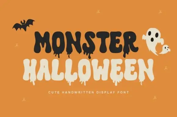
Cute dripping seasonal display
Monster Halloween is a cute dripping display in black and cream on orange: fat rounded letters with long drips hanging from the baseline, uneven heights and a bouncing baseline, with a bat and a ghost drawn in the same weight, so the plate reads as a friendly seasonal card.
Ideas for this font
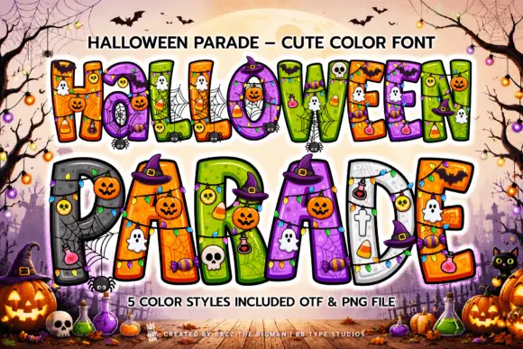
Thick outlined Halloween blocks with saturated patchwork interiors
Halloween Parade draws fat display letters in five colour styles and fills them with seasonal characters: jack-o-lanterns, ghosts, skulls, bats, spiders and webs inside the counters.
Ideas for this font
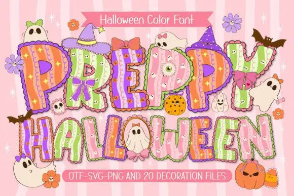
Scalloped pastel Halloween display
Preppy Halloween is a colour display on a pink striped ground: scalloped pastel capitals filled with vertical stripes and tiny spooky motifs, outlined in white with a shadow, decorated with bows, hats, ghosts and pumpkins, with two ribbons that name the format list and the count of decoration files.
Ideas for this font
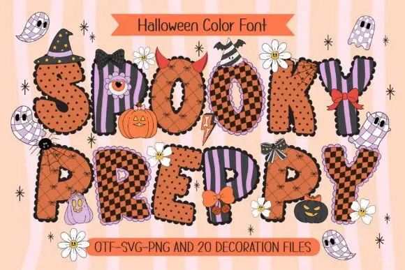
Scalloped Halloween block bundle
Spooky Preppy is a colour bundle on a striped pastel ground: scalloped Halloween blocks filled with orange-and-black checks, dots and lilac stripes, decorated with bows, bats, eyes and small ghosts, with banners at the head and foot naming the set and the included files.
Same independent foundry
Allow optional Google Analytics to measure visits and catalogue actions. Your search words and notes are not included. Privacy & storage