Neutral Sans Workhorse

Groovy Daisy + Corven
Lets Groovy Daisy own the focal silhouette while handling secondary copy, sizing and subheads cleanly.
Inspect Corven specimenDisclosure: MakerFileHub may earn a commission from qualifying purchases via paid links on this page. How our links work.
Swollen rounded mixed case with daisy blooms attached to and inside the letters
Groovy Daisy is a retro hippie display face: fat rounded letters, a layered outline and offset shadow, and daisies with little faces growing out of the tops, bottoms and counters of the glyphs.
Paid link
Get this fontProject & layout blueprintsAt-a-glance maker compatibility
Sturdy stroke walls and open counters weed cleanly on adhesive vinyl, HTV apparel film, and cut cardstock.
Visual anatomy & craft review
GROOVY over DAISY fills the frame inside a wavy double border, the upper word in orange with a cream inner outline and the lower word in a deeper rust. Every letter carries at least one drawn daisy, and several carry a small smiling face at the centre of the flower, so the word reads as a garden bed rather than a line of type. The palette is the warm seventies set, cream, mustard, ochre, rust and olive, with a soft sunburst behind and a few sparkle marks scattered in the gaps. The letters themselves are wide and soft-cornered, with short stems and heavy diagonals, and the two rows are stacked tight so the flowers of one word tuck under the other. Caption lines at the foot run in a ribbon and in small caps and name the style, the studio and the intent. It is a poster face: at 40 pt the faces inside the flowers vanish, so keep it large and let the drawing do the work.
Swollen rounded mixed case with daisy blooms attached to and inside the letters
Two-font hierarchy recipes
Tested contrast partners — pairing Groovy Daisy with grounded secondary typography.
Groovy Daisy + Corven
Lets Groovy Daisy own the focal silhouette while handling secondary copy, sizing and subheads cleanly.
Inspect Corven specimen
Groovy Daisy + Orvelia
Grounds bold display lettering with classic typographic authority on posters, badges and apparel.
Inspect Orvelia specimenPractical applications
Concrete hierarchy, scale and production guidance tailored to Groovy Daisy’s stroke geometry.
The flowers carry the season in the lettering alone, and the heavy retro forms read from the far end of a row of stalls without a printed sign behind them.
Hierarchy & layout recipe
Print an A2 poster: set the stall name at 130 pt across two rows, keep 26 mm of clear ground beneath before the date at 16 pt, and hold 30 mm of border so the outer daisies stay clear of the trim.
Pre-production check
Small faces inside the flowers disappear below 40 pt; print one poster at the finished size before the run. Ask for a proof on the actual stock.
The palette does the decorating for a themed party, and one word across a backdrop replaces a banner, balloons and a paper garland at once.
Hierarchy & layout recipe
Print a 1200 by 400 mm panel: set the greeting at 150 pt across two rows, keep 40 mm of clear ground between the rows, and hold 50 mm at each end so no flower is cut by the frame.
Pre-production check
Warm inks shift green on cheap banner material; print a short sample and compare the ochre before the banner is produced.
The style dates the page in a single glance, and the drawn faces add character to a cover line that would otherwise be plain type on a photograph.
Hierarchy & layout recipe
Print a 210 by 297 mm opener: set the feature title at 84 pt on two rows, keep 24 mm of clear ground beneath before the standfirst at 10.5 pt, and hold 18 mm clearance from the lowest flower to the bottom margin.
Pre-production check
The offset shadow merges with the outline on newsprint; print a page on the real paper and check the separation before the issue goes to press.
Technical & licence verification
Confirm included OTF/TTF/WOFF formats, full glyph tables and licence coverage on the live store page before batch production.
Closest visual alternatives
Matched across letterform anatomy, stroke behaviour and craft applications.
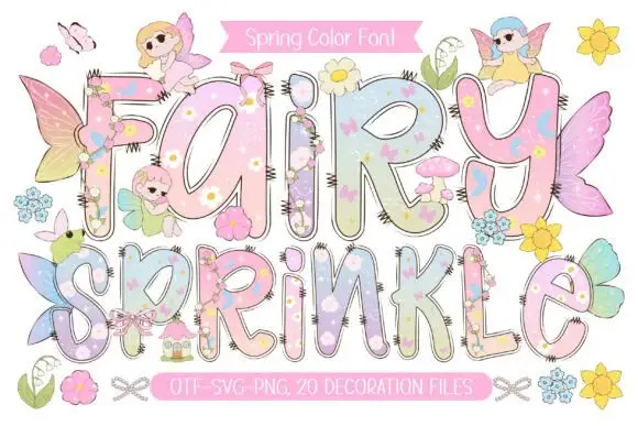
Pastel rounded letters with tiny flowers and overlapping fairy details
Fairy Sprinkle sets a spring scene in tall pastel colour-font letters, each interior printed with flowers, clouds and butterflies, each edge closed by a dashed stitch line, with small fairies perched on top.
Ideas for this font
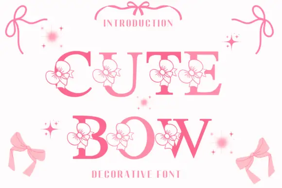
High-contrast serif capitals interrupted by outlined flower-like ribbon motifs
Cute Bow is a high-contrast serif display face in pink, with a drawn ribbon bow attached to each letter and small sparkles scattered around the word.
Ideas for this font
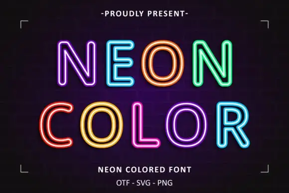
Neon double-line outline display
Neon Colored is a colour display on a dark brick ground: rounded outline capitals in bright double-line neon colours — violet, blue, orange, green, yellow, pink — with soft glow, set in two lines inside small corner brackets, with a small presenting line above and two plain lines below.
Ideas for this font
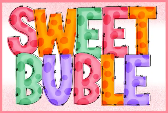
Stitched dotted translucent blocks
Sweet Buble is a colour display on a pale textured ground: tall blocks in pastel pink, orange, green and violet with large darker dots inside, a translucent-looking overlay, fine drawn edge stitches and dark outlines, set in two stacked words.
Ideas for this font
Same independent foundry
Allow optional Google Analytics to measure visits and catalogue actions. Your search words and notes are not included. Privacy & storage