Neutral Sans Workhorse

Grafitti New Year + Noar
Lets Grafitti New Year own the focal silhouette while handling secondary copy, sizing and subheads cleanly.
Inspect Noar specimenDisclosure: MakerFileHub may earn a commission from qualifying purchases via paid links on this page. How our links work.
Sharp street-marker tag graffiti display
Grafitti New Year is an energetic urban marker-tag graffiti font (not a serif) featuring whip-angled strokes, crossbars, and street handstyle rhythm.
Paid link
Get this fontProject & layout blueprintsAt-a-glance maker compatibility
Sturdy stroke walls and open counters weed cleanly on adhesive vinyl, HTV apparel film, and cut cardstock.
Visual anatomy & craft review
Grafitti New Year is a sharp street-marker display built from flat tag strokes, with quick directional changes, sharp flicks and a forward lean that reads as a name written fast on a wall rather than a designed logo. The strokes are flat and even, so the face keeps its energy when printed in one colour, and the flick terminals extend past the letter body. It needs roughly 30 mm for the flicks to read as deliberate, and it is best in a single bright ink on dark paper, or black on a pale wash.
Street-tag · Urban · Edgy
Two-font hierarchy recipes
Tested contrast partners — pairing Grafitti New Year with grounded secondary typography.
Grafitti New Year + Noar
Lets Grafitti New Year own the focal silhouette while handling secondary copy, sizing and subheads cleanly.
Inspect Noar specimen
Grafitti New Year + Askinо
Grounds bold display lettering with classic typographic authority on posters, badges and apparel.
Inspect Askinо specimenPractical applications
Concrete hierarchy, scale and production guidance tailored to Grafitti New Year’s stroke geometry.
Marker tags read as a flyer put up around a city, which is what a New Year street party distributes. The flat strokes hold in one ink on dark stock, and the flicks give the word movement that a geometric sans would need a gradient to match.
Hierarchy & layout recipe
Flyer A5, word 70 mm with 10 mm flick clearance, details 8/11 pt, 12 mm margins. Banner 1500 x 400 mm, word 240 mm, 100 mm margins and 25 mm clear of each eyelet. Sign 600 x 400 mm, word 120 mm, 40 mm margins.
Pre-production check
Flyers pasted on a cold wall ripple as the paste dries and a flick terminal at the trim curls away. Keep 10 mm of trim beyond the flicks, and check one pasted flyer the next morning.
A fast tag reads as a brand that came out of a scene rather than a studio, which is what a skate or street label sells. The even stroke cuts as a 50 mm sticker and prints in one colour on a garment, and the flicks make a short name look hand-done at any size.
Hierarchy & layout recipe
Sticker 80 x 50 mm, word 16 mm, 3 mm die margin. Tee print 260 x 140 mm, word 55 mm, 40 mm margins. Window vinyl 900 x 300 mm, word 150 mm, 60 mm margins.
Pre-production check
A 50 mm sticker leaves a 16 mm tag with flicks under 0.5 mm that tear on the die line. Keep the sticker word at 20 mm or thicken the flicks, and pull one sticker before the sheet.
A marker tag reads as the cover of a self-published zine, which is exactly what a scene publication prints on cheap stock. The flat strokes survive a photocopier, and the lean keeps a long title from looking centred and safe.
Hierarchy & layout recipe
Cover 148 x 210 mm, title 60 mm with 10 mm flick clearance, cover lines 8/11 pt, 12 mm margins. Opener 420 x 297 mm, headline 110 mm, body 9/13 pt. Poster A2, word 260 mm, details 22/28 pt, 30 mm margins.
Pre-production check
A photocopier at 80 percent reduction breaks the flick tips into dots and the title looks printed badly. Print the zine at 100 percent, and check one reduced spread before the run.
Technical & licence verification
Confirm included OTF/TTF/WOFF formats, full glyph tables and licence coverage on the live store page before batch production.
Closest visual alternatives
Matched across letterform anatomy, stroke behaviour and craft applications.

Heavy graffiti bubble caps with rough edges and paint splatter
Street Blaze is a heavy graffiti capital alphabet in which the letters swell into bubbles, the contours chip and the stems carry a rough inner edge, so a two-word title reads as something sprayed on a wall.
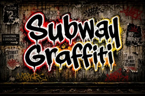
Dripping NYC subway-wall urban marker graffiti font
Subway Graffiti is a lively mixed-case street-art display font featuring flared marker terminals and vertical wet-paint drips.
Ideas for this font
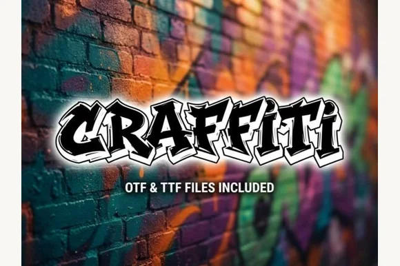
Explosive wildstyle arrow-bar urban graffiti display (OTF & TTF)
Graffiti (by clipartguru) is an energetic wildstyle street-art font armed with interlocking arrow extensions, sharp bevels, and OTF/TTF files.
Ideas for this font
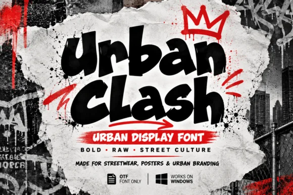
Chunky street-marker graffiti display
Urban Clash is a heavy, tight-set street-marker display typeface with flared chisel terminals, energetic bounce, and raw urban presence.
Ideas for this font
Allow optional Google Analytics to measure visits and catalogue actions. Your search words and notes are not included. Privacy & storage