Neutral Sans Workhorse

Folare + Montreal
Lets Folare own the focal silhouette while handling secondary copy, sizing and subheads cleanly.
Inspect Montreal specimenDisclosure: MakerFileHub may earn a commission from qualifying purchases via paid links on this page. How our links work.
Rounded mixed case with a looped rise between the o bowl and tall l stem
Folare is a geometric sans in which the lowercase l loops over the preceding letter, the counters are near perfect circles, and every terminal is cut flat on the horizontal.
Paid link
Get this fontProject & layout blueprintsAt-a-glance maker compatibility
Sturdy stroke walls and open counters weed cleanly on adhesive vinyl, HTV apparel film, and cut cardstock.
Visual anatomy & craft review
Folare sits across the middle of the card in white on a dark ground that fades into a field of fine vertical lines at the foot, and the letterforms are the argument: the o and the a are circles, the r ends in a short straight arm, the e has an angled terminal, and the l rises above the x-height and curls over the o as a single continuous stroke. That loop is the family's ligature, and it changes the rhythm of a word so that the line reads as a drawn shape rather than a row of letters. Small tracked lines at the corners carry the credits and the glyph count, and one line at the centre left lists the styles. The face is a geometric sans for identities, posters and titles, and the loop means a word can be set so that it reads as one object, which is exactly what a logo needs.
Rounded mixed case with a looped rise between the o bowl and tall l stem
Two-font hierarchy recipes
Tested contrast partners — pairing Folare with grounded secondary typography.
Folare + Montreal
Lets Folare own the focal silhouette while handling secondary copy, sizing and subheads cleanly.
Inspect Montreal specimen
Folare + Cronelo
Grounds bold display lettering with classic typographic authority on posters, badges and apparel.
Inspect Cronelo specimenPractical applications
Concrete hierarchy, scale and production guidance tailored to Folare’s stroke geometry.
The looping ascender turns a plain word into a single drawn shape, which is the cheapest way to make a wordmark look designed rather than typed.
Hierarchy & layout recipe
Print a 70 mm brand block: set the studio name at 20 pt in lowercase, keep 7 mm of clear ground beneath before the descriptor at 5 pt, and hold 5 mm from the loop to the block edge.
Pre-production check
The loop closes on the letter before it at small sizes; print one block at 18 mm wide and check the gap before the stationery.
The geometric shapes read as a lesson in form, and the loop gives a plain course title something to point at during a first lecture.
Hierarchy & layout recipe
Print an A2 poster: set the course title at 120 pt on one row in lowercase, keep 30 mm of clear ground beneath before the term dates at 14 pt, and hold 26 mm of margin at both ends of the line.
Pre-production check
Thin vertical rules behind the type fight the loop; print one poster and check the contrast where the line meets the letters.
The circular forms suit a spread about objects, and the single loop lets a short title carry a page that has no photograph on it.
Hierarchy & layout recipe
Print a 230 by 300 mm opener: set the feature title at 100 pt on one row, keep 34 mm of clear ground beneath before the standfirst at 11 pt, and hold 20 mm from the loop to the top trim.
Pre-production check
Large circular counters can look empty on a wide page; print one opener and check the balance before the issue closes.
Technical & licence verification
Confirm included OTF/TTF/WOFF formats, full glyph tables and licence coverage on the live store page before batch production.
Closest visual alternatives
Matched across letterform anatomy, stroke behaviour and craft applications.
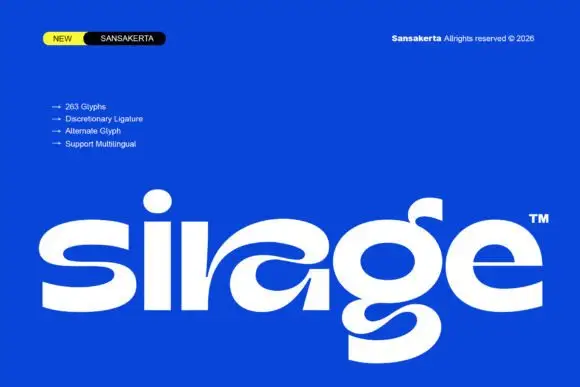
Wide display lowercase with flowing joints
Sirage is a wide display in white on a saturated blue: lowercase with a flowing a construction that sweeps through the bowl, an extended double-bowl g, thick even strokes and round terminals, set as one large word with a small badge at the top left and a list of features beside it.
Ideas for this font
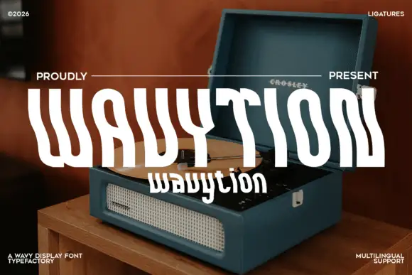
Waved condensed display
Wavytion is a waved display in white over a photograph of a portable record player: very tall narrow forms whose stems bend into broad alternating waves, so the word reads as a ribbon, with a second line in a softer wave beneath and small notes in the corners.
Ideas for this font
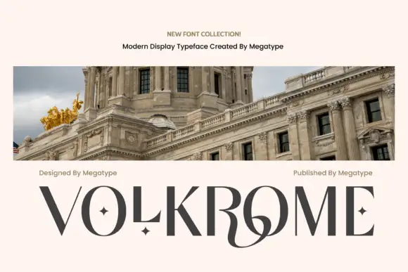
Angular contrast display
Volkrome is an angular contrast display in charcoal on a pale sheet, shown above a photograph of a domed building: wide capitals with fine curves, sharp junctions, small star counters and a sweeping joined centre, with two credits above and the name set across the foot.
Ideas for this font
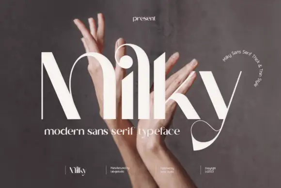
High-contrast arched display
Milky is a high-contrast display in cream over a photograph of hands: mixed case with an arched M that rises into a peak, a round i dot held above the stem, a looping y descender, hairline joins and a wide set, with a small line at the top and a caption beneath.
Ideas for this font
Same independent foundry
Allow optional Google Analytics to measure visits and catalogue actions. Your search words and notes are not included. Privacy & storage