Neutral Sans Workhorse

Floral Line Art + Swaraga
Lets Floral Line Art own the focal silhouette while handling secondary copy, sizing and subheads cleanly.
Inspect Swaraga specimenDisclosure: MakerFileHub may earn a commission from qualifying purchases via paid links on this page. How our links work.
Fine upright botanical sprigs with outlined leaves and small flower clusters
Floral Line Art is a typable set of about thirty botanical stems — flowering sprays, seed heads, leaf pairs, small bells — drawn in one even grey line with a light, airy hand.
Paid link
Get this fontProject & layout blueprintsAt-a-glance maker compatibility
Sturdy stroke walls and open counters weed cleanly on adhesive vinyl, HTV apparel film, and cut cardstock.
Visual anatomy & craft review
The card arranges the drawings in three rows under a heavy serif title, and each is a single stem: a spray of tiny five-petal flowers, a stem of paired leaves with a bud, a stalk of bell flowers, a seed head with radiating ribs, a sprig of leaves only. The stroke is even throughout and nothing is filled, which is what makes the set usable as a line of decoration rather than as an illustration, and the stems are drawn upright with a slight curve, so a row of them reads as a bed of plants. The drawings are consistent in height, which matters more than it sounds: a border built from them needs no scaling, and because they are glyphs a row is typed in seconds.
Fine upright botanical sprigs with outlined leaves and small flower clusters
Two-font hierarchy recipes
Tested contrast partners — pairing Floral Line Art with grounded secondary typography.
Floral Line Art + Swaraga
Lets Floral Line Art own the focal silhouette while handling secondary copy, sizing and subheads cleanly.
Inspect Swaraga specimen
Floral Line Art + Evoire
Grounds bold display lettering with classic typographic authority on posters, badges and apparel.
Inspect Evoire specimenPractical applications
Concrete hierarchy, scale and production guidance tailored to Floral Line Art’s stroke geometry.
One stem per card ties a table together with no printing cost, and the open line work leaves room for a name at a small size.
Hierarchy & layout recipe
Print a 90 by 50 mm place card: set the name at 13 pt with one stem at 22 mm beside it, keep 6 mm of clear ground between the drawing and the name, and hold 5 mm from the tallest flower to the card edge.
Pre-production check
A thin stem disappears on a cream card; print one card on the intended stock and check the stroke before the set.
The line drawings give a plain jar a botanical note without a photograph, and one grey ink keeps a run of small labels cheap.
Hierarchy & layout recipe
Print a 50 by 50 mm jar label: set the scent at 12 pt with two stems at 14 mm beneath it, keep 5 mm of clear ground between the type and the drawings, and hold 4 mm from the stem base to the die line.
Pre-production check
Thin lines vanish on a matt label; print one label on the real stock and check the seed head before the order.
The drawings match the subject of the page without competing with the variety names, and a row of stems gives a catalogue a consistent head.
Hierarchy & layout recipe
Print a 210 by 297 mm page: run five stems at 18 mm across the head, keep 8 mm of clear ground beneath before the first variety at 10.5 pt, and hold 16 mm of margin at both sides.
Pre-production check
Fine grey lines break up on newsprint; print one page on the intended paper and check a stroke before the run.
Technical & licence verification
Confirm included OTF/TTF/WOFF formats, full glyph tables and licence coverage on the live store page before batch production.
Closest visual alternatives
Matched across letterform anatomy, stroke behaviour and craft applications.
Leaf and floral ornament dingbats
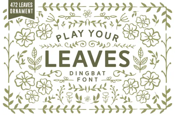
Play Your Leaves is a dingbat sheet on a white ground: many leafy sprigs, floral sprays and border ornaments in a single olive line, some open and some solid, arranged around a lined centre title and a small count badge at the upper left.
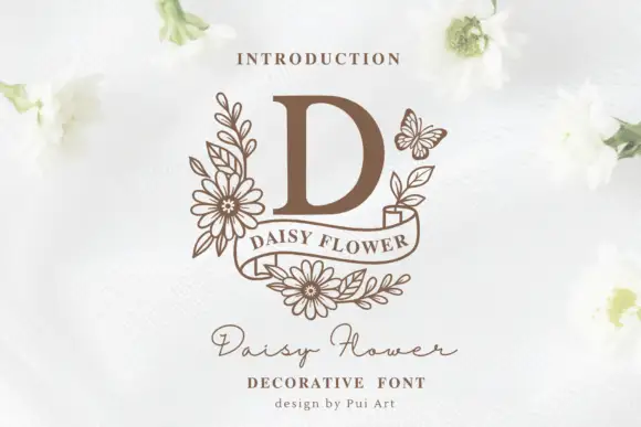
A serif D above a curled ribbon surrounded by daisies, leaves and a small butterfly
Daisy Flower sets a single heavy serif initial at the centre of a drawn wreath of daisies, leaves and one butterfly, with a curved ribbon banner below and a script line under that.
Ideas for this font

A looping contrast B initial with a large outlined flower, leaves and butterfly
Beauty Flower Monogram is a single ornate script initial with a long descending swash that turns into a line-drawn rose, two leaves and a butterfly, set in a warm pink-to-magenta gradient.
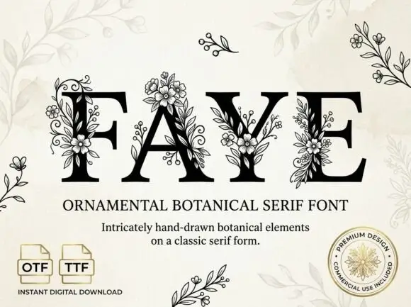
Large contrast serif capitals crossed by fine outlined flower and leaf clusters
Faye places black capitals on pale cream, where large fine-lined flowers overlap the F stem and the A apex, leafy sprigs and small buds cross the Y and E, and narrow curled tendrils climb between the letters while standalone sprigs sit around the page.
Ideas for this font
Same independent foundry
Allow optional Google Analytics to measure visits and catalogue actions. Your search words and notes are not included. Privacy & storage