Neutral Sans Workhorse

Easter Bunny + Bielchon
Lets Easter Bunny own the focal silhouette while handling secondary copy, sizing and subheads cleanly.
Inspect Bielchon specimenDisclosure: MakerFileHub may earn a commission from qualifying purchases via paid links on this page. How our links work.
Rounded mixed-case letters topped by paired rabbit ears and edged with dashed trim
Easter Bunny draws pastel colour capitals with a soft sketched edge and a pair of long stitched bunny ears rising from the top of each letter, with a white dashed seam running inside the shape.
Paid link
Get this fontProject & layout blueprintsAt-a-glance maker compatibility
Sturdy stroke walls and open counters weed cleanly on adhesive vinyl, HTV apparel film, and cut cardstock.
Visual anatomy & craft review
EASTER over BUNNY fills the card, and each letter is a fat rounded shape in a different pastel — pink, blue, yellow, lilac, teal, orange — with a fine hand-drawn contour and a dashed stitch line just inside it. Every letter carries a pair of ears: an outer white shape with a pale pink inner, tilted a little differently from letter to letter, so the row looks drawn rather than repeated. Small doodle flowers and white dots scatter over a pale pink ground, and two captions name the set with a small logo stamp in the corner. The construction is a colour font with the ears attached as part of the glyph, so the letters must be set with extra leading to give the ears room.
Rounded mixed-case letters topped by paired rabbit ears and edged with dashed trim
Two-font hierarchy recipes
Tested contrast partners — pairing Easter Bunny with grounded secondary typography.
Easter Bunny + Bielchon
Lets Easter Bunny own the focal silhouette while handling secondary copy, sizing and subheads cleanly.
Inspect Bielchon specimen
Easter Bunny + Gorga
Grounds bold display lettering with classic typographic authority on posters, badges and apparel.
Inspect Gorga specimenPractical applications
Concrete hierarchy, scale and production guidance tailored to Easter Bunny’s stroke geometry.
The ears and the pastel fills say the season in one word, and the sketched stitch line gives a printed card a hand-finished look without a photograph.
Hierarchy & layout recipe
Print a 120 by 170 mm card: set the greeting at 42 pt across two rows, keep 20 mm of clear ground between the rows for the ears, and hold 14 mm from the tallest ear to the card edge.
Pre-production check
The stitch dashes disappear below 22 pt; print one card at the finished size and check a seam before the batch.
The letterforms suit a young guest list, and the pastel colours match the paper plates, cups and streamers a parent has already bought for the table.
Hierarchy & layout recipe
Print a 400 by 300 mm board: set the greeting at 80 pt across two rows, keep 26 mm of clear ground between the rows for the ears, and hold 22 mm of border so no ear is trimmed.
Pre-production check
Colour fills go flat on foam board; print one sign on the intended material and check the pastels first.
The set gives a seasonal box a decorated lid without a printed illustration, and one word on a plain box already looks finished.
Hierarchy & layout recipe
Print a 70 by 50 mm box label: set the word at 18 pt on one row, keep 8 mm of clear ground above for the ears, and hold 5 mm from the ear tips to the label edge.
Pre-production check
Ears are the first thing to be lost to a die cut; print one label and cut it before ordering the run.
Technical & licence verification
Confirm included OTF/TTF/WOFF formats, full glyph tables and licence coverage on the live store page before batch production.
Closest visual alternatives
Matched across letterform anatomy, stroke behaviour and craft applications.
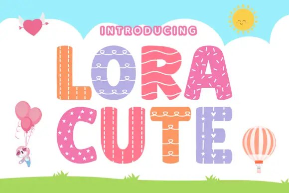
Stitched-pattern block display
Lora Cute is a patterned block display on a sky-blue ground: broad rounded capitals, each filled with a different treatment — stitching, loops, waves, stars — with a pale outline around every letter, plus small balloon, heart and sun illustrations around the edges.
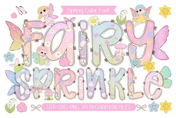
Pastel rounded letters with tiny flowers and overlapping fairy details
Fairy Sprinkle sets a spring scene in tall pastel colour-font letters, each interior printed with flowers, clouds and butterflies, each edge closed by a dashed stitch line, with small fairies perched on top.
Ideas for this font
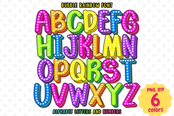
Bright rounded capitals with dotted faces and shaded offset edges
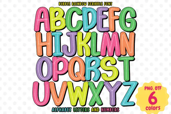
Bubble Rainbow sets fat rounded letters with a heavy outline, a white inline and a grid of pale dots across the fill, supplied in six bright colourways across letters and numerals.
Ideas for this font
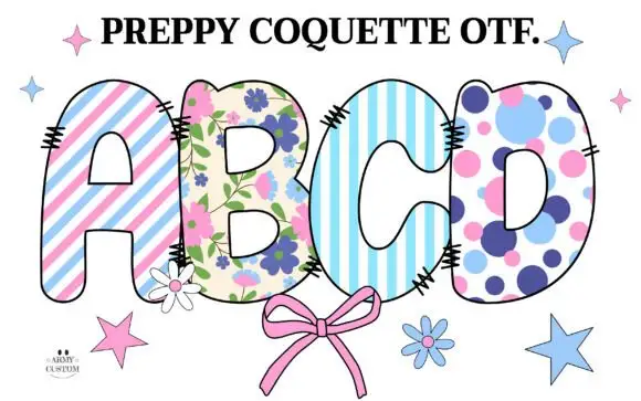
Rounded capitals filled with pastel stripes, flowers and large dots
Preppy Coquette is a colour font in which each cap is filled with a prep pattern: pink and blue stripes, a floral print on cream, a pale striped ground and a lilac polka dot, with stitched edges and a drawn bow under the row.
Ideas for this font
Same independent foundry
Allow optional Google Analytics to measure visits and catalogue actions. Your search words and notes are not included. Privacy & storage