Neutral Sans Workhorse

Drawing Alphabet + Miniplate
Lets Drawing Alphabet own the focal silhouette while handling secondary copy, sizing and subheads cleanly.
Inspect Miniplate specimenDisclosure: MakerFileHub may earn a commission from qualifying purchases via paid links on this page. How our links work.
Bright block capitals with black hatched extrusion along their sides
Drawing Alphabet draws fat rounded caps in a rainbow of pastel fills, outlines them in black and casts a shadow filled with diagonal hatching, so a word looks cut from paper and stuck on.
Paid link
Get this fontProject & layout blueprintsAt-a-glance maker compatibility
Sturdy stroke walls and open counters weed cleanly on adhesive vinyl, HTV apparel film, and cut cardstock.
Visual anatomy & craft review
DRAWING over ALPHABET fills the card, and each letter is a different bright colour — turquoise, green, pink, orange, lilac — with a heavy black outline and a hatched shadow offset to the lower right. The letters are wide and soft-cornered with small counters, and the hatch is drawn at a consistent angle through every shadow, which is what makes the set look hand-made rather than assembled. Around the words a few doodles sit in the corners: a rainbow arc, three balloons, a heart with speed lines and a squiggle. Small captions frame the composition, one naming the style and one crediting the designer. Because the shadow is part of the glyph, the face needs air around it, and it works best at headline sizes where the hatch reads as a drawing rather than as texture.
Bright block capitals with black hatched extrusion along their sides
Two-font hierarchy recipes
Tested contrast partners — pairing Drawing Alphabet with grounded secondary typography.
Drawing Alphabet + Miniplate
Lets Drawing Alphabet own the focal silhouette while handling secondary copy, sizing and subheads cleanly.
Inspect Miniplate specimen
Drawing Alphabet + The Simple Editorial
Grounds bold display lettering with classic typographic authority on posters, badges and apparel.
Inspect The Simple Editorial specimenPractical applications
Concrete hierarchy, scale and production guidance tailored to Drawing Alphabet’s stroke geometry.
The colours and the hatched shadow look like a child's cut-out work, and the heavy outline keeps the title readable on a cover that gets handled.
Hierarchy & layout recipe
Print an A4 folder cover: set the title at 54 pt on one row, keep 18 mm of clear ground beneath before the name at 12 pt, and hold 20 mm of border so the shadow is not trimmed.
Pre-production check
The hatching closes up below 26 pt; print one cover at the finished size and check a shadow before the set.
One word in these colours does the decorating for a table, and the paper-cut look matches the decorations a parent has already made.
Hierarchy & layout recipe
Print a 400 by 300 mm board: set the greeting at 80 pt across two rows, keep 22 mm of clear ground between the rows, and hold 24 mm of border so no hatched edge is cut.
Pre-production check
Colour fills print unevenly on foam board; print one sign on the intended material and check the shadow before the set.
The face reads as illustration rather than as type, which is what a feature about children's books needs on its opening page.
Hierarchy & layout recipe
Print a 190 by 250 mm spread opener: set the feature title at 84 pt across two rows, keep 24 mm of clear ground beneath before the standfirst at 10.5 pt, and hold 22 mm of margin so no corner doodle collides with the type.
Pre-production check
Dense hatching moire in a cheap print; print one page on the intended press and check the shadow before the issue.
Technical & licence verification
Confirm included OTF/TTF/WOFF formats, full glyph tables and licence coverage on the live store page before batch production.
Closest visual alternatives
Matched across letterform anatomy, stroke behaviour and craft applications.
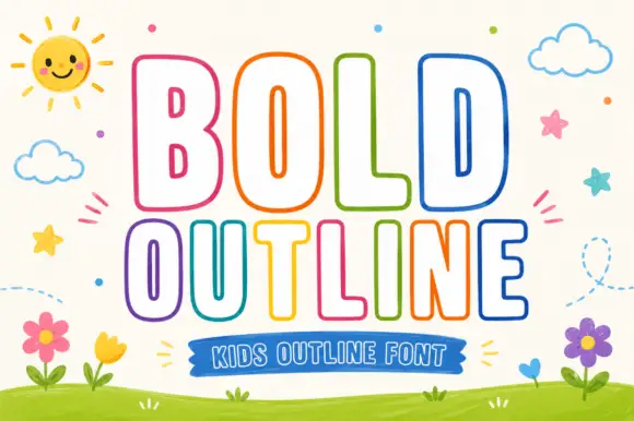
Rounded outline capitals
Bold Outline shows tall rounded capitals traced by a thin coloured contour on a pale field, where the B keeps small narrow counters while the L and D leave broad white interiors, and the letter widths change across the two rows so the second word runs wider than the first.
Ideas for this font
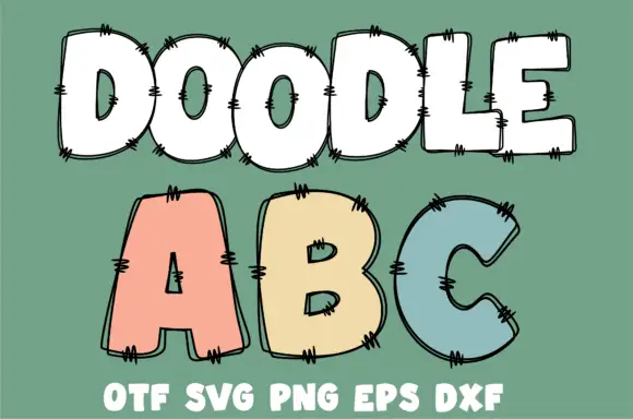
Broad rounded outlined capitals with doubled sketch contours and short crosshatched edge marks
Doodle Abc shows a white DOODLE row above large pastel A, B and C on green, where broad rounded bodies carry doubled irregular outlines and small groups of short dark strokes cross the edges at intervals.
Ideas for this font
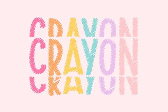
Tall crayon-textured capitals repeated in cropped upper and lower rows
Crayonfriends Stacked repeats the same tall word in three pastel rows on pale pink, where the middle row is complete while the rows above and below are cut by broad horizontal blank bands, and scratchy diagonal marks break both the coloured strokes and their edges.
Ideas for this font
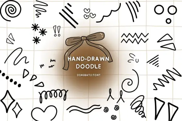
Bold black doodle spirals, zigzags, hearts and short emphasis strokes
Hand Drawn Doodle is a large typable set of loose pen marks — spirals, zigzags, stars, arrows, hearts, loops, dashes, diamonds, squiggles — drawn with a felt-tip wobble on a squared ground.
Ideas for this font
Same independent foundry
Allow optional Google Analytics to measure visits and catalogue actions. Your search words and notes are not included. Privacy & storage