Neutral Sans Workhorse

Dirty Clouds + Modern Limited
Lets Dirty Clouds own the focal silhouette while handling secondary copy, sizing and subheads cleanly.
Inspect Modern Limited specimenDisclosure: MakerFileHub may earn a commission from qualifying purchases via paid links on this page. How our links work.
Soft inflated mixed forms with small counters and uneven rounded edges
Dirty Clouds is a soft inflated display in which the bodies spread wide, the widths and tilts vary from letter to letter, the counters shrink into small rounds and a detached dot floats above a stacked pair of words.
Paid link
Get this fontProject & layout blueprintsAt-a-glance maker compatibility
Fine grain and micro-texture excel in 300 DPI print, sublimation, and screen print rather than small vinyl weeding.
Visual anatomy & craft review
The bodies inflate outward, the t spreads a wide rounded crossbar, the lower s curls into a short end and the letter widths change so the row breathes unevenly. The inflated body is the character: the word reads as a balloon rather than a drawn letter, which is why the sample sets two stacked words against a sky. Because the counters are small and round, keep 30 pt as the floor so they do not close, and the detached dot needs its own space above the row. The cloud photograph is background imagery, and the cover's rough-edge claim is not isolated in this reduced specimen.
Inflated · Soft · Uneven
Two-font hierarchy recipes
Tested contrast partners — pairing Dirty Clouds with grounded secondary typography.
Dirty Clouds + Modern Limited
Lets Dirty Clouds own the focal silhouette while handling secondary copy, sizing and subheads cleanly.
Inspect Modern Limited specimen
Dirty Clouds + Grandeur – Elegant Classic Serif
Grounds bold display lettering with classic typographic authority on posters, badges and apparel.
Inspect Grandeur – Elegant Classic Serif specimenPractical applications
Concrete hierarchy, scale and production guidance tailored to Dirty Clouds’s stroke geometry.
The inflated bodies suit a party banner, and the wide forms keep a short name readable at 42 pt across an A4 sheet in one ink. The uneven widths also keep a short name from looking machine-set.
Hierarchy & layout recipe
Print an A4 banner: set the name at 42 pt, keep 16 mm of clear sheet above the row for the detached dot, and set the age at 15 pt in a rounded sans beneath with 10 mm of clear ground.
Pre-production check
Small round counters close when the name prints below 24 pt; check the proof and keep the banner text at 38 pt or above.
The soft masses read from a distance, and the uneven widths give a summer poster its bounce at 70 pt on an A3 sheet. The varying widths give the stacked rows their sway.
Hierarchy & layout recipe
Print an A3 poster: set the title at 70 pt on two stacked rows, keep 20 mm between the rows so the inflated bodies stay separate, and keep 25 mm of margin all round the sheet.
Pre-production check
Two inflated rows set flush merge into a single mass; check the mounted poster and open the gap to 26 mm. Ask for a proof at the final poster size.
The rounded bodies give a can label its cheer, and the small counters hold at 20 pt on a 55 mm panel in two inks. The detached dot needs its own space above the brand name.
Hierarchy & layout recipe
Print a 55 by 40 mm label: set the brand at 20 pt, keep 5 mm of clear ground below the row for the lower curl, and set the flavour in a 6 pt rounded sans with 4 mm of clear space.
Pre-production check
A detached dot printed into the flavour line looks like a fault; check the artwork and give the dot 6 mm of clear space.
Technical & licence verification
Confirm included OTF/TTF/WOFF formats, full glyph tables and licence coverage on the live store page before batch production.
Closest visual alternatives
Matched across letterform anatomy, stroke behaviour and craft applications.
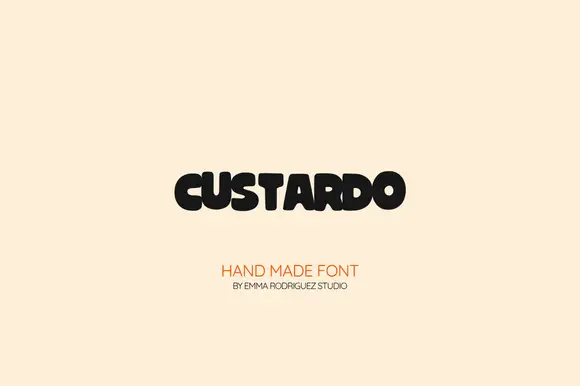
Very heavy chunky capitals with flat joins and tiny counters
Custardo is a very heavy capital alphabet in which the strokes are almost as wide as the letters, the joins flatten and the counters close to small slots, so a short word reads as a solid block of ink.
Ideas for this font
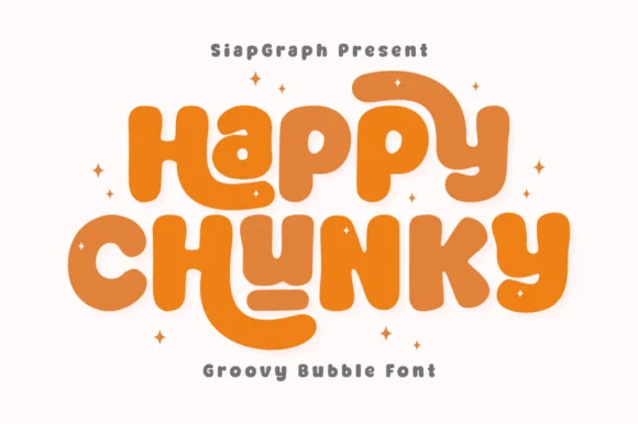
Extra-plump groovy bubble letters with tucked curl terminals
Happy Chunky is an extra-plump bubble display in which the stems balloon, the counters shrink to small openings, the terminals tuck into curls and the letters almost touch, so a short phrase reads as one sticker-ready block.
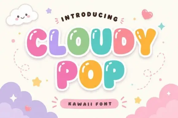
Rounded bubble capitals with small counters and a soft white sticker outline
Cloudy Pop is a rounded bubble capital alphabet with small counters and a soft white outline, so a word reads as a set of inflated stickers that can sit on any background.
Ideas for this font
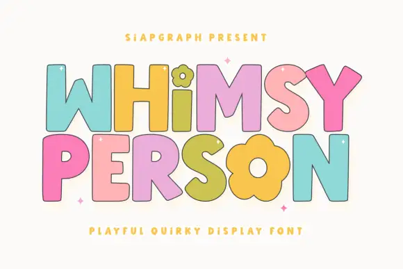
Simple broad letters with flower-shaped details
Whimsy Person is a playful capital display: fat rounded letters with a black contour, each in a different pastel colour, with the i and the o of the second word drawn as flower heads.
Ideas for this font
Same independent foundry
Allow optional Google Analytics to measure visits and catalogue actions. Your search words and notes are not included. Privacy & storage