Editorial Serif Anchor

Delsya Script + Mewah
Anchors Delsya Script's fluid strokes with crisp Roman proportions on wedding suites, headers and packaging.
Inspect Mewah specimenDisclosure: MakerFileHub may earn a commission from qualifying purchases via paid links on this page. How our links work.
Fine vintage-style looped calligraphy with tall caps and flowing joins
Delsya Script is fine vintage-style calligraphy whose capitals rise into tall open loops and whose joins flow without lifting, so two words read as one engraved line.
Paid link
Get this fontProject & layout blueprintsAt-a-glance maker compatibility
Weld or Unite overlapping script joins into one continuous vector path before sending to the blade.
Visual anatomy & craft review
The capital D is drawn as a tall loop that rises above the cap line before the stem swells, and the capital S repeats the gesture at the other end of the line. The lowercase between them is small and fine: the e and the l close tightly, the s reverses through a thin join, the y drops a narrow descender and the a keeps a small bowl. Contrast is moderate, with shaded stems and fine joins, and the loop count is high enough to give the line its period ornament without overwhelming the letterforms. The lean is a steady forward slant, and the ends finish in long tapering strokes rather than abrupt cuts. The cliff photograph, the cream lettering and the small centred credits are presentation; the calligraphy is the two words.
Vintage · Looped · Fine
Two-font hierarchy recipes
Tested contrast partners — pairing Delsya Script with grounded secondary typography.
Delsya Script + Mewah
Anchors Delsya Script's fluid strokes with crisp Roman proportions on wedding suites, headers and packaging.
Inspect Mewah specimen
Delsya Script + One More
Keeps small-scale dates, URLs, nutrition facts and care instructions crisp and legible below script titles.
Inspect One More specimenPractical applications
Concrete hierarchy, scale and production guidance tailored to Delsya Script’s stroke geometry.
The looped vintage calligraphy gives an invitation its period tone, and the fine joins keep a long pair of names light on a tall card.
Hierarchy & layout recipe
Set both names at 28 pt on a 120 by 190 mm card, set the details in a small caps serif at 8 pt, and hold 18 mm below the descender before the details block.
Pre-production check
Fine joins under 0.1 mm drop out of offset; ask for the printer's minimum line and thicken the joins rather than the stems.
The period loops read as engraved glass lettering at small size, and the moderate contrast survives being printed in one colour on a label.
Hierarchy & layout recipe
Set the house name at 13 pt on a 40 by 80 mm label, keep the volume in a 5 pt caps serif, and leave 7 mm of clearance so the exit stroke stays inside the label edge.
Pre-production check
Foil on a fine join bridges at the tightest loops; check a foil dummy and simplify one loop rather than flattening the whole line.
The vintage calligraphy sets a period tone on a title page without falling back on blackletter, and the fine line keeps the page elegant.
Hierarchy & layout recipe
Set the title at 36 pt on an A5 title page, set the author in a small caps serif at 10 pt, and leave 20 mm between the title and the imprint at the foot.
Pre-production check
Uncoated book stock closes fine joins; print the title page on the actual paper and adjust the fit rather than the contrast.
Technical & licence verification
Confirm included OTF/TTF/WOFF formats, full glyph tables and licence coverage on the live store page before batch production.
Closest visual alternatives
Matched across letterform anatomy, stroke behaviour and craft applications.

Very slanted calligraphy with broad lower sweeps and fine hairlines
Silken Luxe is a formal calligraphy script with a steep slant, broad lower sweeps and hairlines that thin almost to nothing, drawn so two words build an ornamental diagonal across the plate.
Ideas for this font
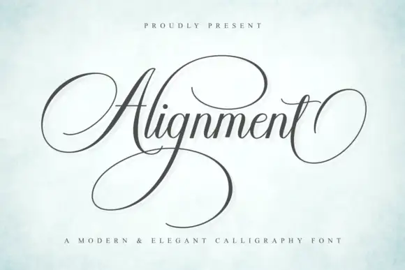
Formal calligraphic script with a large calligraphic capital
Alignment is a formal calligraphy script whose capital occupies three times the x-height and whose oval flourish sweeps out from the first letter and back under the last, so the word is framed top and bottom by one continuous gesture.
Ideas for this font
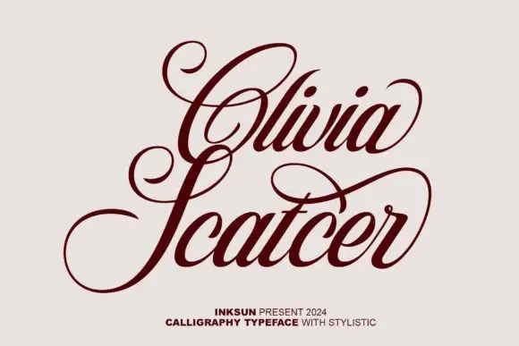
High-contrast looped calligraphy
Olivia Scatcer is a high-contrast calligraphy in oxblood on pale stone: wide open loops on the capitals, a pronounced thick-and-thin and a light forward slant, with a small credit line at the foot.
Ideas for this font
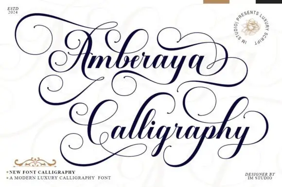
Dense ornamental high-contrast calligraphy
Amberaya Calligraphy builds large spiral A and C forms with thin sweeping connections, and long upper and lower swashes weave around both lines, including a wide curl that leaves the final y.
Same independent foundry
Allow optional Google Analytics to measure visits and catalogue actions. Your search words and notes are not included. Privacy & storage