Neutral Sans Workhorse

Cute Holiday + Miniplate
Lets Cute Holiday own the focal silhouette while handling secondary copy, sizing and subheads cleanly.
Inspect Miniplate specimenDisclosure: MakerFileHub may earn a commission from qualifying purchases via paid links on this page. How our links work.
Soft rounded capitals in a pastel sticker treatment with thick outlines
Cute Holiday is a soft rounded capital alphabet in which every letter carries a thick white sticker outline, so a phrase reads as a set of cut paper shapes rather than as a printed line.
Paid link
Get this fontProject & layout blueprintsAt-a-glance maker compatibility
Sturdy stroke walls and open counters weed cleanly on adhesive vinyl, HTV apparel film, and cut cardstock.
Visual anatomy & craft review
The letters are fat and even: the C closes a wide crescent, the U holds a deep bowl, the T carries a broad arm and the Y forks shallowly, all with fully rounded corners and no contrast at all. The sticker treatment is the defining part: a thick white outline with a soft shadow separates each letter from the ground, which lets the phrase sit on any colour without a plate behind it. Weight is maximal and even, counters stay small and round, and the letterfit is tight enough that the two lines read as one pastel block. Because the outline is generous, the face works at 14 pt on a sticker and at 90 mm on a banner. The pink cloud ground, the rainbow, the heart and the two small caption lines are presentation; the typeface is the two words.
Soft · Pastel · Sticker
Two-font hierarchy recipes
Tested contrast partners — pairing Cute Holiday with grounded secondary typography.
Cute Holiday + Miniplate
Lets Cute Holiday own the focal silhouette while handling secondary copy, sizing and subheads cleanly.
Inspect Miniplate specimen
Cute Holiday + Vanielst Elegant Serif Display Stylistic
Grounds bold display lettering with classic typographic authority on posters, badges and apparel.
Inspect Vanielst Elegant Serif Display Stylistic specimenPractical applications
Concrete hierarchy, scale and production guidance tailored to Cute Holiday’s stroke geometry.
The sticker outline means the letters read on any background, and the rounded blocks stay legible at 11 pt on a small die.
Hierarchy & layout recipe
Set the phrase at 11 pt on a 45 mm round sticker, keep the child's name in a 5 pt sans beneath, and leave 5 mm inside the die so the outline is not clipped.
Pre-production check
A thick outline under 2 mm closes at 11 pt; check the printed sticker at final size and thicken the outline rather than the letters.
The pastel blocks with their outlines read across a room and keep a light tone at 80 mm, which suits a children's celebration.
Hierarchy & layout recipe
Set the greeting at 80 mm on a 1.2 m paper banner, set the party name at 50 mm beneath it, and leave 30 mm at each end so the outline stays inside the banner edge.
Pre-production check
A white outline printed on a light banner disappears; check the proof and choose a tinted outline rather than dropping it.
The cut-paper look suits a classroom display, and the even weight keeps every letter readable from the back of the room at 60 mm.
Hierarchy & layout recipe
Set the heading at 60 mm tall on a 900 mm board, keep the children's names in a plain 15 mm sans beneath, and hold 20 mm between the heading and the first name.
Pre-production check
Cut letters with a shadow effect print twice and mis-register; check one letter on the board before cutting the rest.
Technical & licence verification
Confirm included OTF/TTF/WOFF formats, full glyph tables and licence coverage on the live store page before batch production.
Closest visual alternatives
Matched across letterform anatomy, stroke behaviour and craft applications.
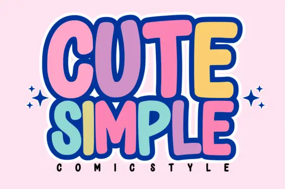
Tall rounded comic blocks with bubble outlines and per-letter colour
Cute Simple is a tall rounded comic alphabet in which the blocks stack tightly, the outlines bubble outward and each letter can take its own colour without breaking the composition.
Ideas for this font
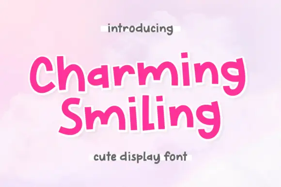
Upright playful letters with varied proportions and a level baseline
Charming Smiling is playful lettering in which the letters stand upright, the proportions vary from letter to letter and the baseline stays level, so a phrase reads as a cheerful hand-drawn label.
Ideas for this font

Tall rounded fantasy capitals with a two-tone fill and offset outline
Jumping Unicorn is a tall rounded capital alphabet in which the strokes swell, the counters stay small and a two-tone fill sits inside an offset outline, so a word reads as a storybook title.
Ideas for this font
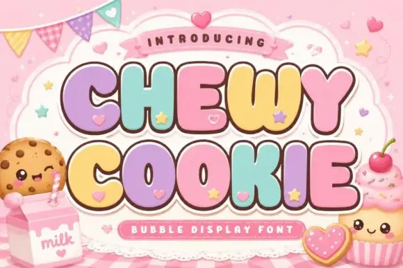
Squat bubble capitals packed tightly with heart accents between letters
Chewy Cookie is a squat bubble capital alphabet packed so tightly that the letters touch, with small hearts scattered into the gaps and a soft outline around the whole phrase.
Ideas for this font
Same independent foundry
Allow optional Google Analytics to measure visits and catalogue actions. Your search words and notes are not included. Privacy & storage