Modern Grotesque Body

Cowboy Western + Helina
Creates crisp high-hierarchy contrast beneath Cowboy Western headlines across menus, websites and labels.
Inspect Helina specimenDisclosure: MakerFileHub may earn a commission from qualifying purchases via paid links on this page. How our links work.
Western slab display with spurred serifs and an inline shade
Cowboy Western is a western slab display in which the serifs grow spurs, the stems stay heavy and an inline shade runs through each letter, so a name reads as a brand burnt into a barn board.
Paid link
Get this fontProject & layout blueprintsAt-a-glance maker compatibility
Sturdy stroke walls and open counters weed cleanly on adhesive vinyl, HTV apparel film, and cut cardstock.
Visual anatomy & craft review
The C curls a heavy crescent with spurred terminals, the O closes a wide oval with an inner line, the W splays four spurred strokes, the B stacks two square bowls and the Y turns two hooked arms, all at a slab weight with exaggerated serifs and a carved inline. The spurs are the character: they sit on every serif and terminal, which is why the sample sets two stacked words on a washed background with desert drawings around them. Because the shapes are solid and the inline stays wide, the face holds from 30 pt and cuts cleanly in vinyl. The pale wash, the cacti, the tumbleweed and the small lines are presentation; the brown display words are the face.
Western · Slab · Spurred
Two-font hierarchy recipes
Tested contrast partners — pairing Cowboy Western with grounded secondary typography.
Cowboy Western + Helina
Creates crisp high-hierarchy contrast beneath Cowboy Western headlines across menus, websites and labels.
Inspect Helina specimen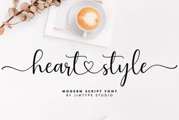
Cowboy Western + Heart Style
Adds a warm human signature touch for 1-to-3-word callouts without competing against structured serif capitals.
Inspect Heart Style specimenPractical applications
Concrete hierarchy, scale and production guidance tailored to Cowboy Western’s stroke geometry.
The spurred slabs read from the highway turn-off, and the inline shade gives a barn sign real depth without a second colour at 100 mm of letter height.
Hierarchy & layout recipe
Paint a 900 by 300 mm board: set the words at 100 mm, keep the inline as a 6 mm gap, and paint the outer shape first so the shade stays even across the whole line.
Pre-production check
An inline painted by hand drifts from letter to letter; check the board at arm's length and keep one brush width for the gap.
The western register suits a smoked barbecue product, and the spurred slabs hold a short brand name at 20 pt on a paper label in one ink.
Hierarchy & layout recipe
Print a 70 by 45 mm label: set the brand name at 20 pt, set the heat level in a 7 pt slab beneath, and keep 5 mm from the die so the spurred feet survive the cut.
Pre-production check
Spur feet cut by a small die lose their points; check the imposed label and keep 4 mm of clear ground around the word.
The spurred letters suit an outdoor ceremony, and the heavy slabs hold a welcome line at 45 mm on a painted board at the gate.
Hierarchy & layout recipe
Paint a 600 by 300 mm board: set the welcome line at 45 mm, keep 30 mm of border, and paint in one deep colour on a light ground so the spurs read at distance.
Pre-production check
Thin paint on a rough board breaks the spurred serifs; check the board and prime it before the lettering pass.
Technical & licence verification
Confirm included OTF/TTF/WOFF formats, full glyph tables and licence coverage on the live store page before batch production.
Closest visual alternatives
Matched across letterform anatomy, stroke behaviour and craft applications.
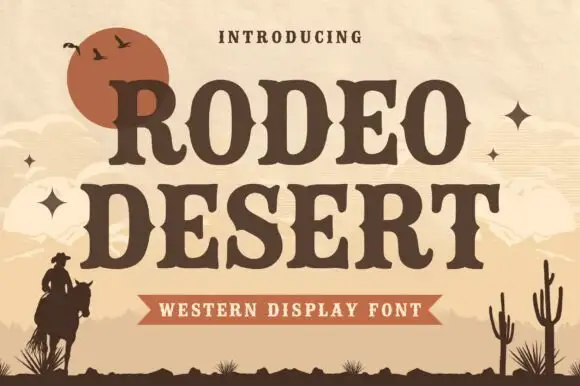
Western slab with desert setting
Rodeo Desert is a western slab in dark brown on sand: heavy bracketed serifs, spurred stems, a notched crossbar, and a composition framed by a low sun, dunes, a rider and cacti, so the pair reads as a printed rodeo poster rather than a modern slab.
Ideas for this font
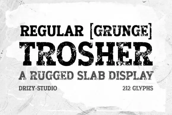
Rugged eroded slab display
Trosher is a rugged slab display in black on a mottled white ground: broad bracketed slabs with clean and heavily eroded fills, mixed case with tall ascenders and a full-width setting, with a bracketed note above, a plain line beneath and two small notes at the foot.
Ideas for this font
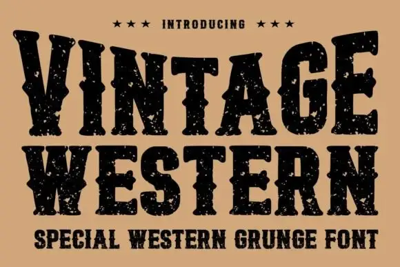
Grunge western slab
Vintage Western is a grunge western slab in black on tan: heavy bracketed serifs with deep notches, a swollen waist and thick stems, the whole surface eaten by a speckled wear, with three stars above and a tracked subtitle beneath in the same face.
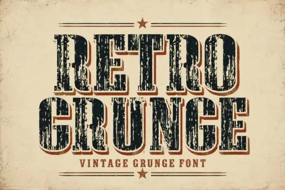
Tall worn slabs with vertical scrape texture
Retro Grunge shows tall closely spaced slab capitals with rounded bowls and deep vertical scratches, where the E and R keep heavy stems even as the surface breaks and a red-brown offset edge sits behind the black letters on aged paper.
Ideas for this font
Same independent foundry
Allow optional Google Analytics to measure visits and catalogue actions. Your search words and notes are not included. Privacy & storage