Neutral Sans Workhorse

Christmas Starwish + Saltriver Grotesk
Lets Christmas Starwish own the focal silhouette while handling secondary copy, sizing and subheads cleanly.
Inspect Saltriver Grotesk specimenDisclosure: MakerFileHub may earn a commission from qualifying purchases via paid links on this page. How our links work.
Rounded modern handwritten sans with twinkling star-burst accents!
Christmas Starwish is a warm, rounded disconnected display sans (NOT a cursive script!) accented with twinkling starburst glyphs!
Paid link
Get this fontProject & layout blueprintsAt-a-glance maker compatibility
Sturdy stroke walls and open counters weed cleanly on adhesive vinyl, HTV apparel film, and cut cardstock.
Visual anatomy & craft review
Christmas Starwish is a rounded, disconnected display sans in mixed case, drawn with smooth monoline strokes and curly hooks on the C and S, then finished with starburst glyphs that sit on the cap line rather than floating outside the word. The letter shapes stay open and generous, so a greeting reads as warm rather than playful, and the regular weight leaves room for metallic ink and heat foil without filling the counters. It is upright, not a script, which makes it useful where a curved line would be hard to place on an ornament or a curved glass surface.
Starburst-magic · Gold-rounded-sans · Disconnected
Two-font hierarchy recipes
Tested contrast partners — pairing Christmas Starwish with grounded secondary typography.
Christmas Starwish + Saltriver Grotesk
Lets Christmas Starwish own the focal silhouette while handling secondary copy, sizing and subheads cleanly.
Inspect Saltriver Grotesk specimen
Christmas Starwish + Askinо
Grounds bold display lettering with classic typographic authority on posters, badges and apparel.
Inspect Askinо specimenPractical applications
Concrete hierarchy, scale and production guidance tailored to Christmas Starwish’s stroke geometry.
Open rounded letterforms in a single weight behave well under foil, because there is enough counter space for the foil to release cleanly instead of bridging. The starburst accent gives a festive note without illustrations, which keeps a small surface from becoming busy.
Hierarchy & layout recipe
Ornament 80 mm sphere, word 18 mm cap-height, 8 mm top clearance for the cap and hanger. Topper box 180 x 120 x 60 mm, word 26 mm on the lid, contents 6/8 pt neutral sans. Tag 50 x 90 mm, names 7 mm, hole 6 mm clear.
Pre-production check
Foil on a curved surface stretches the starburst points and pushes them together at the edges. Keep accents at least 12 mm from the sphere's equator, and press one test ornament before approving the run.
The rounded upright sans reads gentle and legible for a nursery while the stars carry the theme, so the sign still looks calm once the party is over. Disconnected letters hold well on a child's door plaque cut from timber, where joined script would need a stencil bridge.
Hierarchy & layout recipe
Door sign 250 x 120 mm, name 30 mm, stars 10 mm, 15 mm margins, 2 mm screw holes 20 mm from each end. Invite A6, headline 20 pt, details 9/12 pt. Milestone card 105 x 148 mm, age 40 mm centred, greeting 10 mm below.
Pre-production check
Timber routing requires bridges in enclosed counters such as 'a' and 'o'. Check the inner island width at 30 mm cap-height and add 3 mm bridges if the plaque is routed rather than printed.
Warm rounded capitals keep a winter programme friendly rather than formal, which matters for a school or community choir whose audience includes children and grandparents. The single weight reproduces cleanly on a photocopied programme and holds a heading without the concertina of a decorative face.
Hierarchy & layout recipe
Programme A5, 14 mm margins, title 26 pt, running order 9/13 pt with 4 mm tab stops. Folder 230 x 310 mm, choir name 20 mm on the front panel. Poster A3, title 90 pt, event details 14/18 pt in two columns of 80 mm.
Pre-production check
A5 programmes are usually printed on the cheapest 80 gsm stock available, which shows through from the reverse. Keep the title area clear on the back side and test one duplex sheet for show-through before the full run.
Technical & licence verification
Confirm included OTF/TTF/WOFF formats, full glyph tables and licence coverage on the live store page before batch production.
Closest visual alternatives
Matched across letterform anatomy, stroke behaviour and craft applications.
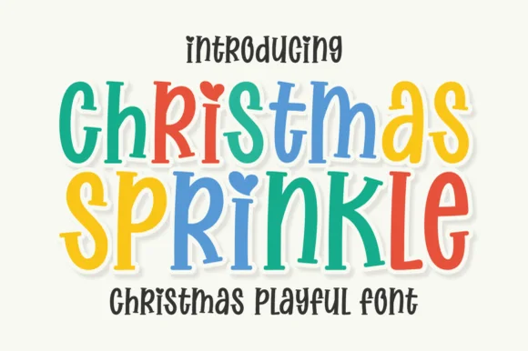
Tall bouncy whimsical cut-paper display with heart-dotted i
Christmas Sprinkle is a tall, joyful mixed-case whimsical display font with heart-dotted 'i's and curled 'S/R/K' terminals—usable all year in rainbow palettes!
Ideas for this font
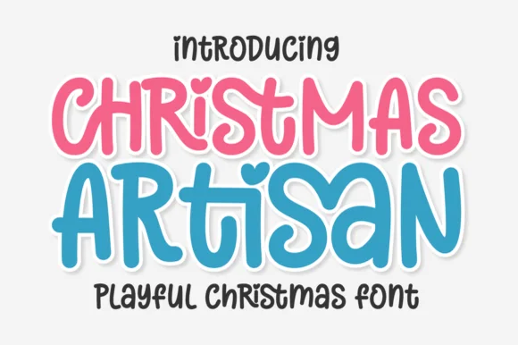
Playful curly-hooked candy-pastel holiday & kids' sans
Christmas Artisan is a cheerful, bouncy cartoon display sans sporting a heart-dotted 'i', curled 'S/R' hooks, and zero locked-in holiday clipart!
Ideas for this font
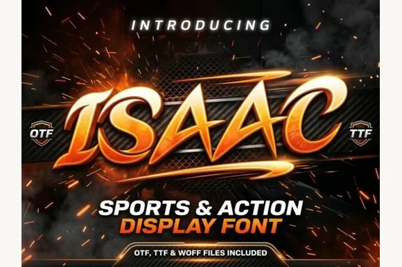
Slanted winged esports & motorsport action display
Isaac is an aggressive, forward-slanted sports display font featuring speed-sliced horizontal wings and razor-angled athletic geometry.
Ideas for this font
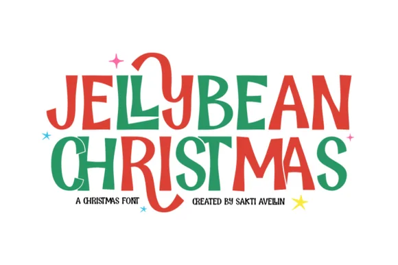
Chunky hand-drawn Christmas capitals with one letter dropping below the line
Jellybean Christmas is a heavy hand-drawn capital alphabet in which the strokes stay fat and slightly uneven, the corners soften and one letter in each line is allowed to fall out of the baseline, so a greeting reads as cut paper.
Ideas for this font
Allow optional Google Analytics to measure visits and catalogue actions. Your search words and notes are not included. Privacy & storage