Neutral Sans Workhorse

Bull Stand + Prime Nordic
Lets Bull Stand own the focal silhouette while handling secondary copy, sizing and subheads cleanly.
Inspect Prime Nordic specimenDisclosure: MakerFileHub may earn a commission from qualifying purchases via paid links on this page. How our links work.
Layered-looking Victorian lettering with striped stems and curled terminals
The Bullstands is a Victorian display face with a slab skeleton, tall ornamental spurs on the capitals, and a chrome finish that makes it look like a fairground marquee sign.
Paid link
Get this fontProject & layout blueprintsAt-a-glance maker compatibility
Cut solid base, outline, and shadow layers in separate vinyl colors and align on registration marks.
Visual anatomy & craft review
THE BULLSTANDS is set on a dark ground inside an oval of gold filigree, the letters in a silver chrome with a black outline and small curls growing out of the stems. The word starts with an oversized B whose top curls into a scroll, the S throws a long tail under the line, and the d and the s carry little hooks at their feet. Around the oval the composition is dressed like a Victorian playbill: a curved band at the top with a presenting line, a banner at the right with a founding year, a roundel at the lower left with a glyph count, and a credit at the foot with a drawn ornament. The lettering itself is heavy enough to survive the chrome treatment, and the ornaments are drawn at the same line weight as the outline, which is why the page reads as one engraved object.
Layered-looking Victorian lettering with striped stems and curled terminals
Two-font hierarchy recipes
Tested contrast partners — pairing Bull Stand with grounded secondary typography.
Bull Stand + Prime Nordic
Lets Bull Stand own the focal silhouette while handling secondary copy, sizing and subheads cleanly.
Inspect Prime Nordic specimen
Bull Stand + Evoire
Grounds bold display lettering with classic typographic authority on posters, badges and apparel.
Inspect Evoire specimenPractical applications
Concrete hierarchy, scale and production guidance tailored to Bull Stand’s stroke geometry.
The fairground lettering gives a bar an identity that a modern sans cannot, and the chrome treatment works on a metal or vinyl fascia without extra artwork.
Hierarchy & layout recipe
Print a 1200 by 400 mm fascia: set the bar name at 140 pt on one row, keep 30 mm of clear ground beneath before the strapline at 16 pt, and hold 36 mm at each end so the ornamental spurs stay inside the panel.
Pre-production check
Chrome gradients band on flat vinyl; print one panel on the intended material and check the transition before the install.
The playbill composition tells the reader what the book is about before the title is read, and the heavy lettering holds at thumbnail size on a shelf.
Hierarchy & layout recipe
Print a 210 by 280 mm cover: set the book title at 76 pt across two rows, keep 26 mm of clear ground beneath before the author at 11 pt, and hold 18 mm from the oval frame to the trim.
Pre-production check
The filigree frame is fine and breaks at small print; print one cover at the final size and check the frame corners first.
The style dresses a seasonal event as an old fairground attraction, and the busy ornaments give a dark poster plenty to look at without a photograph.
Hierarchy & layout recipe
Print an A2 poster: set the event name at 100 pt across two rows, keep 30 mm of clear ground beneath before the gate time at 14 pt, and hold 26 mm of margin around the oval frame.
Pre-production check
Gold and silver inks need a dark ground; print one poster with the real inks and inspect the metallic areas before the run.
Technical & licence verification
Confirm included OTF/TTF/WOFF formats, full glyph tables and licence coverage on the live store page before batch production.
Closest visual alternatives
Matched across letterform anatomy, stroke behaviour and craft applications.
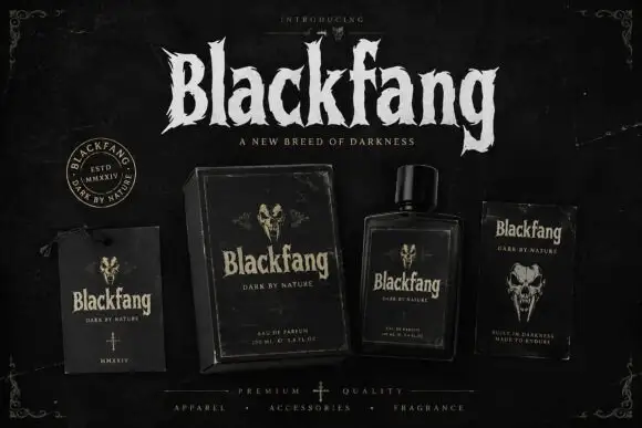
Ragged Gothic lettering with torn points and uneven bowls
Blackfang is a gothic display face with sharp spiked terminals and a smooth filled contour, shown here across a hang tag, a box, a bottle and a folded card.
Ideas for this font
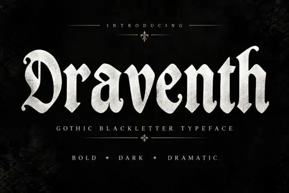
Broad rounded blackletter with curled D and pointed lower joins
Draventh is a wide gothic blackletter display face with heavy stems, sharp hooked shoulders and a weathered silver fill that reads as rubbed metal.
Ideas for this font
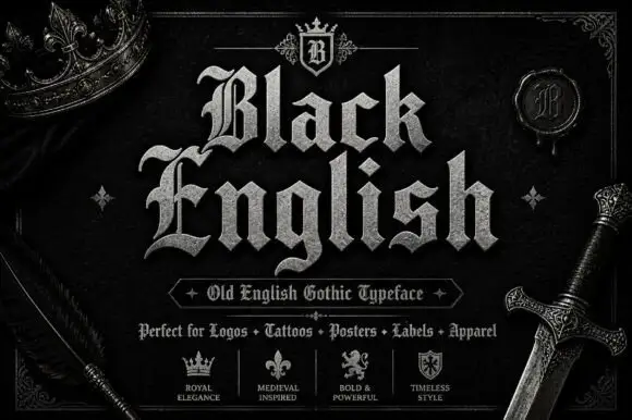
Angular blackletter with diamond-ended strokes and ornate initials
Black English shows pale Gothic mixed case on black, where angular broken bowls, pointed joins and diamond stroke endings give the lowercase a dense rhythm, the large B and E carry extra entry flourishes and a grey hatched treatment adds surface detail to the shown title.
Ideas for this font
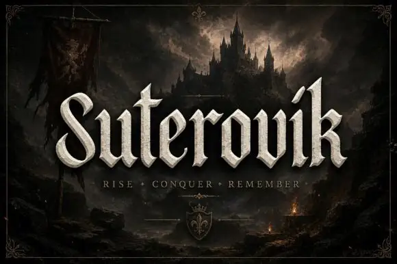
Narrow gothic display with sweep
Suterovik is a narrow gothic display in silver on a dark landscape: mixed case with a sweeping S, a hooked tall k, angular shoulders and a scaled texture, set as one word with a tracked line beneath and a small crest at the foot, framed against a castle and a banner.
Same independent foundry
Allow optional Google Analytics to measure visits and catalogue actions. Your search words and notes are not included. Privacy & storage