Editorial Serif Anchor

Brolin Vintage + Evoire
Anchors Brolin Vintage's fluid strokes with crisp Roman proportions on wedding suites, headers and packaging.
Inspect Evoire specimenDisclosure: MakerFileHub may earn a commission from qualifying purchases via paid links on this page. How our links work.
Creamy 1970s soda-fountain & ice-cream parlor script
Brolin Vintage is actually a lush, plump 1970s retro script (NOT a rigid block display!) built for multi-ringed pastel outlines and diner-parlor logos!
Paid link
Get this fontProject & layout blueprintsAt-a-glance maker compatibility
Cut solid base, outline, and shadow layers in separate vinyl colors and align on registration marks.
Visual anatomy & craft review
Brolin Vintage is a plump connected retro script with wide rounded bowls, a flowing baseline and thick uniform strokes that were drawn to take multi-ringed outlines. The letters connect with wide joins, so the face reads as a soda-fountain logo rather than handwriting, and the round bowls leave room for a keyline inside the stroke. It needs roughly 22 mm for a second outline to sit without closing the counters, and it is at its best in two or three pastel tones over a sunburst.
Cream-soda-70s · Plump-extruded-script · Mint-retro
Two-font hierarchy recipes
Tested contrast partners — pairing Brolin Vintage with grounded secondary typography.
Brolin Vintage + Evoire
Anchors Brolin Vintage's fluid strokes with crisp Roman proportions on wedding suites, headers and packaging.
Inspect Evoire specimen
Brolin Vintage + Limited Coffee
Keeps small-scale dates, URLs, nutrition facts and care instructions crisp and legible below script titles.
Inspect Limited Coffee specimenPractical applications
Concrete hierarchy, scale and production guidance tailored to Brolin Vintage’s stroke geometry.
Plump connected script reads as a painted parlour sign, which is the reference a dessert brand wants. Wide joins allow a second ring of colour without redrawing.
Hierarchy & layout recipe
Logo 140 mm wide, word 40 mm with a 2 mm outer ring. Sleeve 200 x 60 mm, word 18 mm on a 45 mm face. Window decal 400 x 250 mm, word 90 mm, 15 mm cut margin.
Pre-production check
A 2 mm outer ring on a curved cup sleeve distorts where the sleeve wraps. Keep the ring on flat surfaces, and check one assembled cup before printing the batch.
Retro script reads as a summer treat in one glance, and the round bowls stay legible at 20 mm under glare. Two pastel inks keep a cart sign bright.
Hierarchy & layout recipe
Menu 148 x 210 mm, heading 26 mm, items 8.5/12 pt, 15 mm margins. Cup wrap 200 x 90 mm, word 20 mm, 10 mm from the rim. Cart sign 600 x 400 mm, word 140 mm.
Pre-production check
Bright pastels wash out in direct sun and the outer ring disappears, leaving a blob. Check one sign at midday, and add a dark keyline to the outer ring if the letter shape closes.
A retro script reads as a shop's own thank-you, which is warmer than a plain card. The connected flow holds a short message at 14 mm.
Hierarchy & layout recipe
Card 105 x 148 mm, greeting 16 mm, message 7/10 pt, 12 mm margins. Tag 45 x 80 mm, word 9 mm, hole 5 mm clear. Loyalty card 85 x 55 mm, word 12 mm, 8 mm margins.
Pre-production check
Loyalty cards are stamped repeatedly at the counter and a glossy finish scuffs first. Use a matt laminate, and check one card after a week of stamping.
Technical & licence verification
Confirm included OTF/TTF/WOFF formats, full glyph tables and licence coverage on the live store page before batch production.
Closest visual alternatives
Matched across letterform anatomy, stroke behaviour and craft applications.
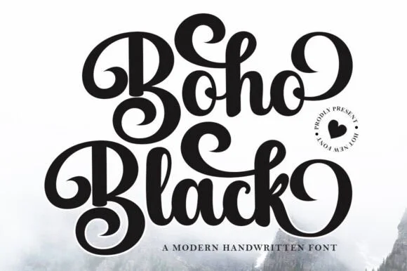
Ultra-bold 70s coiled-swash retro calligraphy script
Boho Black is an ultra-bold, plush retro script wrapping thick brush downstrokes in dramatic 1970s spiral curls and bouncy loops.
Ideas for this font
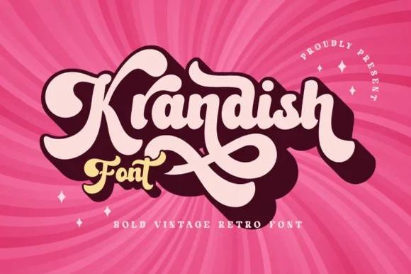
Chunky 1970s swash-tail retro brush script
Krandish is a heavy, cream-smooth 1970s retro script featuring dramatic looping swash capitals and thick figure-eight underline tails.
Ideas for this font
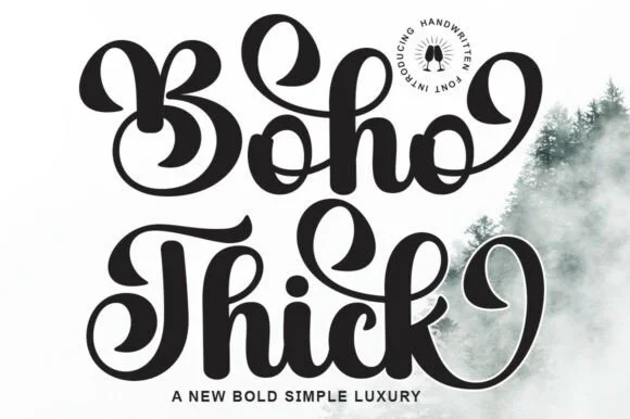
Chunky retro-groovy swashed brush script
Boho Thick is a bold, curvy retro calligraphy script (not a geometric display) packing heavy teardrop swashes and thick vinyl-friendly strokes!
Ideas for this font
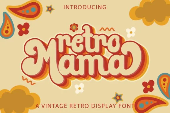
Groovy 1970s connected marshmallow script with swash loops
Retro Mama is a plump, connected 1970s marshmallow script featuring bulbous heart-cleft M arches and sweeping wrap-around swash loops.
Ideas for this font
Same independent foundry
Allow optional Google Analytics to measure visits and catalogue actions. Your search words and notes are not included. Privacy & storage