Neutral Sans Workhorse

Belva + One More
Lets Belva own the focal silhouette while handling secondary copy, sizing and subheads cleanly.
Inspect One More specimenDisclosure: MakerFileHub may earn a commission from qualifying purchases via paid links on this page. How our links work.
High-contrast serif capitals with small solid leafy branches attached near their lower strokes
Belva is a heavy serif display face whose stems are drawn as ornamental carving: leaves, buds and thin curling tendrils grow out of the letters and fill the counters, so a word looks engraved rather than set.
Paid link
Get this fontProject & layout blueprintsAt-a-glance maker compatibility
Sturdy stroke walls and open counters weed cleanly on adhesive vinyl, HTV apparel film, and cut cardstock.
Visual anatomy & craft review
BELVA fills the middle of the card in solid black, and each letter carries its own ornament: the B has a branch climbing its stem, the E sprouts a flower in the middle bar, the L sends a tendril into the counter, the V is filled with two sprays and the A ends in a bud. The ornaments are the same weight as the letter, so the word reads as one object rather than as type with decoration added, and the serifs are heavy and flat, which keeps the base of the word stable. The ground is a pale cream with painted magnolia branches at the corners and a thin ornamental border, and three captions name the set in the same alphabet with wide spacing. It is a display cut for stationery, book covers and labels, and it needs size: the tendrils are fine, so they close up first.
High-contrast serif capitals with small solid leafy branches attached near their lower strokes
Two-font hierarchy recipes
Tested contrast partners — pairing Belva with grounded secondary typography.
Belva + One More
Lets Belva own the focal silhouette while handling secondary copy, sizing and subheads cleanly.
Inspect One More specimen
Belva + Cronelo
Grounds bold display lettering with classic typographic authority on posters, badges and apparel.
Inspect Cronelo specimenPractical applications
Concrete hierarchy, scale and production guidance tailored to Belva’s stroke geometry.
The flowers growing out of the letters give a formal card its botanical ornament without a second illustration, and the heavy serifs hold the names at a modest size.
Hierarchy & layout recipe
Print a 148 by 210 mm invitation: set the names at 26 pt on one row, keep 22 mm of clear ground beneath before the venue at 9 pt, and hold 16 mm from the widest bud to the card edge.
Pre-production check
The tendrils fill in on textured card; print one invitation on the intended board and check the counter of the V before the suite.
The engraved ornament suits a small bottle that is sold on its label, and the lettering carries the drawing so no separate image is needed on the front.
Hierarchy & layout recipe
Print a 50 by 80 mm bottle label: set the house name at 18 pt on one row, keep 7 mm of clear ground beneath before the volume at 4.5 pt, and hold 5 mm from the ornament to the die line.
Pre-production check
Fine leaves break on a curved label; print one label and wrap it onto the bottle before the batch.
The lettering is a period reference without a photograph, and a cover built from one word in this face reads as a considered title rather than a stock layout.
Hierarchy & layout recipe
Print a 152 by 229 mm cover: set the title at 52 pt across two rows, keep 22 mm of clear ground beneath before the author at 11 pt, and hold 15 mm from the ornament to the spine edge.
Pre-production check
Fine stems drop out in a small paperback; print one cover at the final size and check the tendrils before the run.
Technical & licence verification
Confirm included OTF/TTF/WOFF formats, full glyph tables and licence coverage on the live store page before batch production.
Closest visual alternatives
Matched across letterform anatomy, stroke behaviour and craft applications.
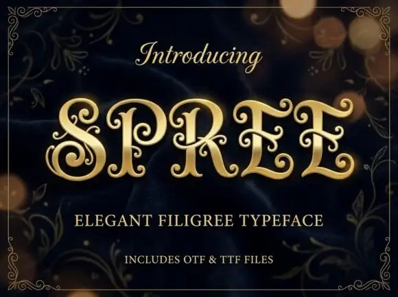
Filigree spiral display
Spree is an ornate display in gold on a dark bokeh ground: high-contrast capitals with long inward spirals, curled terminal extensions and fine filigree inside the bowls, set as one word between a script introducing line and two plain lines naming the style and the formats, all inside a fine ornamental frame.
Ideas for this font
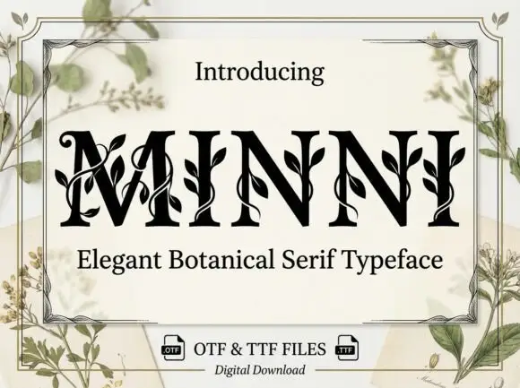
Botanical ornamented serif
Minni is a botanical serif in black on cream: high-contrast caps whose stems sprout leaves and curling vines, sharp serifs and a narrow waist, with a light botanical frame and small file badges at the foot.
Ideas for this font
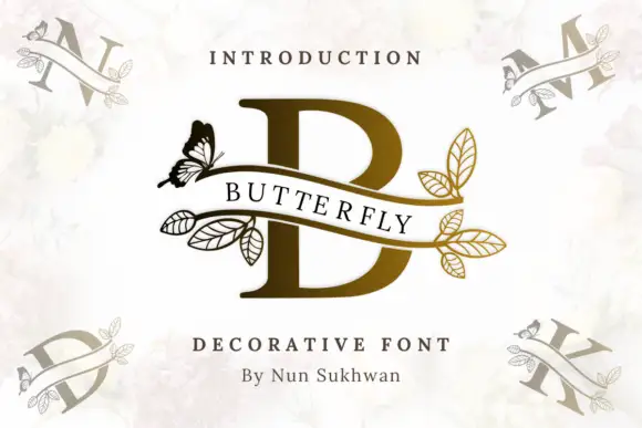
A serif B crossed by an open ribbon with butterfly and outlined leaf branches
Butterfly Vine Monogram draws a heavy serif initial, crosses it with a curved ribbon banner, and finishes both ends of the ribbon with line-drawn leaves and a single butterfly.
Ideas for this font
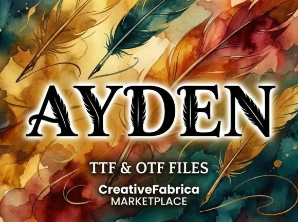
High-contrast serif capitals with thin feather-like cuts running through selected broad strokes
Ayden shows black serif capitals with pale feather-like lines inside their stems and diagonals, where a central quill-like line branches into short fine marks that appear in the broad strokes, and painted feathers, swirls and a pale glow fill the presentation around the letters.
Ideas for this font
Same independent foundry
Allow optional Google Analytics to measure visits and catalogue actions. Your search words and notes are not included. Privacy & storage