Neutral Sans Workhorse

Bisre + Montreal
Lets Bisre own the focal silhouette while handling secondary copy, sizing and subheads cleanly.
Inspect Montreal specimenDisclosure: MakerFileHub may earn a commission from qualifying purchases via paid links on this page. How our links work.
Retro fat display sans with blobby bowls and tight spacing
Bisre is a retro fat display sans in which the bowls swell into blobs, the counters close to slots and the letters jostle each other, so a short word reads as a hand-painted 1970s sign.
Paid link
Get this fontProject & layout blueprintsAt-a-glance maker compatibility
Sturdy stroke walls and open counters weed cleanly on adhesive vinyl, HTV apparel film, and cut cardstock.
Visual anatomy & craft review
The B stacks two fat bowls, the I is a single wide bar, the S swells a thick spine, the R turns a short blunt leg and the E stacks three short arms, all at a retro weight with rounded corners and a tight fit. The blobbiness is the character: the letters sit almost touching, which is why the sample sets one word at poster size with a starburst label on either side. Because the shapes are solid and open, the face holds from 30 pt and cuts cleanly; the tight fit needs a tracking decision at any size. The mustard ground, the small starbursts and the two lines above and below are presentation; the red display word is the face.
Retro · Fat · Playful
Two-font hierarchy recipes
Tested contrast partners — pairing Bisre with grounded secondary typography.
Bisre + Montreal
Lets Bisre own the focal silhouette while handling secondary copy, sizing and subheads cleanly.
Inspect Montreal specimen
Bisre + Askinо
Grounds bold display lettering with classic typographic authority on posters, badges and apparel.
Inspect Askinо specimenPractical applications
Concrete hierarchy, scale and production guidance tailored to Bisre’s stroke geometry.
The fat blobs read through a diner window, and the period shapes give a plain sign some personality at 100 mm in one ink.
Hierarchy & layout recipe
Cut a 700 by 250 mm sign: set the word at 100 mm, keep 12 mm of ground between letters so the blade has a path, and leave 30 mm of border all round for the fixings.
Pre-production check
A tight retro fit leaves no cutting path between letters; check the vector and add 6 mm of tracking before cutting.
The fat shapes suit a seventies party invitation, and the closed counters still read at 34 pt on a matte card in one colour.
Hierarchy & layout recipe
Print an A6 card: set the party title at 34 pt, set the date in a 10 pt rounded sans beneath, and keep 12 mm of margin so the blobby ends are inside the trim.
Pre-production check
A blob letter at the trim edge looks cut; check the card and keep every stroke 8 mm inside the edge.
The retro weight reads in flat daylight, and the solid bowls keep a short food stall name legible at 90 mm on painted board.
Hierarchy & layout recipe
Paint a 600 by 300 mm board: set the stall name at 90 mm, keep 25 mm of border, and paint the letters in two coats so the tight counters stay sharp at the edges.
Pre-production check
Paint bleeding into a closed counter looks like a blot; check the board and mask the counter rather than painting freehand.
Technical & licence verification
Confirm included OTF/TTF/WOFF formats, full glyph tables and licence coverage on the live store page before batch production.
Closest visual alternatives
Matched across letterform anatomy, stroke behaviour and craft applications.
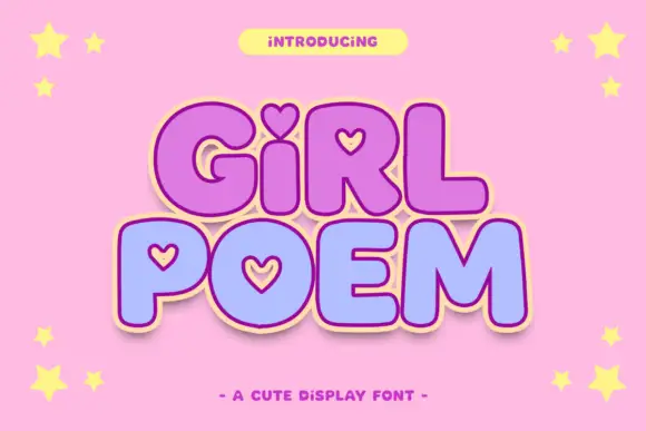
Round display blocks with heart-shaped counters and a soft outline
Girl Poem is a round display alphabet in which several letters carry heart-shaped counters, drawn as heavy soft blocks with a light outline and no contrast at all.
Ideas for this font
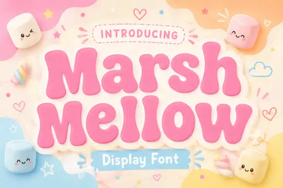
Very fat rounded display with a sticker outline
Marshmellow is a very fat rounded display face in pink with a cream sticker outline: soft inflated letters with almost no contrast, a bouncy baseline, and a pastel page scattered with marshmallow characters and hearts.
Ideas for this font
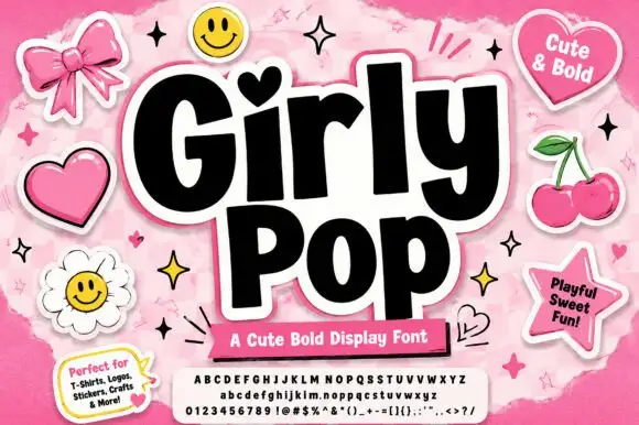
Heavy playful sans with a heart dot and slightly tilted letter bodies
Girly Pop is a heavy playful sans in which the letters stand at slightly different tilts, the i carries a heart dot and the weight stays maximal from first letter to last.
Ideas for this font
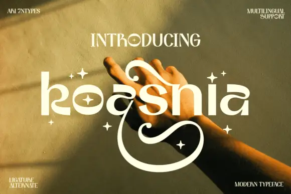
Rounded stylized lowercase with large upper curls and a deep lower sweep
Koasnia shows pale rounded lettering across a warm photograph of hands: wide bowls and fairly even substantial strokes contrast with a large curl above the middle letters and an open sweep that descends far below the line.
Ideas for this font
Same independent foundry
Allow optional Google Analytics to measure visits and catalogue actions. Your search words and notes are not included. Privacy & storage