Editorial Serif Anchor

Baseball + Things
Anchors Baseball's fluid strokes with crisp Roman proportions on wedding suites, headers and packaging.
Inspect Things specimenDisclosure: MakerFileHub may earn a commission from qualifying purchases via paid links on this page. How our links work.
Retro connected script with a looping capital and a returning under-terminal
Baseball is a retro connected script in which the letters join at a steady angle, the capital loops high, the b curls its ascender and a long terminal returns under the word, so a name reads as a vintage team mark.
Paid link
Get this fontProject & layout blueprintsAt-a-glance maker compatibility
Weld or Unite overlapping script joins into one continuous vector path before sending to the blade.
Visual anatomy & craft review
The B lifts a wide loop above the cap line, the b repeats a smaller curl, the connectors keep an even weight and the final stroke travels beneath the letters before it lifts. The returning terminal is the character: it frames the word from below, which is why the sample sets one name with a layered fill and shadow behind it. Because the terminal is part of the letter, the face needs 1.1 inches of x-height in vinyl and 22 pt in print, and the joins weld into a single path before cutting. The coral fill, outlines and shadow in the sample are treatments rather than extra layers; the dark script name is the face.
Retro · Connected · Returning
Two-font hierarchy recipes
Tested contrast partners — pairing Baseball with grounded secondary typography.
Baseball + Things
Anchors Baseball's fluid strokes with crisp Roman proportions on wedding suites, headers and packaging.
Inspect Things specimen
Baseball + Mansory
Keeps small-scale dates, URLs, nutrition facts and care instructions crisp and legible below script titles.
Inspect Mansory specimenPractical applications
Concrete hierarchy, scale and production guidance tailored to Baseball’s stroke geometry.
The returning terminal gives a club name a vintage look, and the connected script holds at 50 mm on a printed board seen from the field.
Hierarchy & layout recipe
Print a 600 by 250 mm board: set the name at 50 mm, let the under-terminal form the bottom edge of the block, and keep 25 mm of border all round so the loop is not trimmed.
Pre-production check
A terminal printed to the board edge looks cut; check the mounted sign and keep 20 mm of margin.
The connected script holds on fabric, and the even weight stays solid at 60 mm across a printed chest in one flat colour.
Hierarchy & layout recipe
Print a 280 mm chest print: set the name at 60 mm, weld the joins into one continuous path, and keep 45 mm of clear shirt beneath the terminal for the number.
Pre-production check
Unwelded script joins cut as separate pieces; check the file and weld the word before sending it to the screen.
The retro tone suits a small label, and the connected body stays readable at 20 pt on a 50 mm panel printed in two inks.
Hierarchy & layout recipe
Print a 50 by 70 mm label: set the brand at 20 pt, keep 8 mm at each end for the capital loop and the terminal, and set the volume in a 6 pt caps at the foot.
Pre-production check
A terminal printed across a label die is cut short; check the imposed label and keep 6 mm of clearance.
Technical & licence verification
Confirm included OTF/TTF/WOFF formats, full glyph tables and licence coverage on the live store page before batch production.
Closest visual alternatives
Matched across letterform anatomy, stroke behaviour and craft applications.
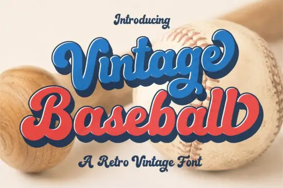
Retro layered script with an offset
Vintage Baseball is a retro script in blue and red with a navy keyline and offset: thick rounded strokes, a tight loop on the V and the B, and a shadow that sits behind each word at a fixed distance.
Ideas for this font
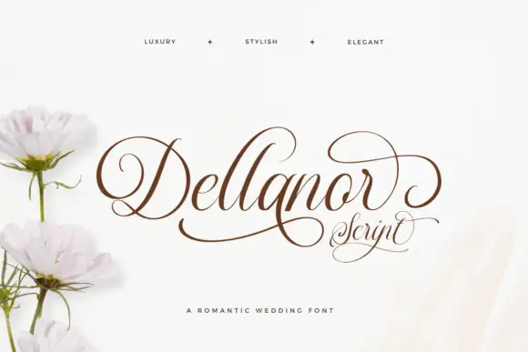
Fine formal script with curled D and terminal r
Dellanor Script shows long slanted ascenders and delicate low lowercase links, where the D opens a large inward curl, the r rises into a wide upper loop and a low stroke sweeps under the whole name.
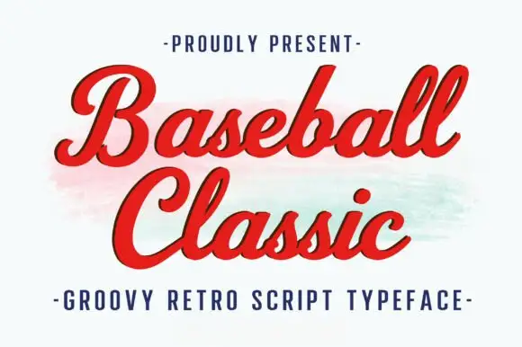
Thick retro sports script with high contrast and a lean
Baseball Classic is a thick retro sports script that leans forward, its downstrokes heavy and its joins thin, with looped capitals on both words and a small ball terminal at the exits.
Ideas for this font
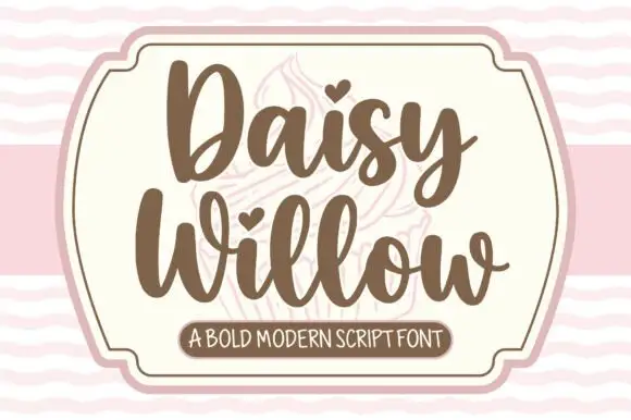
Bold modern script with heart tittles and a soft rounded baseline
Daisy Willow is a bold modern script with soft rounded strokes, generous loops and heart tittles, drawn so two stacked words sit evenly inside a framed panel.
Ideas for this font
Same independent foundry
Allow optional Google Analytics to measure visits and catalogue actions. Your search words and notes are not included. Privacy & storage