Editorial Serif Anchor

Absolutely + Askinо
Anchors Absolutely's fluid strokes with crisp Roman proportions on wedding suites, headers and packaging.
Inspect Askinо specimenDisclosure: MakerFileHub may earn a commission from qualifying purchases via paid links on this page. How our links work.
Fine open-loop continuous script with a light even stroke
Absolutely is a fine continuous script whose loops stay open rather than closing, so the word reads as a line of relaxed arcs with visible air inside each letter.
Paid link
Get this fontProject & layout blueprintsAt-a-glance maker compatibility
Weld or Unite overlapping script joins into one continuous vector path before sending to the blade.
Visual anatomy & craft review
The script is written in one unbroken movement: the first stroke enters from the left as a fine diagonal, the a closes a small bowl, the b and the l rise into open loops that do not meet their stems, and the u, t and e continue at the same weight until the final y drops into a long open loop that swings back under the word. Nothing tapers to a point and nothing thickens; the line stays the same weight from the entry to the exit, which is what gives the phrase its light, unforced character. The counters are generous and the joins sit at the x-height midline, so the letters separate clearly even though the stroke never lifts. The pale pink brush mark, the black ink splatter and the small tracked caption are presentation; the script is the word.
Fine · Open · Continuous
Two-font hierarchy recipes
Tested contrast partners — pairing Absolutely with grounded secondary typography.
Absolutely + Askinо
Anchors Absolutely's fluid strokes with crisp Roman proportions on wedding suites, headers and packaging.
Inspect Askinо specimen
Absolutely + Kohilo
Keeps small-scale dates, URLs, nutrition facts and care instructions crisp and legible below script titles.
Inspect Kohilo specimenPractical applications
Concrete hierarchy, scale and production guidance tailored to Absolutely’s stroke geometry.
A light continuous script reads as a person's hand rather than a brand system, which suits a workshop where the work is done at a bench, and the open loops stay crisp at small size.
Hierarchy & layout recipe
Set the studio name at 14 pt on a 35 by 70 mm ticket, keep the service list in a 5 pt sans, and leave 6 mm so the final open loop does not run under the stitching.
Pre-production check
A fine loop printed at 14 pt on a coated ticket can close; check the proof and hold the size at 16 pt if the air inside the loops disappears.
The open loops read as a byline rather than a heading, so the column keeps its editorial voice, and the light weight does not disturb the type colour of the page.
Hierarchy & layout recipe
Set the byline at 12 pt at the foot of the column, keep the sign-off line in a 9 pt serif, and leave 8 mm above so the open loop of the l sits clear of the last line of body text.
Pre-production check
A light script under a paragraph can look like a printer's error at 12 pt; check the page proof and raise it to 14 pt if it reads as dirt.
Letterpress gives a fine continuous stroke a slight bite, which makes the script look written into the paper, and the open loops survive the impression better than tight closed counters.
Hierarchy & layout recipe
Set the closing at 16 pt on a 105 by 148 mm note, leave 8 mm above and 12 mm below for a real signature, and keep the printed rule off the card so the only line work is the script.
Pre-production check
Deep impression closes thin loops; ask for a plate proof and open the loop of the l if the paper fills it in.
Technical & licence verification
Confirm included OTF/TTF/WOFF formats, full glyph tables and licence coverage on the live store page before batch production.
Closest visual alternatives
Matched across letterform anatomy, stroke behaviour and craft applications.
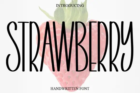
Tall narrow handwritten caps
Strawberry is a tall narrow handwritten face in black over a faded illustration of a strawberry: very condensed capitals with uneven strokes, high ascenders and a light bounce, set as one word with a small serif line above and beneath.
Ideas for this font
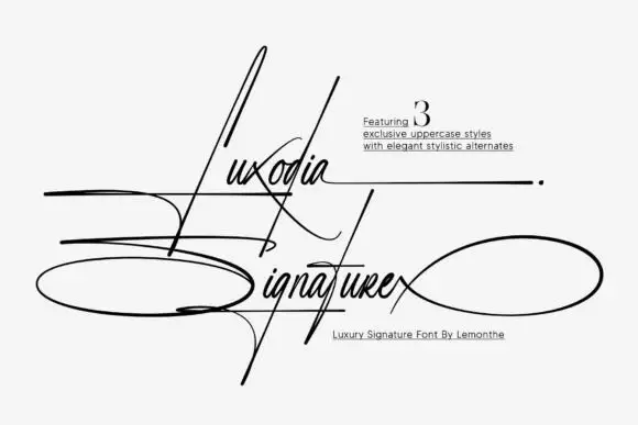
Needle-tall signature with wide horizontal loops
Luxodia Signature is a hairline signature script in black on off-white: needle-tall ascenders, a lowercase kept small, and loops that leave the word in wide ellipses to the left and right, with three uppercase styles offered as alternates.
Ideas for this font
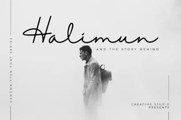
Fine low signature with a crossed capital and a wide flat baseline
Halimun is a fine signature script in which the capital crosses its own stem, the body stays low and the joins stay thin, so a name reads as something written on a photograph with a fine pen.
Ideas for this font
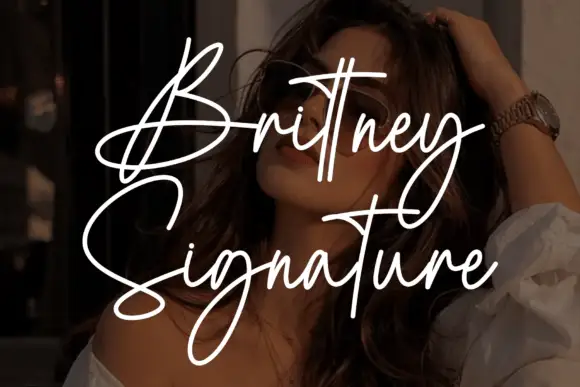
Tall signature script with long crossing crossbars and thin even strokes
Brittney Signature is a tall signature script with thin even strokes, very tall narrow ascenders and crossbars that extend across several letters before lifting away.
Ideas for this font
Same independent foundry
Allow optional Google Analytics to measure visits and catalogue actions. Your search words and notes are not included. Privacy & storage