High-Contrast Display Serif

Watermelon + Evoire
Pairs sculptural editorial warmth with Watermelon's clean modern geometry.
Inspect Evoire specimenDisclosure: MakerFileHub may earn a commission from qualifying purchases via paid links on this page. How our links work.
Tall light print with a monoline script
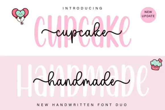
Watermelon is a duo on white: very tall narrow light capitals in pale pink for the word behind, and a black monoline script written across the middle in lowercase with long looping entry and exit strokes, with a drawn lemon and a watermelon slice in the corners.
Paid link
Get this fontProject & layout blueprintsAt-a-glance maker compatibility
Weld or Unite overlapping script joins into one continuous vector path before sending to the blade.
Visual anatomy & craft review
The page layers two hands: WATERMELON is set in tall narrow capitals with a light, almost hairline stroke and generous height, wide enough to span the page but pale enough to act as a ground, while watermelon is written in a small monoline script across the middle with a looping s-shaped entry from the left and an exit that curls back to the right. The script is even in weight and round in the bowls, and it sits at about a third of the height of the capitals, so the two together make a label rather than a headline. A drawn lemon with two slices sits at the top left, a watermelon wedge at the lower right, and tracked capital lines name the product at the top and the foot of the page. The palette is pale pink, black and two fruit colours on white. Watermelon is a duo for packaging, cards, labels and menus, and it wants short words, since the tall capitals take a lot of width.
Tall, light, layered
Two-font hierarchy recipes
Tested contrast partners — pairing Watermelon with grounded secondary typography.
Watermelon + Evoire
Pairs sculptural editorial warmth with Watermelon's clean modern geometry.
Inspect Evoire specimen
Watermelon + Lovely
Introduces organic movement on pull-quotes, signatures and gift tags.
Inspect Lovely specimenPractical applications
Concrete hierarchy, scale and production guidance tailored to Watermelon’s stroke geometry.
The tall pale line and the black script make a small jar look designed in two colours, and the script can carry a flavour name across the pale word.
Hierarchy & layout recipe
Print a 60 by 60 mm jar label: set the tall word at 20 pt in pale ink, set the script at 13 pt across it with 6 mm of clear ground, and hold 5 mm of margin on all four sides.
Pre-production check
A pale capital behind a black script can look like a printing error if the contrast is wrong; print one label and judge it in the hand.
The pair lets one small card carry a name in script over a tall quiet word, and the layered look needs no border to hold it together.
Hierarchy & layout recipe
Print a 90 by 60 mm card: set the tall word at 16 pt, set the name at 14 pt in the script with 7 mm of clear ground, and hold 6 mm of margin on all four sides.
Pre-production check
Two hands on a small card can read as two mistakes; proof one card at the finished size and check the layering.
A layered duo gives a small sticker depth without a photograph behind it, and the script stays readable at the size of a cup lid held close.
Hierarchy & layout recipe
Print a 70 mm round sticker: set the tall word at 18 pt, set the script at 12 pt with 7 mm of clear ground inside the die, and hold the artwork 6 mm clear of the edge.
Pre-production check
A thin script at twelve points can break on a die-cut sticker; cut one and check the joins before running the sheet.
Technical & licence verification
Confirm included OTF/TTF/WOFF formats, full glyph tables and licence coverage on the live store page before batch production.
Closest visual alternatives
Matched across letterform anatomy, stroke behaviour and craft applications.
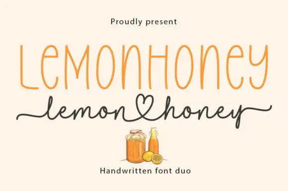
Tall narrow printed caps paired with a heart-tail handwritten script
Lemonhoney Duo pairs a tall narrow printed capital line with a handwritten script whose tail curls into a heart, so one label carries a structured name and a warm signed line beneath it.
Ideas for this font
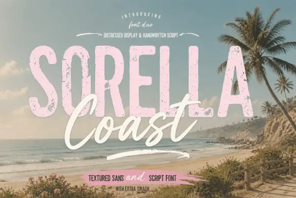
Distressed display sans and handwritten script
Sorella Coast is a duo: a tall distressed display sans in dusty pink with worn edges and speckles, and a loose handwritten script in cream that crosses the block letters.
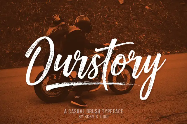
Rough brush script with a fine companion
Ourstory is a duo on a warm-toned photograph: a rough brush script in white with dry, split strokes and a long underline swash, plus a fine companion hand for smaller lines.
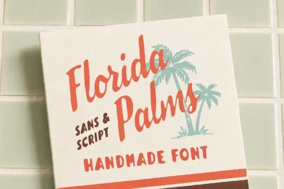
Hand-painted script paired with a sturdy all-caps sans
Florida Palms matches a relaxed hand-painted script with a sturdy all-caps sans, and ships textured versions of both so the pair can look screen-printed rather than digitally clean.
Ideas for this font
Same independent foundry
Allow optional Google Analytics to measure visits and catalogue actions. Your search words and notes are not included. Privacy & storage