Valentine Handwriting + Vanielst Elegant Serif Display Stylistic
Anchors Valentine Handwriting's fluid strokes with crisp Roman proportions on wedding suites, headers and packaging.
Inspect Vanielst Elegant Serif Display Stylistic specimenDisclosure: MakerFileHub may earn a commission from qualifying purchases via paid links on this page. How our links work.

Fine tall informal handwriting
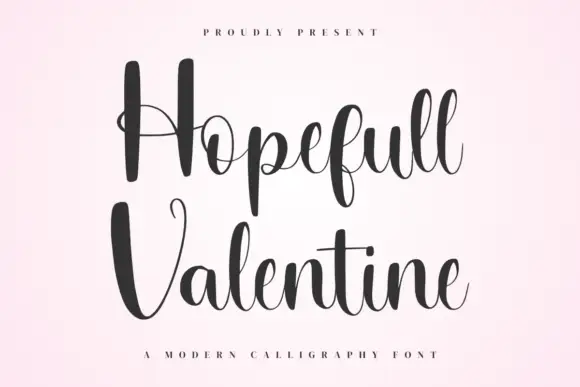
Valentine Handwriting is a fine tall informal hand in black over a bed of red roses: narrow stems, open bowls, a high crossbar on the t and a very deep descender on the g.
Paid link
Get this fontProject & layout blueprintsAt-a-glance maker compatibility
Weld or Unite overlapping script joins into one continuous vector path before sending to the blade.
Visual anatomy & craft review
Valentine sits above Handwriting, and the lettering is a casual hand rather than a script: the V is a narrow pair of strokes, the a and the e are small open bowls, the l and the t rise tall, the t carries its crossbar high and the g drops into a deep loop that circles back under the word. The strokes are light and even, the letters are unjoined and spaced generously, and the whole pair reads as written with a fine pen on a card. The ground is white with red roses laid at the lower left, and one tracked caption beneath names the style. The face is an informal handwriting for stationery, notes and packaging: it needs a decent size for the light strokes, it is legible enough for a short list, and it prints best in one dark ink on a light ground.
A tall open hand with a deep descender
Two-font hierarchy recipes
Tested contrast partners — pairing Valentine Handwriting with grounded secondary typography.

Valentine Handwriting + Vanielst Elegant Serif Display Stylistic
Anchors Valentine Handwriting's fluid strokes with crisp Roman proportions on wedding suites, headers and packaging.
Inspect Vanielst Elegant Serif Display Stylistic specimen

Valentine Handwriting + Mango Dream
Keeps small-scale dates, URLs, nutrition facts and care instructions crisp and legible below script titles.
Inspect Mango Dream specimenPractical applications
Concrete hierarchy, scale and production guidance tailored to Valentine Handwriting’s stroke geometry.
An informal hand carries a short list of times and directions without losing the hand-made tone of the rest of the suite.
Hierarchy & layout recipe
Print a 105 by 148 mm details card: set the heading at 20 pt, set the times at 9.5 pt with 12 mm of clear ground between, and hold 12 mm of margin on all sides.
Pre-production check
A deep descender can collide with the line beneath; print one card at the finished size and check the leading before the set.
A light informal hand reads as written rather than printed, which is what a valentine is supposed to feel like in the hand.
Hierarchy & layout recipe
Print a 120 by 120 mm square card: set the greeting at 32 pt on one row, keep 15 mm of clear ground beneath before the message, and hold 13 mm of margin on all sides.
Pre-production check
Fine strokes on a coated card can skip; print one card on the intended stock and check the thin joins before the batch.
A light hand gives a first-person essay a voice before the text starts, and it holds at opener size where a script would look decorative.
Hierarchy & layout recipe
Print a 230 by 300 mm opener: set the title at 70 pt on one row, keep 24 mm of clear ground beneath before the standfirst at 11 pt, and hold 20 mm of margin on both sides.
Pre-production check
A large hand-drawn title over a photograph can lose contrast; print one opener and check the word separates from the image before the issue.
Technical & licence verification
Confirm included OTF/TTF/WOFF formats, full glyph tables and licence coverage on the live store page before batch production.
Allow optional Google Analytics to measure visits and catalogue actions. Your search words and notes are not included. Privacy & storage