Modern Grotesque Body

Typnic Headline Family + Homies
Creates crisp high-hierarchy contrast beneath Typnic Headline Family headlines across menus, websites and labels.
Inspect Homies specimenDisclosure: MakerFileHub may earn a commission from qualifying purchases via paid links on this page. How our links work.
Broad rounded headline slab family
Typnic Headline Family is a broad headline slab in navy with a pale keyline on white: wide caps with heavy square slabs and softly rounded corners, set on one line with a second line beneath in a warmer orange at the same width, and a studio flag at the upper right.
Paid link
Get this fontProject & layout blueprintsAt-a-glance maker compatibility
Sturdy stroke walls and open counters weed cleanly on adhesive vinyl, HTV apparel film, and cut cardstock.
Visual anatomy & craft review
The plate shows two weights of the same family in two colours, which is the honest way to present a headline family: the navy line establishes the display weight and the orange line beneath shows the family at a slightly narrower width, so a buyer can judge how the pair stacks in a real title. The drawing is a broad slab with square serifs and softened corners, which keeps the face sturdy without looking sharp, and the keyline around the navy line is a second colour that separates it from the white ground. Because the letters are wide and the counters open, the family works at headline sizes and in signage, and the plate keeps the sheet plain so the two lines are the whole composition.
Slab, headline, rounded, sturdy
Two-font hierarchy recipes
Tested contrast partners — pairing Typnic Headline Family with grounded secondary typography.
Typnic Headline Family + Homies
Creates crisp high-hierarchy contrast beneath Typnic Headline Family headlines across menus, websites and labels.
Inspect Homies specimen
Typnic Headline Family + Hello Honey
Adds a warm human signature touch for 1-to-3-word callouts without competing against structured serif capitals.
Inspect Hello Honey specimenPractical applications
Concrete hierarchy, scale and production guidance tailored to Typnic Headline Family’s stroke geometry.
A headline slab family gives an editor a display weight and a secondary weight from one licence, which keeps a section consistent across a long run of pages.
Hierarchy & layout recipe
Set the section title at 70 mm cap height in the heavy cut, the standfirst in the lighter cut at 14 pt, and the folio at 8 pt. Print two colours on a matte stock and keep 20 mm margins.
Pre-production check
Check the 70 mm title, where the rounded corners can soften the edges; keep the slab square. Confirm the 14 pt standfirst reads at arm's length and that the folio clears the trim.
A rounded slab reads as a friendly shop, and the broad letters hold on a fascia without needing a second line of type underneath.
Hierarchy & layout recipe
Paint a 1,000 by 350 mm fascia: the cafe at 110 mm cap height, the menu in a 22 mm slab, and a 4 mm rule. Keep 22 mm margins and paint two colours on a light board.
Pre-production check
Check the fascia at five metres, where a keyline can disappear; keep it above 4 mm. Confirm the 22 mm menu reads at two metres and that the rule clears the fixings.
A headline slab sets a fair poster in a friendly voice, and the wide letters stay readable from across a school corridor.
Hierarchy & layout recipe
A3 poster: the fair at 80 mm cap height, the times in a 22 mm slab, and the field at 10 mm. Keep 25 mm margins and print two colours on a light sheet.
Pre-production check
Check the A3 at three metres, where the rounded corners can read as blur; keep the corners crisp. Confirm the 10 mm field reads at arm's length and that the poster fits the sheet.
Technical & licence verification
Confirm included OTF/TTF/WOFF formats, full glyph tables and licence coverage on the live store page before batch production.
Closest visual alternatives
Matched across letterform anatomy, stroke behaviour and craft applications.
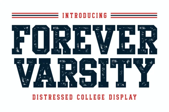
Distressed collegiate block capitals with heavy slabs and worn edges
Forever Varsity is a collegiate block alphabet with heavy slabs, tight fitting and a speckled wear texture, so a word reads as a print pulled off a worn athletic screen.
Ideas for this font
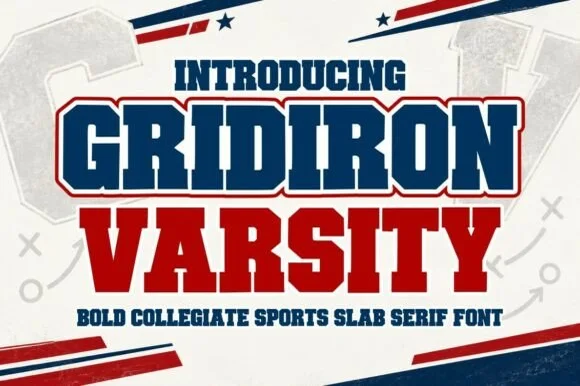
Heavy square-slab game-day block with layered outlines and tight fit
Gridiron Varsity is a heavy square-slab block in which the letters are wide and solid, the slabs are unbracketed and two outlines register behind the fill, so a word reads as a printed athletic banner.
Ideas for this font
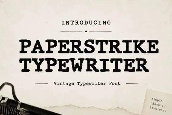
Distressed typewriter serif with worn edges
Paperstrike Typewriter is a vintage typewriter serif in black on cream paper: heavy slabs, a bold even stroke and edges worn away in small flakes, set with a ruled caption and a small note card in the corner.
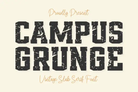
Heavy angular slabs with broad diagonal scars
Campus Grunge shows black athletic blocks on pale cream: large pale chips and diagonal scars interrupt the squared stems while clipped bowl corners and broad feet remain visible beneath the wear.
Ideas for this font
Allow optional Google Analytics to measure visits and catalogue actions. Your search words and notes are not included. Privacy & storage