Editorial Serif Anchor

Handmade + Glofi
Anchors Handmade's fluid strokes with crisp Roman proportions on wedding suites, headers and packaging.
Inspect Glofi specimenDisclosure: MakerFileHub may earn a commission from qualifying purchases via paid links on this page. How our links work.
Fine slanted handwriting with a long flat entry and an even light stroke
Handmade is fine slanted handwriting in a single even weight, with one long flat entry stroke crossing the whole word and letters that stay lean and open throughout.
Paid link
Get this fontProject & layout blueprintsAt-a-glance maker compatibility
Weld or Unite overlapping script joins into one continuous vector path before sending to the blade.
Visual anatomy & craft review
The capital H enters from far left as a horizontal hairline that rises into the first stem, and that entry is the longest single gesture in the word. The letters that follow keep a consistent forward lean: the a closes a small bowl, the n and the d rise into tall plain stems, the m repeats two narrow arches, the e keeps a small counter and the final e exits in a short flat stroke that mirrors the entry. Weight is uniform from the first hairline to the last, with no swelling at the turns and no taper at the ends, which is what keeps the face light and modern rather than calligraphic. Counters are wide and the baseline is level. The pink brush stroke behind the word, the cream ground and the two tracked captions are presentation; the script is the word.
Fine · Slanted · Even
Two-font hierarchy recipes
Tested contrast partners — pairing Handmade with grounded secondary typography.
Handmade + Glofi
Anchors Handmade's fluid strokes with crisp Roman proportions on wedding suites, headers and packaging.
Inspect Glofi specimen
Handmade + Modern Limited
Keeps small-scale dates, URLs, nutrition facts and care instructions crisp and legible below script titles.
Inspect Modern Limited specimenPractical applications
Concrete hierarchy, scale and production guidance tailored to Handmade’s stroke geometry.
A light even hand reads as a maker's own name on a pot's base label, and because the stroke is uniform it prints cleanly at the small size of a maker's mark.
Hierarchy & layout recipe
Set the studio name at 11 pt on a 30 by 50 mm label, keep the clay body and firing in a 4 pt sans, and leave 5 mm of clearance so the long entry stroke stays inside the label.
Pre-production check
A 0.15 mm hairline will not reproduce on an uncoated sticker; print a test sheet on the actual stock and raise the name to 13 pt if the entry stroke breaks.
A fine slanted hand keeps a long name readable on a small place card, and the even weight means the name does not compete with the table decoration.
Hierarchy & layout recipe
Set the name at 15 pt on a 90 by 45 mm card, keep the table number in a 6 pt caps serif, and leave 7 mm at the left so the entry stroke has space to run in from the edge.
Pre-production check
Place cards in a holder are viewed at a tilt; check one card in the actual holder before the set is printed, and raise the size if the fine exits vanish.
The light handwriting gives a confirmation card a personal tone, and the uniform stroke keeps the printed line from looking like a logo on a receipt.
Hierarchy & layout recipe
Set the greeting at 16 pt on a 105 by 148 mm card, keep the booking details in a 7 pt sans, and leave 12 mm below the greeting so the mail-in address block has clear space.
Pre-production check
Cards that go through the post get machine-sorted; check the printed card for contrast at the fine stroke width and darken the ink rather than thickening the type.
Technical & licence verification
Confirm included OTF/TTF/WOFF formats, full glyph tables and licence coverage on the live store page before batch production.
Closest visual alternatives
Matched across letterform anatomy, stroke behaviour and craft applications.
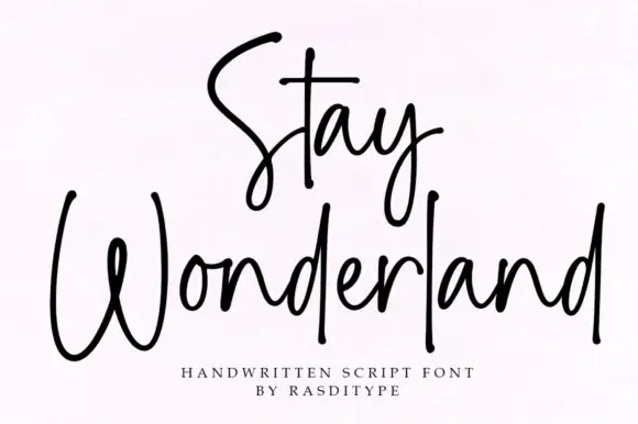
Thin monoline signature script
Stay Wonderland is a thin monoline signature script in black on white: tall narrow loops, a stem on the S that rises above the cap line, a straight-tailed y, and a spacing wide enough that the word reads as a signature written quickly.
Ideas for this font
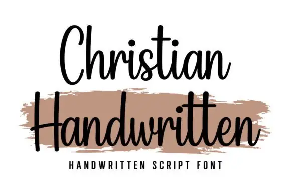
Upright compact connected script
Christian is an upright connected script with a compact rhythm, a heavy-brush companion line beneath it and no forward slant at all across the alphabet.
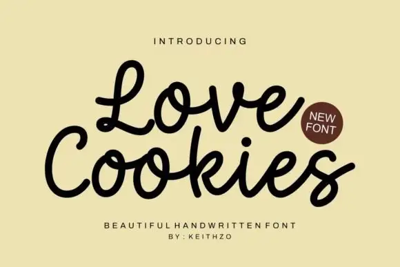
Rounded looping handwritten script
Love Cookies is a rounded looping script in black on a warm cream ground: fat uniform strokes, generous loops on the ascenders and a bounce that lifts the first word above the second.
Ideas for this font
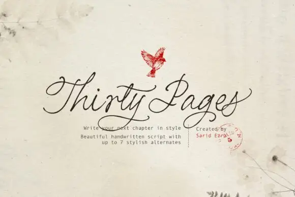
Clean connected handwritten script with alternates
Thirty Pages is a clean connected handwriting script in near-black on cream felt: tall ascenders, small open bowls and a light even stroke, sold with seven stylistic alternates for the capitals.
Ideas for this font
Same independent foundry
Allow optional Google Analytics to measure visits and catalogue actions. Your search words and notes are not included. Privacy & storage