Editorial Serif Anchor

Christian + Rosemode
Anchors Christian's fluid strokes with crisp Roman proportions on wedding suites, headers and packaging.
Inspect Rosemode specimenDisclosure: MakerFileHub may earn a commission from qualifying purchases via paid links on this page. How our links work.
Upright compact connected script
Christian is an upright connected script with a compact rhythm, a heavy-brush companion line beneath it and no forward slant at all across the alphabet.
Paid link
Get this fontProject & layout blueprintsAt-a-glance maker compatibility
Weld or Unite overlapping script joins into one continuous vector path before sending to the blade.
Visual anatomy & craft review
The upright angle is the defining choice: the letters stand vertical, so the word reads as deliberate hand lettering rather than as quick handwriting, and the joins stay short enough that the whole word compacts into a tight block. The first line is drawn with a moderate stroke and small rounded terminals; the second line beneath it is a heavier brush companion with a rougher edge, so the pair gives two levels of texture without changing family. A wide brush-stroke divider sits between the lines, and the tracked caption at the bottom belongs to a separate label face.
Upright · Compact · Connected
Two-font hierarchy recipes
Tested contrast partners — pairing Christian with grounded secondary typography.
Christian + Rosemode
Anchors Christian's fluid strokes with crisp Roman proportions on wedding suites, headers and packaging.
Inspect Rosemode specimen
Christian + Homies
Keeps small-scale dates, URLs, nutrition facts and care instructions crisp and legible below script titles.
Inspect Homies specimenPractical applications
Concrete hierarchy, scale and production guidance tailored to Christian’s stroke geometry.
An upright compact script reads formally without the flourish of a slanted calligraphy, which suits a community announcement.
Hierarchy & layout recipe
Set the event name at 4-inch height on a 2 m banner, keep the date and venue in a plain sans at 1 inch beneath it, and leave 8 cm between the two lines.
Pre-production check
Upright letters stack predictably, but the compact spacing can close up at distance; check the banner from 10 m before printing.
The upright rhythm matches a traditional ceremony while staying legible on a folded A5 order-of-service programme printed in one ink.
Hierarchy & layout recipe
Set the header at 26 pt on an A5 programme, keep the order of service in a serif at 9 pt, and leave 8 mm between the header and the first service item.
Pre-production check
On thin programme stock the compact joins can show through from the reverse; test the paper weight.
A compact upright script gives a chapter heading a hand-written note while remaining formal enough for a printed hardback book.
Hierarchy & layout recipe
Set the heading at 30 pt, keep the running text at 10.5 pt, and leave 12 mm between the heading baseline and the first line of body text beneath it on the page.
Pre-production check
The brush companion should stay on the cover; mixing two textures inside a chapter reads as an inconsistency.
Technical & licence verification
Confirm included OTF/TTF/WOFF formats, full glyph tables and licence coverage on the live store page before batch production.
Closest visual alternatives
Matched across letterform anatomy, stroke behaviour and craft applications.
Thin monoline signature script
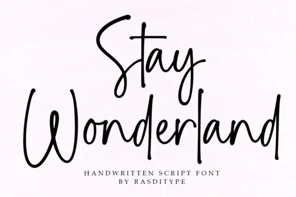
Stay Wonderland is a thin monoline signature script in black on white: tall narrow loops, a stem on the S that rises above the cap line, a straight-tailed y, and a spacing wide enough that the word reads as a signature written quickly.
Ideas for this font
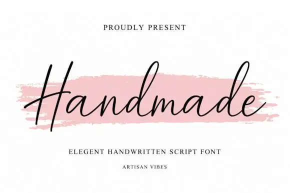
Fine slanted handwriting with a long flat entry and an even light stroke
Handmade is fine slanted handwriting in a single even weight, with one long flat entry stroke crossing the whole word and letters that stay lean and open throughout.
Ideas for this font
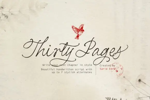
Clean connected handwritten script with alternates
Thirty Pages is a clean connected handwriting script in near-black on cream felt: tall ascenders, small open bowls and a light even stroke, sold with seven stylistic alternates for the capitals.
Ideas for this font
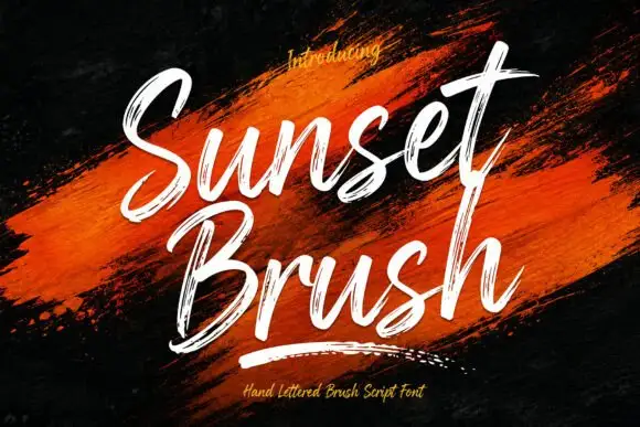
Rough brush script with a dry edge
Sunset Brush is a rough brush script in white over an orange paint smear: heavy strokes with dry, split ends, tall narrow loops and a forward slant that keeps a twelve-letter phrase moving.
Ideas for this font
Same independent foundry
Allow optional Google Analytics to measure visits and catalogue actions. Your search words and notes are not included. Privacy & storage