Modern Grotesque Body

Personal Vogue + Miniplate
Creates crisp high-hierarchy contrast beneath Personal Vogue headlines across menus, websites and labels.
Inspect Miniplate specimenDisclosure: MakerFileHub may earn a commission from qualifying purchases via paid links on this page. How our links work.
Elegant editorial serif with italic
Personal Vogue is a serif in cream on a monochrome fashion photograph: a moderate-contrast roman with fine serifs and a true italic with a strong slant, set on two lines with small tracked notes at the sides and an attribution beneath.
Paid link
Get this fontProject & layout blueprintsAt-a-glance maker compatibility
Sturdy stroke walls and open counters weed cleanly on adhesive vinyl, HTV apparel film, and cut cardstock.
Visual anatomy & craft review
The plate sets one word in the roman and one in the italic, which is the fair way to show a family with a real italic: the buyer can compare the two voices at the same size and see that the italic is drawn rather than slanted. The roman has moderate contrast and fine serifs, and the italic carries a narrower waist and a flowing tail, which is what makes it usable for a name rather than only for emphasis. Because the type sits over a dark photograph, the plate is also a test of contrast: the cream has to hold against folds of fabric, and it does because the type is placed over the darkest area. The tracked side notes and the small attribution beneath belong to the layout, not the letterforms.
Serif, editorial, elegant, contrast
Two-font hierarchy recipes
Tested contrast partners — pairing Personal Vogue with grounded secondary typography.
Personal Vogue + Miniplate
Creates crisp high-hierarchy contrast beneath Personal Vogue headlines across menus, websites and labels.
Inspect Miniplate specimen
Personal Vogue + Bunglon
Adds a warm human signature touch for 1-to-3-word callouts without competing against structured serif capitals.
Inspect Bunglon specimenPractical applications
Concrete hierarchy, scale and production guidance tailored to Personal Vogue’s stroke geometry.
A roman and a true italic let a fashion cover set a masthead and a name in one family, which is exactly what the plate demonstrates at full size.
Hierarchy & layout recipe
Set the masthead at 110 mm cap height across 210 mm in the roman, the cover lines in an 8 pt serif, and the issue details at 7 pt. Keep the type over the darkest part of the photograph.
Pre-production check
Check the masthead at 110 mm, where fine serifs can break on press; keep them above 0.25 mm. Confirm the cover lines read at newsstand distance and that the masthead holds at thumbnail size.
A serif with a true italic gives a label two working voices, and the italic supplies movement for a mark without a script.
Hierarchy & layout recipe
Set the mark at 18 pt on a card, 80 mm on a bag and 11 pt in a footer, using the italic only above 20 pt. Keep one colour and reserve clear space equal to the cap height.
Pre-production check
Check the 11 pt footer on uncoated paper, where fine serifs can fill; keep the size at or above 9 pt. Confirm the bag mark reads at three metres and that the italic stays open at 20 pt.
A roman and an italic pair gives a formal invitation structure, and the italic lets the couple's names carry a single gesture of movement.
Hierarchy & layout recipe
A5 invitation: the names in the italic at 26 pt, the request in the roman at 10 pt, and the date at 9 pt caps. Keep 22 mm margins and letterpress one ink on a heavy card.
Pre-production check
Check the 26 pt italic names in letterpress, where hairlines can sink; proof the plate. Confirm the 10 pt request reads at arm's length and that the italic tail clears the trim.
Technical & licence verification
Confirm included OTF/TTF/WOFF formats, full glyph tables and licence coverage on the live store page before batch production.
Closest visual alternatives
Matched across letterform anatomy, stroke behaviour and craft applications.
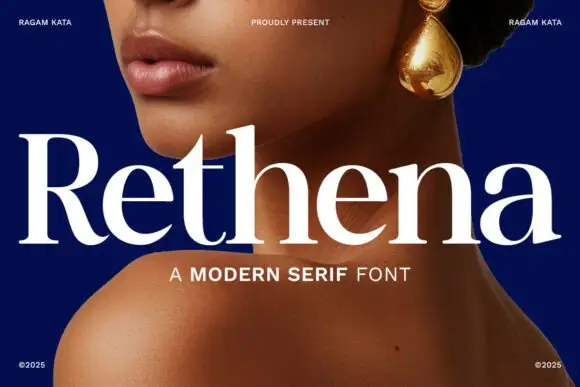
Modern serif with softened joins
Rethena is a modern serif in white over a deep blue portrait: moderate contrast, softened joins, round bowls and short bracketed serifs, set as one large word with a capital line beneath and small credits in the corners.
Ideas for this font
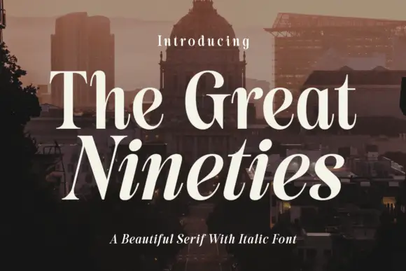
High-contrast serif with an italic companion
The Great Nineties is a serif family in cream over a city at dusk: a high-contrast roman with fine bracketed serifs for the first line and a matching italic for the second, sold together as a pair.

High-contrast italic editorial serif
The Simple Editorial is a high-contrast italic serif in near-black on white: very fine hairlines, sharp serifs, a strong forward slant and a tall waist, shown in a full specimen with weight and width labels in a small caps grid around the display line.
Ideas for this font
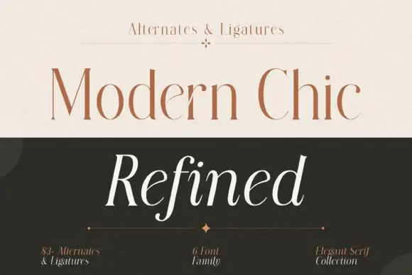
Fine upright serif title paired with an open italic sample
Modern Chic Refined pairs a pale brown upright cap line with a white slanted word: both keep long fine stems and contrasting rounded bowls, and the italic f drops below the baseline as the one descending letter.
Ideas for this font
Allow optional Google Analytics to measure visits and catalogue actions. Your search words and notes are not included. Privacy & storage