Modern Grotesque Body

Texas + Headline
Creates crisp high-hierarchy contrast beneath Texas headlines across menus, websites and labels.
Inspect Headline specimenDisclosure: MakerFileHub may earn a commission from qualifying purchases via paid links on this page. How our links work.
Western slab with italic
Texas is a western slab in cream over a sepia desert photograph: wide caps with heavy bracketed serifs, a high waist and closed counters, set on one line across the plate with a tracked line beneath naming the style, the italic and the language support.
Paid link
Get this fontProject & layout blueprintsAt-a-glance maker compatibility
Sturdy stroke walls and open counters weed cleanly on adhesive vinyl, HTV apparel film, and cut cardstock.
Visual anatomy & craft review
The word is set once, wide, and the drawing is a western slab at heavy weight: the serifs are wide and bracketed, the stems are thick, and the counters are narrow, which gives the block its cinematic weight. The photograph behind is a sepia desert with a lone rider, and the cream type sits over the brightest band of sky, which is a realistic test of contrast. The tracked line beneath states the regular and italic cuts and the language support in a small condensed face, which is the practical information a buyer needs. Because the letterforms are heavy, the face works at poster size and in signage, and the specimen keeps the plate to one word so the silhouette reads.
Western, slab, bold, cinematic
Two-font hierarchy recipes
Tested contrast partners — pairing Texas with grounded secondary typography.
Texas + Headline
Creates crisp high-hierarchy contrast beneath Texas headlines across menus, websites and labels.
Inspect Headline specimen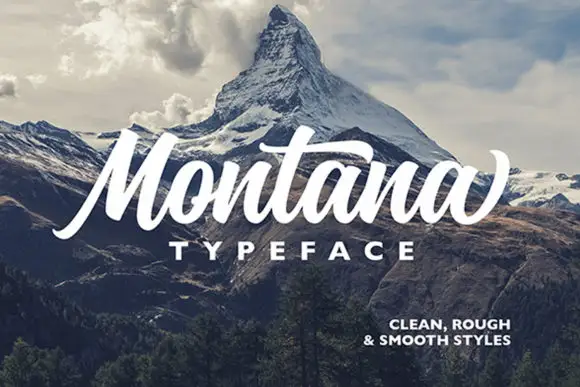
Texas + Montana
Adds a warm human signature touch for 1-to-3-word callouts without competing against structured serif capitals.
Inspect Montana specimenPractical applications
Concrete hierarchy, scale and production guidance tailored to Texas’s stroke geometry.
A western slab reads as a period sign, and the heavy bracketed serifs hold in paint at fascia scale where a lighter face would soften.
Hierarchy & layout recipe
Paint a 1,300 by 400 mm fascia: the name at 140 mm cap height, the hours in a 26 mm slab, and a 6 mm rule. Keep 30 mm margins and paint two colours on a light board.
Pre-production check
Check the fascia at 140 mm, where a narrow counter can fill; keep it above 6 mm. Confirm the 26 mm hours read at four metres and that the rule clears the fixings.
A western slab gives a novel the tone of a film title, and the heavy letters hold at thumbnail size where a fine serif would fade into the artwork.
Hierarchy & layout recipe
Set the title at 100 mm cap height across 220 mm, the author in a 12 pt slab, and the imprint at 8 pt. Print cream over a photograph and keep the title over the brightest band.
Pre-production check
Check the title at thumbnail size, where the cream on sepia can drop in contrast; keep the ground even. Confirm the 8 pt imprint survives lamination and that the title clears the trim.
A heavy western slab reads across a field, and the italic cut lets a secondary line carry movement without a second family.
Hierarchy & layout recipe
A2 portrait: the event at 130 mm cap height, the dates in the italic at 26 mm, and the venue at 14 mm. Keep 30 mm margins and print two colours on a warm ground.
Pre-production check
Check the poster at six metres, where the italic can look like a skew at small sizes; use the roman below 20 mm. Confirm the 14 mm venue reads at three metres and that the dates clear the block.
Technical & licence verification
Confirm included OTF/TTF/WOFF formats, full glyph tables and licence coverage on the live store page before batch production.
Closest visual alternatives
Matched across letterform anatomy, stroke behaviour and craft applications.
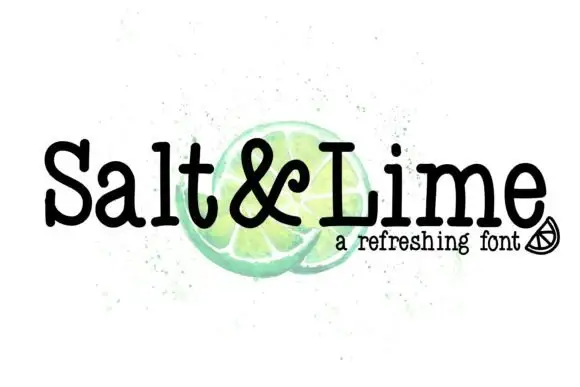
Narrow soft slab
Salt & Lime is a narrow soft slab in black over a watercolour lime on white: mixed case with rounded slab endings, a tight rhythm and a large x-height, with the ampersand drawn at the same weight and a small line beneath in a tracked sans.
Ideas for this font
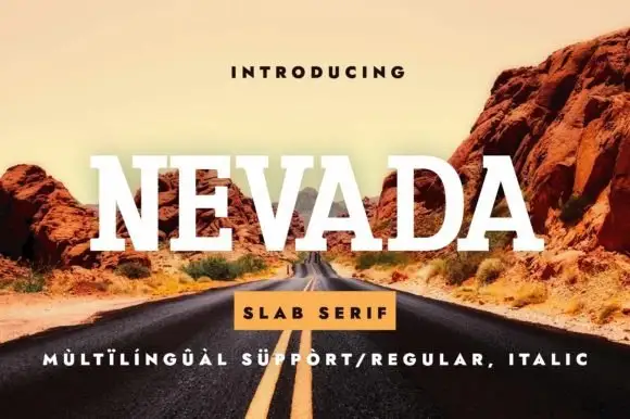
Broad clean slab
Nevada is a broad clean slab in white over a desert road photograph: wide caps with bracketed slab serifs, open round bowls and even spacing, with a small tracked line above and a banner beneath that states the style and the language support.
Ideas for this font
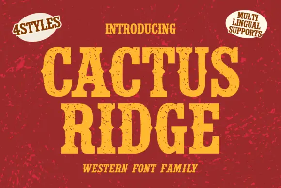
Tall notched Western slabs with small scattered erosion marks
Cactus Ridge shows yellow Western capitals on red, where pinched midsections and long broad slab ends create a tall sign shape and small dark chips interrupt the fill without any complete outline.
Ideas for this font
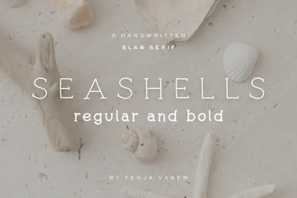
Light drawn slab capital
Seashells is a light drawn slab in white over a beach scattered with shells and a starfish: widely spaced capitals with fine even strokes, small irregular slab ends and slightly uneven curves, with a bold lowercase line beneath and two tracked notes at the foot.
Ideas for this font
Same independent foundry
Allow optional Google Analytics to measure visits and catalogue actions. Your search words and notes are not included. Privacy & storage