Editorial Serif Anchor

Sweetie + Resquel
Anchors Sweetie's fluid strokes with crisp Roman proportions on wedding suites, headers and packaging.
Inspect Resquel specimenDisclosure: MakerFileHub may earn a commission from qualifying purchases via paid links on this page. How our links work.
Heart-accented bold calligraphy
Sweetie is a bold calligraphy in black on pale wood: heavy shaded strokes, a capital S drawn as a single open loop with a heart cut into its lower counter, and a final e that lifts into a short exit.
Paid link
Get this fontProject & layout blueprintsAt-a-glance maker compatibility
Weld or Unite overlapping script joins into one continuous vector path before sending to the blade.
Visual anatomy & craft review
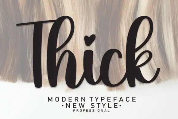
The word runs across the frame beside a giant capital, and the face is a bold calligraphy: the capital S is drawn as one continuous open stroke that curls top and bottom, with a heart drawn inside the lower bowl, while the lower-case letters are narrow with a heavy shade on the downstrokes and a hairline on the joins, and the t carries a heart instead of a plain dot. That substitution is the detail the face is sold on: a formal shape with one drawn heart, which keeps a script from needing a separate motif. The stroke contrast is high, the slant is light and the letters connect in a steady rhythm, so a seven-letter word holds at a card size. The ground is a pale timber surface. Sweetie is a script for cards, packaging and wedding stationery.
A bold script with a heart in the capital
Two-font hierarchy recipes
Tested contrast partners — pairing Sweetie with grounded secondary typography.
Sweetie + Resquel
Anchors Sweetie's fluid strokes with crisp Roman proportions on wedding suites, headers and packaging.
Inspect Resquel specimen
Sweetie + Noar
Keeps small-scale dates, URLs, nutrition facts and care instructions crisp and legible below script titles.
Inspect Noar specimenPractical applications
Concrete hierarchy, scale and production guidance tailored to Sweetie’s stroke geometry.
A bold script with a heart built into the capital does the ornament for a card, and the heavy shade reads at a small size where a hairline face would vanish.
Hierarchy & layout recipe
Print a 120 by 120 mm square card: set the word at 36 pt on one line, keep 14 mm of clear ground beneath before the message at 9.5 pt, and hold 13 mm of margin on all four sides.
Pre-production check
A heart cut into a counter can close at thirty-six points; print one at the finished size and check the capital before the batch.
The face gives a favour label the tone of the day without a second graphic, and the heavy stroke holds at thirteen points on a small tag.
Hierarchy & layout recipe
Print a 45 by 70 mm tag: set the word at 13 pt on one line, keep 5 mm of clear ground beneath before the names at 6 pt, and leave 5 mm from the lowest loop to the punch hole.
Pre-production check
A descending loop can reach the punch hole; print one tag, punch it and check the clearance before the order.
A bold script keeps a short note from feeling like a form, and the heart detail gives the card its warmth without a drawn border.
Hierarchy & layout recipe
Print a 105 by 148 mm card: set the greeting at 28 pt on one line, keep 14 mm of clear ground beneath before the message at 10 pt, and hold 13 mm of margin on all four sides.
Pre-production check
Hairline joins fill on textured card; print one on the intended stock and check the connectors before the batch.
Technical & licence verification
Confirm included OTF/TTF/WOFF formats, full glyph tables and licence coverage on the live store page before batch production.
Closest visual alternatives
Matched across letterform anatomy, stroke behaviour and craft applications.
Medium-weight joined script with a looped capital
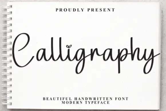
Calligraphy is a medium-weight joined script whose capital C lifts a wide loop before it closes, and whose tall l, l and g keep the word in a single even rhythm.
Ideas for this font
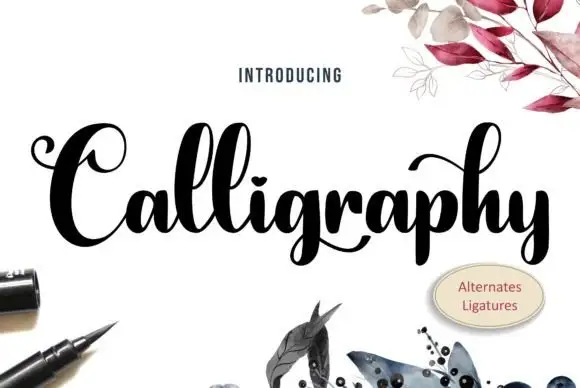
Heavy high-contrast looped calligraphy with swashed capitals and tight fit
Calligraphy is heavy high-contrast looped lettering in which the capitals carry wide swashes, the stems are thick and the joins are hairline, so a single word reads as a drawn flourish rather than a written line.
Ideas for this font
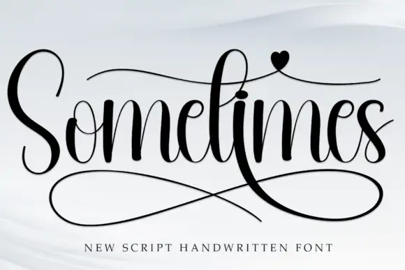
High-contrast handwritten script with long swashes
Sometimes is a high-contrast handwritten script in black on white: thick downstrokes against hairlines, a very tall S, crossbar strokes that run the length of the word, a heart on the i and a huge double loop sweeping under the letters.
Ideas for this font
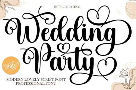
Ornamental modern script with heart flourishes
Wedding Party is an ornamental script in black on cream: heavy stems with hairline joins, capitals that throw loops over the whole line, and drawn hearts worked into the flourishes above and below the words.
Ideas for this font
Same independent foundry
Allow optional Google Analytics to measure visits and catalogue actions. Your search words and notes are not included. Privacy & storage