Editorial Serif Anchor

Calligraphy + Things
Anchors Calligraphy's fluid strokes with crisp Roman proportions on wedding suites, headers and packaging.
Inspect Things specimenDisclosure: MakerFileHub may earn a commission from qualifying purchases via paid links on this page. How our links work.
Medium-weight joined script with a looped capital
Calligraphy is a medium-weight joined script whose capital C lifts a wide loop before it closes, and whose tall l, l and g keep the word in a single even rhythm.
Paid link
Get this fontProject & layout blueprintsAt-a-glance maker compatibility
Weld or Unite overlapping script joins into one continuous vector path before sending to the blade.
Visual anatomy & craft review
The C opens with a long rising stroke that loops back over itself at the top before it turns into the bowl, which is the one elaborate gesture in the word. From there the a, l, l, i, g, r, a, p, h and y run in a consistent medium weight with joins at mid-height, ascenders in the two l's that clear the x-height by a third, and a g whose descender closes into a loop that returns to the baseline rather than stopping short. The script is set in black on a spiral-bound notebook page, and the ruled page behind it does the job a grid would in a layout: it shows how much of the word sits above and below the line. The tracked label at the top, the two-line caption beneath and the spiral binding are presentation rather than alphabet.
Modern · Joined · Rounded
Two-font hierarchy recipes
Tested contrast partners — pairing Calligraphy with grounded secondary typography.
Calligraphy + Things
Anchors Calligraphy's fluid strokes with crisp Roman proportions on wedding suites, headers and packaging.
Inspect Things specimen
Calligraphy + Mansory
Keeps small-scale dates, URLs, nutrition facts and care instructions crisp and legible below script titles.
Inspect Mansory specimenPractical applications
Concrete hierarchy, scale and production guidance tailored to Calligraphy’s stroke geometry.
A medium weight holds up on both letterpress and digital print, which matters when a couple orders a small run and cannot afford to reprint a header that filled in or greyed out.
Hierarchy & layout recipe
Set the header at 30 pt on a 5 by 7 inch card, keep the names and date in a light serif beneath at 9 pt, and hold 12 mm between the lowest loop of the g and the first line of details.
Pre-production check
The g and y descenders reach far below the baseline; measure the space under the header from the lowest point of those loops, not from the letters beside them.
A joined script with a looped capital gives a paper brand a mark that looks written with the same tools it sells, and the medium weight survives being printed small on a belly band.
Hierarchy & layout recipe
Keep the brand name at 13 pt on a 45 mm band, set the product line in a plain sans at 6 pt under it, and leave 4 mm at each end so the entry loop of the capital is never trimmed by the die.
Pre-production check
Belly bands crease where they wrap; place the crease between two letters rather than through the capital's loop, or the mark will break at the fold.
A written-looking header suits a card sent after a class, and the even weight means the greeting can be printed on the same cheap card stock as the handouts without looking out of place.
Hierarchy & layout recipe
Set the greeting at 22 pt on an A6 card, keep the message in a serif at 10 pt with 5 mm of space under the loop of the g, and leave the lower half plain for a handwritten line.
Pre-production check
Printed script beside handwriting invites comparison; check that the printed weight is either clearly lighter or clearly heavier than the pen used to sign the card.
Technical & licence verification
Confirm included OTF/TTF/WOFF formats, full glyph tables and licence coverage on the live store page before batch production.
Closest visual alternatives
Matched across letterform anatomy, stroke behaviour and craft applications.
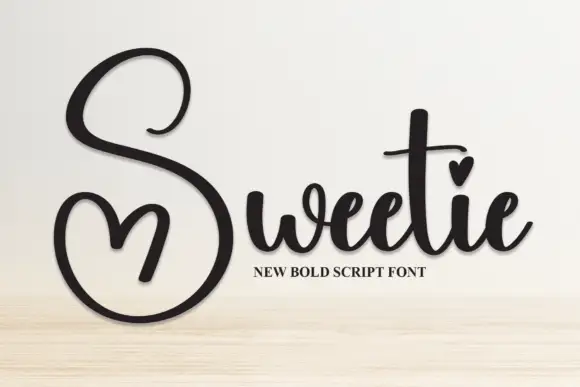
Heart-accented bold calligraphy
Sweetie is a bold calligraphy in black on pale wood: heavy shaded strokes, a capital S drawn as a single open loop with a heart cut into its lower counter, and a final e that lifts into a short exit.
Ideas for this font
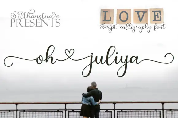
Fine heart-linked script
Oh Juliya is a fine script in charcoal over a misty seascape: small bowls, light joins, a heart drawn between the words, and long tails that run out to both edges of the card.
Ideas for this font
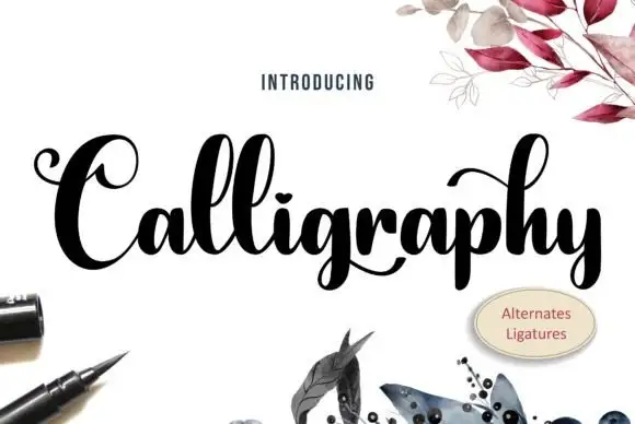
Heavy high-contrast looped calligraphy with swashed capitals and tight fit
Calligraphy is heavy high-contrast looped lettering in which the capitals carry wide swashes, the stems are thick and the joins are hairline, so a single word reads as a drawn flourish rather than a written line.
Ideas for this font
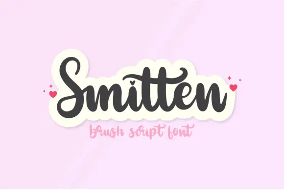
Heavy heart-dotted brush script
Smitten is a heavy brush script in charcoal on pink: fat rounded strokes, tight loops, a heart in place of the dot on the i and a long entry stroke that runs in from the left before the first letter.
Ideas for this font
Same independent foundry
Allow optional Google Analytics to measure visits and catalogue actions. Your search words and notes are not included. Privacy & storage