High-Contrast Display Serif

Super Teacher + Mewah
Pairs sculptural editorial warmth with Super Teacher's clean modern geometry.
Inspect Mewah specimenDisclosure: MakerFileHub may earn a commission from qualifying purchases via paid links on this page. How our links work.
Narrow monoline sans
Super Teacher is a narrow monoline sans in deep teal on cream: mixed case with tall simple ascenders, rounded ends, open apertures and an even light stroke, set as one line with a boxed caption beneath that names the style.
Paid link
Get this fontProject & layout blueprintsAt-a-glance maker compatibility
Sturdy stroke walls and open counters weed cleanly on adhesive vinyl, HTV apparel film, and cut cardstock.
Visual anatomy & craft review
The plate is quiet: one line, a lot of cream, and a thin box under it. The drawing is a narrow monoline sans with rounded ends and open apertures, which keeps a light face legible at moderate sizes, and the ascenders are tall enough that a phrase set in it stays airy. That construction sets a size floor, because a monoline stroke fades at small sizes on uncoated stock, and the plate sets the line large enough that the roundness reads. The boxed caption beneath is product copy and it names the style. Because the letters are narrow and even, the face suits a school, a clinic or a small brand that wants a calm voice, and the light weight means it works on a screen better than in small print.
Sans serif, monoline, narrow, minimal
Two-font hierarchy recipes
Tested contrast partners — pairing Super Teacher with grounded secondary typography.
Super Teacher + Mewah
Pairs sculptural editorial warmth with Super Teacher's clean modern geometry.
Inspect Mewah specimen
Super Teacher + Simple Alphabet
Introduces organic movement on pull-quotes, signatures and gift tags.
Inspect Simple Alphabet specimenPractical applications
Concrete hierarchy, scale and production guidance tailored to Super Teacher’s stroke geometry.
A calm monoline sans suits a primary classroom, and the open apertures help a new reader pick out letters. A calm face helps a new reader.
Hierarchy & layout recipe
A3 poster: the class at 60 mm cap height, the teacher in a 20 mm sans, and the room at 12 mm. Keep 25 mm margins and print one colour on a light stock.
Pre-production check
Check the A3 at three metres, where a light stroke can fade; keep the weight up. Confirm the 12 mm room reads at two metres and that the poster sits at child height.
A quiet sans reads as trustworthy rather than slick, which matters when a parent is choosing a tutor. Parents read calm as competence.
Hierarchy & layout recipe
Set the name at 15 pt on a card, 80 mm on a door and 10 pt on a letterhead, in one weight. Keep one colour and clear space equal to the cap height. Keep the letterhead on one line at 10 pt.
Pre-production check
Check the 10 pt letterhead on uncoated paper, where a monoline can fill; keep the size above 11 pt. Confirm the door name reads at three metres and that the apertures stay open.
A narrow monoline gives a guide a calm cover, and the tall ascenders hold a long subtitle in a narrow column. A guide should look approachable, not academic.
Hierarchy & layout recipe
Set the title at 60 mm cap height across 150 mm, the subtitle at 10 pt, and the imprint at 8 pt. Print one ink on a matte stock and keep 22 mm margins.
Pre-production check
Check the title at 60 mm, where a monoline can fill on a matte sheet; keep it above 0.35 mm. Confirm the 8 pt imprint survives and that the title clears the trim.
Technical & licence verification
Confirm included OTF/TTF/WOFF formats, full glyph tables and licence coverage on the live store page before batch production.
Closest visual alternatives
Matched across letterform anatomy, stroke behaviour and craft applications.
Mixed handwritten display
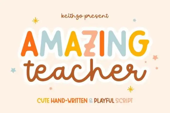
Amazing Teacher places broad separate capitals in mixed warm colours above a connected lowercase sample in brown, where the top line has blunt rounded ends and the lower t and h rise above the joined rhythm on a cream field with small star marks around the words.
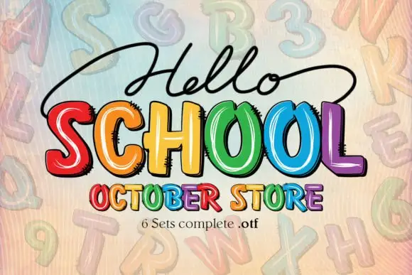
Bright irregular capitals with pale curved highlights and rough dark offsets
Hello School shows chunky irregular capitals in red, orange, yellow, green, blue and violet, where pale curved strokes sit inside the faces, dark rough-edged offsets create a drawn shadow and the large SCHOOL row has tall open counters with uneven widths.
Ideas for this font
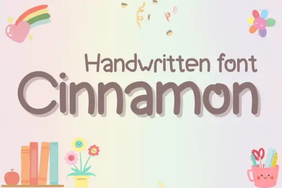
Rounded uneven mixed case with broad n arches and an inward-turning o stroke
Cinnamon shows grey-brown mixed case on a pale pastel field, where rounded substantial strokes form an open C and a tall narrow i, repeated n letters rise through broad uneven arches, the o turns inward at its upper stroke and the m spreads across two soft shoulders on a gently irregular baseline.
Ideas for this font
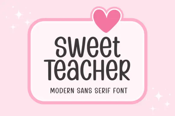
Tall informal rounded sans
Sweet Teacher is a tall informal sans in charcoal on a white rounded panel: narrow uprights with rounded terminals, uneven body widths, a large x-height and a light bounce, with a drawn heart above the panel and sparkles at the corners.
Same independent foundry
Allow optional Google Analytics to measure visits and catalogue actions. Your search words and notes are not included. Privacy & storage