High-Contrast Display Serif

Spooky Humerus + Wolles Elegant Modern Serif
Pairs sculptural editorial warmth with Spooky Humerus's clean modern geometry.
Inspect Wolles Elegant Modern Serif specimenDisclosure: MakerFileHub may earn a commission from qualifying purchases via paid links on this page. How our links work.
Rounded Halloween duo with drip lower case
Spooky Humerus is a Halloween duo in cream and red on a purple forest: a soft bouncy capital cut with a thick black outline, paired with a rounded lower cut whose letters drip at the base and swell in the middle, so the same word can be set friendly or gruesome.
Paid link
Get this fontProject & layout blueprintsAt-a-glance maker compatibility
Sturdy stroke walls and open counters weed cleanly on adhesive vinyl, HTV apparel film, and cut cardstock.
Visual anatomy & craft review
The two lines show both cuts of the pair: the upper word is a rounded, high-contrast-free display with wide counters and a bouncy baseline, and the lower word uses the same overall weight but adds drips at the base of each letter and a red fill, so it reads as the same design at a different temperature. Both are outlined in a thick black contour and stacked with a shadow step at the bottom, which is how the duo is meant to be combined, and the second cut keeps generous counters so the drips never close the word. The ground is a purple forest scene with bats and a pumpkin, drawn flat rather than photographed, and there is a small badge announcing multilingual support, so the specimen is selling a family for craft projects. Everything is set at large size, which is honest for a duo whose drips and outlines only work above about 30 pt.
Playful, rounded, drippy, seasonal
Two-font hierarchy recipes
Tested contrast partners — pairing Spooky Humerus with grounded secondary typography.
Spooky Humerus + Wolles Elegant Modern Serif
Pairs sculptural editorial warmth with Spooky Humerus's clean modern geometry.
Inspect Wolles Elegant Modern Serif specimen
Spooky Humerus + Wishful Women
Introduces organic movement on pull-quotes, signatures and gift tags.
Inspect Wishful Women specimenPractical applications
Concrete hierarchy, scale and production guidance tailored to Spooky Humerus’s stroke geometry.
A duo lets one card use the friendly cut for the invitation and the drippy cut for the warning line, which sets a tone that a single face cannot.
Hierarchy & layout recipe
A6 card: the upper word at 30 pt in cream with a 1.5 mm black outline, the second line at 22 pt in the drippy cut, and the details in a 9 pt sans. Keep 12 mm margins so the outline and the drips stay inside the trim.
Pre-production check
Check the 22 pt drippy line, where a drip under 1 mm can fill and read as a smudge; keep drips at 1.5 mm for print. Confirm the 9 pt details keep a 4.5:1 contrast on the purple ground and that the two cuts look like the same family.
Two cuts of one family give a banner a hierarchy without a second typeface, which matters when the banner is printed at home and colour choice is limited.
Hierarchy & layout recipe
Print 900 by 400 mm: the name at 140 mm in the friendly cut, the age at 90 mm in the drippy cut, and the details in a 22 mm sans. Keep the black outline at 4 mm and leave 30 mm of clear ground around the drip line.
Pre-production check
Check the outline at 4 mm on the printed banner, where it must stay even around the drips; inspect the lower edge of the word. Confirm the 22 mm details read from five metres and that the drippy cut does not make the age illegible.
A rounded friendly cut suits a school audience, and having a second, drippier cut lets the same notice carry a playful headline and a clear reading line.
Hierarchy & layout recipe
A4 print: the headline at 60 mm in the friendly cut, the details at 12 mm in a sans, and the drippy cut used only for the word free. Keep the palette to two colours so a school copier can reproduce it without turning the drips into mud.
Pre-production check
Check the A4 on a school copier, where the black outline can thicken and close the counters; test one copy first. Confirm the 12 mm details read from two metres and that the drippy word does not confuse the meaning of the notice.
Technical & licence verification
Confirm included OTF/TTF/WOFF formats, full glyph tables and licence coverage on the live store page before batch production.
Closest visual alternatives
Matched across letterform anatomy, stroke behaviour and craft applications.
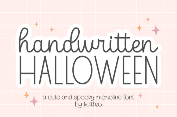
Cute monoline cursive script & tall skinny Halloween print duo
Handwritten Halloween combines a sweet rounded monoline cursive lowercase script with tall, airy disconnected uppercase print.
Ideas for this font
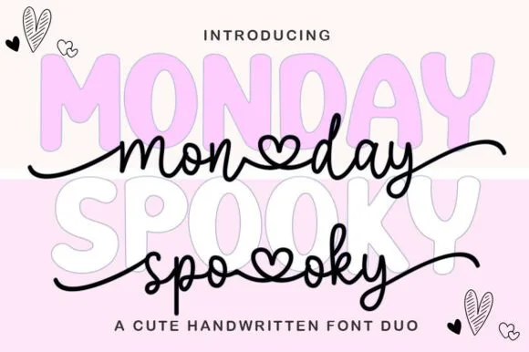
Pastel spooky-cute bubble sans & heart-connected script duo
Monday Spooky Script is a two-font 'Pasteloween' duo pairing a chunky rounded uppercase bubble display with a heart-connected monoline script.
Ideas for this font
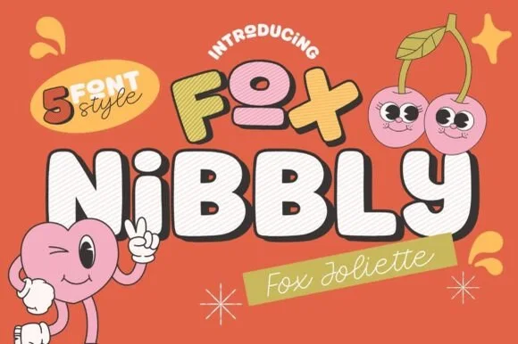
5-style retro cartoon mascot superfamily (Block, 3D/Outline + Monoline Script!)
Fox Joliette and Fox Nibbly is a 5-font retro cartoon superfamily pairing chunky 3D-ready mascot bubble caps ('FOX NIBBLY') with a sweet monoline script ('Fox Joliette')!
Ideas for this font
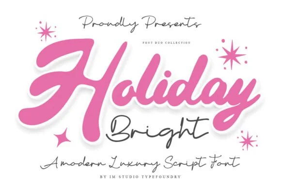
Dual-script font duo: Chunky marker brush + airy fine-pen signature!
Holiday Bright ('Haliday Bright') is a rare dual-script font duo pairing a bold, juicy bubblegum brush script with a delicate fine-pen signature script!
Ideas for this font
Same independent foundry
Allow optional Google Analytics to measure visits and catalogue actions. Your search words and notes are not included. Privacy & storage