Modern Grotesque Body

Sherlock + Monure
Creates crisp high-hierarchy contrast beneath Sherlock headlines across menus, websites and labels.
Inspect Monure specimenDisclosure: MakerFileHub may earn a commission from qualifying purchases via paid links on this page. How our links work.
High-contrast display serif with ligatures
Sherlock is a high-contrast display serif in cream over a dark landscape painting: very fine hairlines, sharp serifs, tall caps with a narrow waist and a set of discretionary ligatures that fuse adjacent letters, laid out in three lines with small tracked labels in the corners.
Paid link
Get this fontProject & layout blueprintsAt-a-glance maker compatibility
Crisp hairline serifs shine on stationery, foil stamping, and packaging; add slight offset for small decals.
Visual anatomy & craft review
The specimen sets a full phrase, which is the right test for a face with ligatures: the fused pairs are visible in place rather than described, and the buyer can see how the joins behave at a display size. The drawing is a contrasted serif — the stems are heavy, the hairlines are fine, the serifs are sharp — and the joins in the ligatures are drawn rather than forced, so the phrase keeps a rhythm. Because the hairlines are fine, the face needs a large size and a smooth ground, and the specimen uses a photographic painting behind, keeping the type over the darkest area. The tracked labels in the corners name the alternates, the language support and the designer, and the small script signature at the foot is the one soft element on the plate.
Serif, contrasted, editorial, literary
Two-font hierarchy recipes
Tested contrast partners — pairing Sherlock with grounded secondary typography.
Sherlock + Monure
Creates crisp high-hierarchy contrast beneath Sherlock headlines across menus, websites and labels.
Inspect Monure specimen
Sherlock + Handmade Calligraphy
Adds a warm human signature touch for 1-to-3-word callouts without competing against structured serif capitals.
Inspect Handmade Calligraphy specimenPractical applications
Concrete hierarchy, scale and production guidance tailored to Sherlock’s stroke geometry.
A contrasted serif reads as literary rather than commercial, and the ligatures give a short title a distinctive join that a customer will recognise on a shelf.
Hierarchy & layout recipe
Set the title at 85 mm cap height across 210 mm, the author in a 10 pt serif, and the imprint at 7 pt. Print cream on a dark ground, keep the title in the upper half, and use one ligature only.
Pre-production check
Check the title at thumbnail size, where the hairlines can vanish; keep the contrast high. Confirm the 7 pt imprint survives lamination and that the ligature does not close a counter.
A contrasted serif gives a formal invitation its authority, and the ligatures let the couple's names join in a way a script would make too decorative.
Hierarchy & layout recipe
A5 invitation: the names at 26 pt with one ligature, the request in a 10 pt serif, and the date at 9 pt caps. Keep 22 mm margins and letterpress one ink on a heavy cotton card.
Pre-production check
Check the 26 pt names on cotton, where hairlines can sink; proof the plate. Confirm the 10 pt request reads at arm's length and that the ligature stays open on the press.
A contrasted serif reads as books rather than retail, and the fine construction scales from a bag to a fascia without a second face.
Hierarchy & layout recipe
Set the mark at 20 mm on a bag, 12 pt on a card and 90 mm on a fascia, in one colour. Keep clear space equal to the cap height and avoid reversing it out of a busy photograph.
Pre-production check
Check the 12 pt card mark on uncoated stock, where hairlines can fill; keep the size at or above 10 pt. Confirm the fascia reads at fifteen metres and that the mark holds when reversed.
Technical & licence verification
Confirm included OTF/TTF/WOFF formats, full glyph tables and licence coverage on the live store page before batch production.
Closest visual alternatives
Matched across letterform anatomy, stroke behaviour and craft applications.
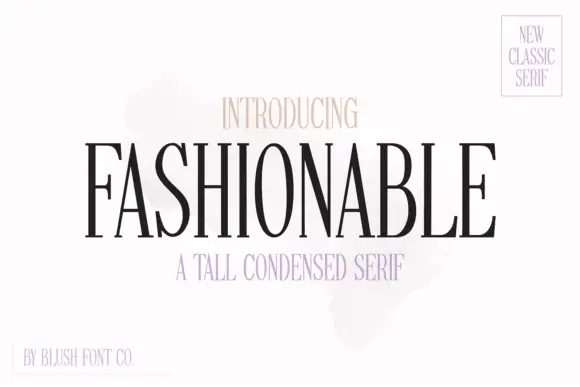
Tall condensed classic serif with narrow bowls and fine hairlines
Fashionable is a tall condensed serif in which the stems stretch upward, the bowls narrow and the hairlines stay fine, so a single word reads as a magazine masthead rather than as a title.
Ideas for this font
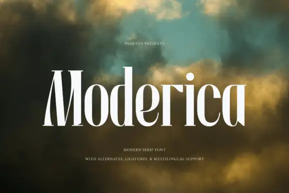
Tall condensed serif with narrow curved bowls and heavy verticals
Moderica is a tall condensed serif in which the stems hold substantial weight, the bowls compress into narrow curves and the ratio between them runs steep, so a stacked title reads as an architectural editorial head.
Ideas for this font
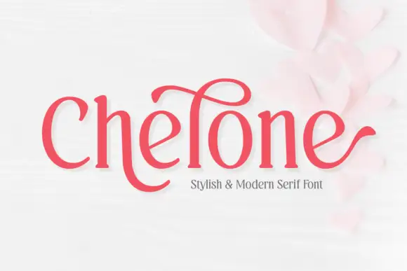
Soft narrow serif with a high looping ascender and outward terminal hooks
Chelone is a soft narrow serif in which the stems curve gently, the bowls stay open, one tall ascender carries a large loop above the word and the final e ends in a long outward hook, so a name reads as playful modern lettering.
Ideas for this font
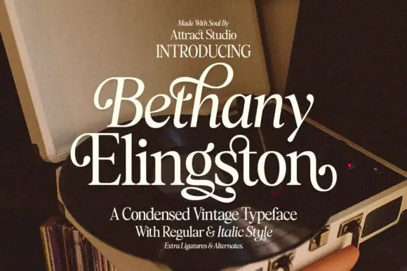
Condensed serif pairing with curled capitals and a looping g
Bethany Elingston shows pale mixed-case serif letters in a slanted upper row and a straighter lower row over an open record player, where curled B and E entries, a tall looped h and a low g extension make the compact stack ornamental, and the cover advertises regular, italic, ligatures and alternates.
Ideas for this font
Same independent foundry
Allow optional Google Analytics to measure visits and catalogue actions. Your search words and notes are not included. Privacy & storage