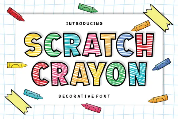
Modern Grotesque Body

Semica + Homies
Creates crisp high-hierarchy contrast beneath Semica headlines across menus, websites and labels.
Inspect Homies specimenDisclosure: MakerFileHub may earn a commission from qualifying purchases via paid links on this page. How our links work.
Modern contrasted serif
Semica is a modern serif in rust brown on a soft grey ground: high contrast, fine bracketed serifs, tall narrow stems and a light waist, set in caps on one line with a curved label above and a tracked line beneath.
Paid link
Get this fontProject & layout blueprintsAt-a-glance maker compatibility
Sturdy stroke walls and open counters weed cleanly on adhesive vinyl, HTV apparel film, and cut cardstock.
Visual anatomy & craft review
The word is set once in caps and the drawing is a contrasted serif: the stems are tall, the hairlines are fine, and the serifs are bracketed rather than hairline, which keeps the face warmer than a strict didone. The plate is deliberately spare — a curved tracked label above and a straight tracked line beneath — which lets the letterforms carry the page. Because the hairlines are fine, the face works at display sizes and on a smooth ground, and the specimen sets the word large enough that the contrast is visible across the whole line. The palette is one ink on a soft gradient ground, which reads as a photograph of light rather than as decoration.
Serif, modern, contrasted, editorial
Two-font hierarchy recipes
Tested contrast partners — pairing Semica with grounded secondary typography.
Semica + Homies
Creates crisp high-hierarchy contrast beneath Semica headlines across menus, websites and labels.
Inspect Homies specimen
Semica + Wishful Women
Adds a warm human signature touch for 1-to-3-word callouts without competing against structured serif capitals.
Inspect Wishful Women specimenPractical applications
Concrete hierarchy, scale and production guidance tailored to Semica’s stroke geometry.
A contrasted serif gives a studio a mark with presence, and the bracketed serifs keep it warmer than a strict didone at the small sizes a card and a footer need.
Hierarchy & layout recipe
Set the mark at 20 pt on a card, 85 mm on a wall and 11 pt in a footer. Keep one colour and reserve clear space equal to the cap height so the hairlines never crowd.
Pre-production check
Check the 11 pt footer on uncoated paper, where hairlines can fill; keep the size at or above 10 pt. Confirm the wall mark reads at six metres and that the mark holds when reversed out.
A contrasted serif reads as editorial authority, and the tall narrow caps let a long single word hold a cover width at full height.
Hierarchy & layout recipe
Set the title at 100 mm cap height across 220 mm, the subtitle in a 12 pt serif, and the publisher at 8 pt. Print one ink on a light matte stock and keep the title in the upper half.
Pre-production check
Check the title at 100 mm, where hairlines can break on press; keep them above 0.3 mm. Confirm the 8 pt publisher survives lamination and that the title clears the trim by 12 mm.
A modern serif reads as formal without a script, and the bracketed serifs keep the small print legible on a textured card.
Hierarchy & layout recipe
A5 invitation: the names at 26 pt, the request in a 10 pt serif at 14 pt leading, and the date at 9 pt caps. Keep 22 mm margins and letterpress one ink on a heavy card.
Pre-production check
Check the 26 pt names on cotton, where fine serifs can sink; proof the plate on the actual stock. Confirm the 10 pt request reads at arm's length and that the names keep a visible gap.
Technical & licence verification
Confirm included OTF/TTF/WOFF formats, full glyph tables and licence coverage on the live store page before batch production.
Closest visual alternatives
Matched across letterform anatomy, stroke behaviour and craft applications.

Fine serif title with large upper and lower loops
Amilea shows pale yellow high-contrast letters with fine tapered serifs and broad rounded lowercase over a dark portrait, where a thin loop curves below the capital A and a tall upper flourish crosses the central ascender before sweeping right.
Broad serif with enclosing loops
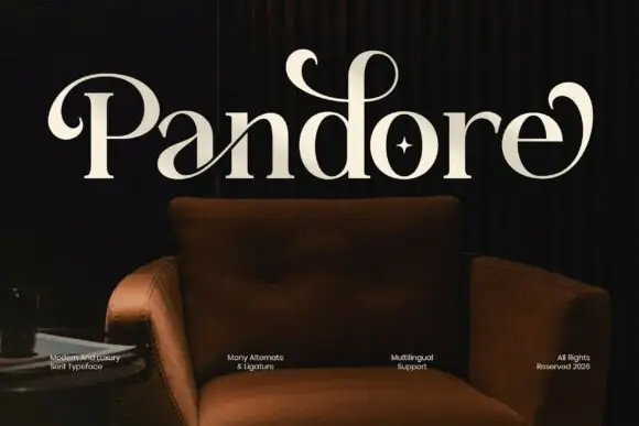
Pandore is a broad serif in cream on a dark interior photograph: heavy stems with fine serifs, and curled strokes that leave the P and the final e and loop back over the word, with a star set inside the o and a row of small tracked notes along the foot.
Vintage serif with floral frame
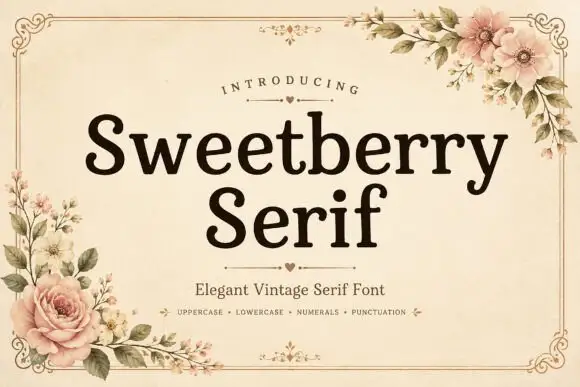
Sweetberry Serif is a vintage serif in deep brown on cream: moderate contrast, bracketed serifs, a large x-height and generous spacing, set in two lines inside a fine ornamental frame with roses and blossom at the corners and a small heart rule beneath the title.
Ideas for this font
Elegant retro serif with tall ascenders
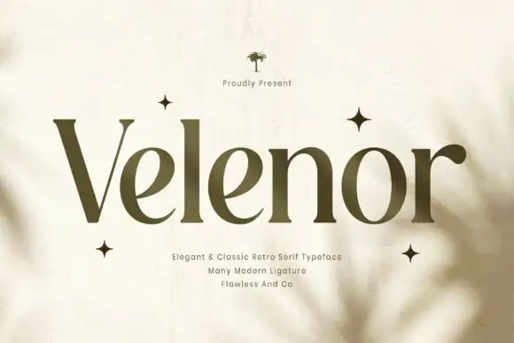
Velenor is an elegant retro serif in olive on cream: tall ascenders, wide bowls, high contrast and long flat serifs, set among four-point stars on a page with soft leaf shadows falling across it.
Ideas for this font
Same independent foundry
Allow optional Google Analytics to measure visits and catalogue actions. Your search words and notes are not included. Privacy & storage