Neutral Sans Workhorse

Sea Divider + Noar
Lets Sea Divider own the focal silhouette while handling secondary copy, sizing and subheads cleanly.
Inspect Noar specimenDisclosure: MakerFileHub may earn a commission from qualifying purchases via paid links on this page. How our links work.
Hairline divider dingbats
Sea Divider is a dingbat set of hairline dividers in graphite on an off-white sheet: each glyph a horizontal rule with a small device at its centre or ends, including leaves, curls, opposed arrows and paired tips, arranged in five rows beneath a plain title and a tracked subtitle.
Paid link
Get this fontProject & layout blueprintsAt-a-glance maker compatibility
Set Cricut or Silhouette operation to Pen, Foil Quill, or Laser Score — not Basic Blade Cut.
Visual anatomy & craft review
The plate is a type case rather than a specimen, and it works because every glyph is shown at the same scale on the same measure, so a designer can compare the devices directly. The drawing is a hairline rule with a small device, which makes the set an editorial tool for separating sections rather than a decorative display, and the hairline sets a size and reproduction limit, because the rule thickens or breaks at small sizes and on rough stock. The off-white ground is neutral, and the subtitle names the format. It suits a book, a magazine and an invitation, and the practical checks are the rule weight at the intended size and the behaviour of the device in one-colour print.
Decorative, dingbat, dividers, editorial
Two-font hierarchy recipes
Tested contrast partners — pairing Sea Divider with grounded secondary typography.
Sea Divider + Noar
Lets Sea Divider own the focal silhouette while handling secondary copy, sizing and subheads cleanly.
Inspect Noar specimen
Sea Divider + Aureline
Grounds bold display lettering with classic typographic authority on posters, badges and apparel.
Inspect Aureline specimenPractical applications
Concrete hierarchy, scale and production guidance tailored to Sea Divider’s stroke geometry.
A hairline divider separates the names from the details without a rule that competes, which is what a formal suite needs.
Hierarchy & layout recipe
A5 invitation: a divider at 60 mm between the names and the request, the request in a 9.5 pt serif, and the date at 8.5 pt caps. Keep 24 mm margins and print one ink on a heavy card.
Pre-production check
Check the 60 mm divider in letterpress, where a hairline can break; keep the rule above 0.3 mm. Confirm the request reads at arm's length and that the divider aligns with the text block.
A set of dividers gives a book a consistent break, and one glyph repeated through a chapter reads as a system rather than as an ornament.
Hierarchy & layout recipe
Set the divider at 40 mm centred on a 120 mm measure, the body at 10 pt with 1.4 leading, and the captions at 8.5 pt. Print one ink on an uncoated stock.
Pre-production check
Check the 40 mm divider at 1,200 dpi output, where a hairline can vanish; keep the rule above 0.25 mm. Confirm the body reads at arm's length and that the divider stays centred across pages.
A divider glyph carries a small brand from a letterhead to a card, and the hairline suits a quiet identity. The rule stays quiet.
Hierarchy & layout recipe
Set the divider at 50 mm on a letterhead, 30 mm on a card and 45 mm on an invoice footer, in one ink. Keep the rule above 0.3 mm and align it to the text block.
Pre-production check
Check the 30 mm card divider, where a device can close; use a simpler glyph at that size. Confirm the letterhead divider prints cleanly on an office laser and that the alignment holds across pages.
Technical & licence verification
Confirm included OTF/TTF/WOFF formats, full glyph tables and licence coverage on the live store page before batch production.
Closest visual alternatives
Matched across letterform anatomy, stroke behaviour and craft applications.
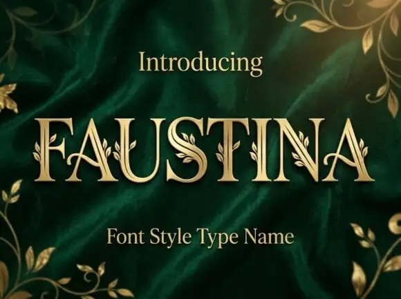
Fine serif capitals with small leaf sprigs attached along stems and curves
Faustina sets gold serif capitals on green velvet and grows gold vines across the strokes, so leaves and buds climb out of the letters instead of sitting beside them.
Ideas for this font
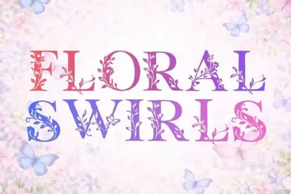
High-contrast serif capitals with fine leafy stems attached to their strokes
Floral Swirls replaces the stems of serif capitals with climbing vines: leaves, tendrils and small blossoms grow out of every letter, and a gradient runs from red at the left to blue at the right.
Ideas for this font

Soft scalloped capitals with pointed leaf-like peaks and small dark leaf motifs
Cannabis sets green capitals on yellow, where rounded scalloped edges form cloud-like strokes, the A shapes rise into tall pointed leaf-like peaks, small dark leaf silhouettes sit inside several counters and a separate large leaf floats below the name above a rougher caption line.
Ideas for this font
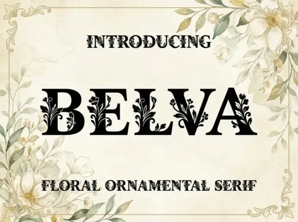
High-contrast serif capitals with small solid leafy branches attached near their lower strokes
Belva is a heavy serif display face whose stems are drawn as ornamental carving: leaves, buds and thin curling tendrils grow out of the letters and fill the counters, so a word looks engraved rather than set.
Ideas for this font
Same independent foundry
Allow optional Google Analytics to measure visits and catalogue actions. Your search words and notes are not included. Privacy & storage