Neutral Sans Workhorse

Cannabis + Helina
Lets Cannabis own the focal silhouette while handling secondary copy, sizing and subheads cleanly.
Inspect Helina specimenDisclosure: MakerFileHub may earn a commission from qualifying purchases via paid links on this page. How our links work.
Soft scalloped capitals with pointed leaf-like peaks and small dark leaf motifs
Cannabis sets green capitals on yellow, where rounded scalloped edges form cloud-like strokes, the A shapes rise into tall pointed leaf-like peaks, small dark leaf silhouettes sit inside several counters and a separate large leaf floats below the name above a rougher caption line.
Paid link
Get this fontProject & layout blueprintsAt-a-glance maker compatibility
Sturdy stroke walls and open counters weed cleanly on adhesive vinyl, HTV apparel film, and cut cardstock.
Visual anatomy & craft review
The bodies stay broad, the outlines scallop rather than sit smooth, the A peaks sharpen and the counters carry small silhouettes. That scalloped contour is the character: the word reads as a soft cloud form interrupted by pointed leaves, which is why the sample needs a flat bright ground. Colour and shading are styling, and the standalone leaf may not ship with the type. Keep 44 pt so the scallops stay distinct, confirm the leaf artwork separately and proof at a reduced size where the serrations can close.
Soft scalloped capitals with pointed leaf-like peaks and small dark leaf motifs
Two-font hierarchy recipes
Tested contrast partners — pairing Cannabis with grounded secondary typography.
Cannabis + Helina
Lets Cannabis own the focal silhouette while handling secondary copy, sizing and subheads cleanly.
Inspect Helina specimen
Cannabis + The Bilstein Editorial
Grounds bold display lettering with classic typographic authority on posters, badges and apparel.
Inspect The Bilstein Editorial specimenPractical applications
Concrete hierarchy, scale and production guidance tailored to Cannabis’s stroke geometry.
The scalloped letters give a small shop a soft, decorative mark, and the leaf peaks carry the theme without an added illustration.
Hierarchy & layout recipe
Print a 60 by 90 mm label: set the shop name at 22 pt on one row, keep 10 mm of clear ground beneath before the town at 7 pt, and keep 6 mm to the die edge so the scallops are not clipped.
Pre-production check
Serrated edges close under 18 pt; check the plate proof and hold the name at 20 pt or above.
The soft cloud forms read across a market counter, and the sharp leaf peaks give a short name a clear silhouette from a distance.
Hierarchy & layout recipe
Print a 600 by 300 mm board: set the stall name at 56 mm on one row, keep 22 mm of clear ground beneath before the prices at 15 pt, and keep 26 mm of border all round.
Pre-production check
The separate leaf may not be part of the font file; check the download before planning it.
The rounded scalloped forms suit a playful themed poster, where the lettering is the illustration and nothing else is needed.
Hierarchy & layout recipe
Print an A2 poster: set the title at 92 pt on one row, keep 28 mm of clear ground beneath before the details at 16 pt, and keep 26 mm of border so the peaks stay inside.
Pre-production check
Shading in the cover is styling; check the file before planning a two-tone print of the poster.
Technical & licence verification
Confirm included OTF/TTF/WOFF formats, full glyph tables and licence coverage on the live store page before batch production.
Closest visual alternatives
Matched across letterform anatomy, stroke behaviour and craft applications.
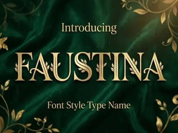
Fine serif capitals with small leaf sprigs attached along stems and curves
Faustina sets gold serif capitals on green velvet and grows gold vines across the strokes, so leaves and buds climb out of the letters instead of sitting beside them.
Ideas for this font
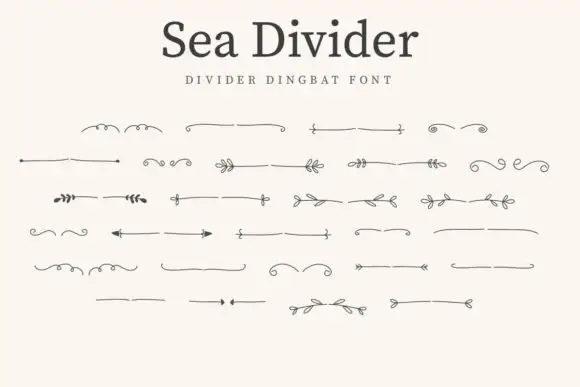
Hairline divider dingbats
Sea Divider is a dingbat set of hairline dividers in graphite on an off-white sheet: each glyph a horizontal rule with a small device at its centre or ends, including leaves, curls, opposed arrows and paired tips, arranged in five rows beneath a plain title and a tracked subtitle.
Ideas for this font
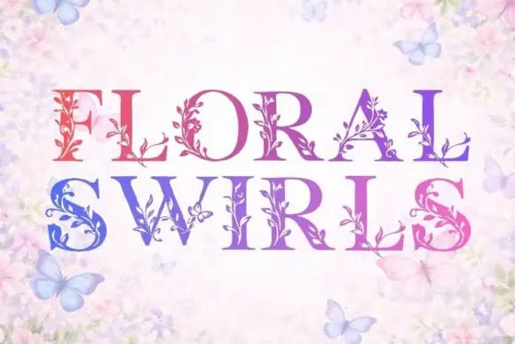
High-contrast serif capitals with fine leafy stems attached to their strokes
Floral Swirls replaces the stems of serif capitals with climbing vines: leaves, tendrils and small blossoms grow out of every letter, and a gradient runs from red at the left to blue at the right.
Ideas for this font
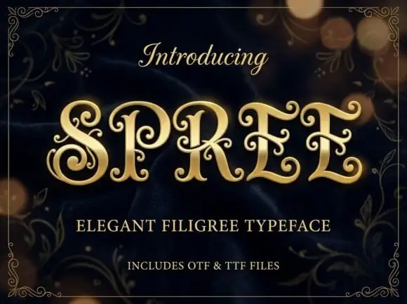
Filigree spiral display
Spree is an ornate display in gold on a dark bokeh ground: high-contrast capitals with long inward spirals, curled terminal extensions and fine filigree inside the bowls, set as one word between a script introducing line and two plain lines naming the style and the formats, all inside a fine ornamental frame.
Ideas for this font
Allow optional Google Analytics to measure visits and catalogue actions. Your search words and notes are not included. Privacy & storage