Editorial Serif Anchor

Marginale + Auretha
Anchors Marginale's fluid strokes with crisp Roman proportions on wedding suites, headers and packaging.
Inspect Auretha specimenDisclosure: MakerFileHub may earn a commission from qualifying purchases via paid links on this page. How our links work.
High-contrast calligraphy
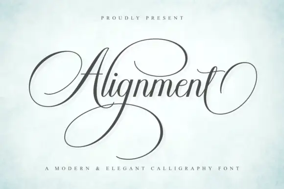
Marginale is a high-contrast calligraphy script in black on a soft floral ground: a looped capital with a long terminal sweep, fine connecting hairlines, tall ascenders and wide descenders, set as one word with a small presenting line above and a tracked descriptor beneath.
Paid link
Get this fontProject & layout blueprintsAt-a-glance maker compatibility
Weld or Unite overlapping script joins into one continuous vector path before sending to the blade.
Visual anatomy & craft review
The plate is a soft mock-up with a pen nib in the frame, and the type is set large enough that the hairlines are visible, which is the honest way to present a calligraphic face. The drawing has a looped capital and a long terminal sweep, so the word reads as written with a pointed pen rather than as a digital script, and the wide descenders mean the face needs generous leading. That construction sets a moderate size floor, because the connecting hairlines break first. The presenting line and the descriptor are product copy. It suits an invitation, a label and a cover for a wedding or an editorial subject, and it should never be set in all caps or long lines.
Script, calligraphy, elegant, wedding
Two-font hierarchy recipes
Tested contrast partners — pairing Marginale with grounded secondary typography.
Marginale + Auretha
Anchors Marginale's fluid strokes with crisp Roman proportions on wedding suites, headers and packaging.
Inspect Auretha specimen
Marginale + Furion
Keeps small-scale dates, URLs, nutrition facts and care instructions crisp and legible below script titles.
Inspect Furion specimenPractical applications
Concrete hierarchy, scale and production guidance tailored to Marginale’s stroke geometry.
A calligraphic script reads as a written invitation, and the long terminal gives the names a finish that a digital script cannot.
Hierarchy & layout recipe
A5 invitation: the names at 32 pt, the request in a 9.5 pt serif, and the date at 8.5 pt caps. Keep 26 mm margins and letterpress one ink on a heavy, smooth card.
Pre-production check
Check the 32 pt names in letterpress, where a hairline can sink; proof the plate first. Confirm the request reads at arm's length and that the terminal clears the trim.
A calligraphic label reads as a personal house, and the fine hairlines hold on a coated carton where a textured board would break them.
Hierarchy & layout recipe
Print a 50 by 85 mm label: the house at 13 pt, the scent at 8 pt, and the volume at 7 pt. Keep 5 mm inside the die and keep the hairlines above 0.3 mm.
Pre-production check
Check the 13 pt house on the carton, where a hairline can fill; keep it above 0.3 mm. Confirm the 7 pt volume reads on the shelf and that the label clears the fold.
A calligraphy cover reads as a literary title, and the looped capital gives a short word a shape at display size. It frames a literary cover.
Hierarchy & layout recipe
Set the title at 70 mm x-height across 180 mm, the author in an 11 pt serif, and the imprint at 8 pt. Print two colours on a coated stock and keep 22 mm margins.
Pre-production check
Check the title at 70 mm, where a hairline can break; keep it above 0.25 mm. Confirm the 8 pt imprint survives lamination and that the descenders clear the trim.
Technical & licence verification
Confirm included OTF/TTF/WOFF formats, full glyph tables and licence coverage on the live store page before batch production.
Closest visual alternatives
Matched across letterform anatomy, stroke behaviour and craft applications.

Very slanted calligraphy with broad lower sweeps and fine hairlines
Silken Luxe is a formal calligraphy script with a steep slant, broad lower sweeps and hairlines that thin almost to nothing, drawn so two words build an ornamental diagonal across the plate.
Ideas for this font
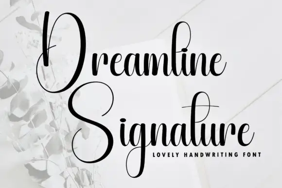
Tall narrow contrast calligraphy with double-height capitals
Dreamline is tall narrow calligraphy in which each word opens with a capital drawn at double the x-height, with fine joins and a small tightly packed lowercase beneath it.
Ideas for this font

Modern copperplate calligraphy with overhead swash loops and thick-thin contrast
Bunglon is a modern copperplate script in which the downstrokes carry weight, the hairlines stay fine and generous swashes arch above the x-height and below the baseline, so a single name reads as formal calligraphy.
Ideas for this font
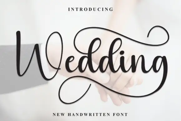
Looped script with a deep returning tail
Wedding is a looped script in black over a pale photograph: wide bowls, tall capitals with full loops, and a tail from the final letter that drops into a deep loop beneath the word before lifting.
Ideas for this font
Same independent foundry
Allow optional Google Analytics to measure visits and catalogue actions. Your search words and notes are not included. Privacy & storage