Neutral Sans Workhorse

Retro Fancy Dot + Bareum
Lets Retro Fancy Dot own the focal silhouette while handling secondary copy, sizing and subheads cleanly.
Inspect Bareum specimenDisclosure: MakerFileHub may earn a commission from qualifying purchases via paid links on this page. How our links work.
Dotted puffy display
Retro Fancy Dot is a puffy display in coral, teal, orange, pink and violet on a pale ruled ground: irregular fat capitals with small pale dots following the strokes inside each letter, set in three staggered lines with a small studio mark above and dots scattered around.
Paid link
Get this fontProject & layout blueprintsAt-a-glance maker compatibility
Sturdy stroke walls and open counters weed cleanly on adhesive vinyl, HTV apparel film, and cut cardstock.
Visual anatomy & craft review
The plate sets three short words in three colours and lets the dots do the work: every letter is a fat, slightly irregular shape with a line of pale dots running inside it, so the block reads as a set of cookies or tiles rather than as typesetting. That construction sets a large size floor, because the dots close when the letters shrink, and the staggered rows give the composition a handmade bounce. The ruled ground and the scattered dots are staging, and the small mark above is a studio badge. Because the letters are fat and decorated, the face suits a party card, a shirt and a sign for a young audience, and the plate is honest about the limits by setting three short words only.
Decorative, playful, puffy, dotted
Two-font hierarchy recipes
Tested contrast partners — pairing Retro Fancy Dot with grounded secondary typography.
Retro Fancy Dot + Bareum
Lets Retro Fancy Dot own the focal silhouette while handling secondary copy, sizing and subheads cleanly.
Inspect Bareum specimen
Retro Fancy Dot + Rosemode
Grounds bold display lettering with classic typographic authority on posters, badges and apparel.
Inspect Rosemode specimenPractical applications
Concrete hierarchy, scale and production guidance tailored to Retro Fancy Dot’s stroke geometry.
A puffy dotted face sets a child's card in one go, and the pastel palette prints at home without a registration problem.
Hierarchy & layout recipe
A6 card: the greeting at 28 pt, the details in a 10 pt sans, and the date at 9 pt. Keep 15 mm margins and print four colours on a white card. Leave 14 mm at the foot for the time and the address line.
Pre-production check
Check the 28 pt greeting at home-print resolution, where a dot can close; keep it above 1.2 mm. Confirm the 10 pt details keep a 4.5:1 contrast and that the card folds flat.
A puffy display prints as a costume piece, and the pale dots read against a coloured shirt rather than merging. It prints as party kit.
Hierarchy & layout recipe
Print a 240 mm chest graphic: the name at 55 mm cap height, the age at 26 mm, and four inks on a light shirt. Keep the smallest dot at 3 mm and place the graphic 80 mm below the collar.
Pre-production check
Check the screen at actual mesh, where a 3 mm dot can fill; enlarge it to 4 mm. Wash-test one shirt and confirm the dots stay distinct after five cycles.
A dotted display makes a table banner, and the fat letters read at arm's length across a cake table. It reads across a table.
Hierarchy & layout recipe
Print a 600 by 150 mm banner: the name at 45 mm cap height, the age at 18 mm, and four colours on a card stock. Keep 15 mm margins and punch two holes clear of the dots.
Pre-production check
Check the banner at 45 mm, where a dot can reach the punched hole; keep 8 mm clearance. Confirm the name reads at two metres and that the banner hangs level.
Technical & licence verification
Confirm included OTF/TTF/WOFF formats, full glyph tables and licence coverage on the live store page before batch production.
Closest visual alternatives
Matched across letterform anatomy, stroke behaviour and craft applications.
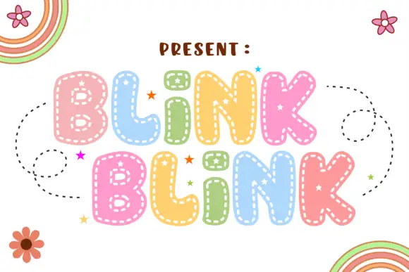
Soft rounded letters with dashed inner borders and small star-shaped openings
Blink Blink stacks two rounded words in pastel colour, traces each letter with a dotty inner line and sprinkles small stars on the fills, with dashed swirls and cartoon flowers around the block.
Ideas for this font
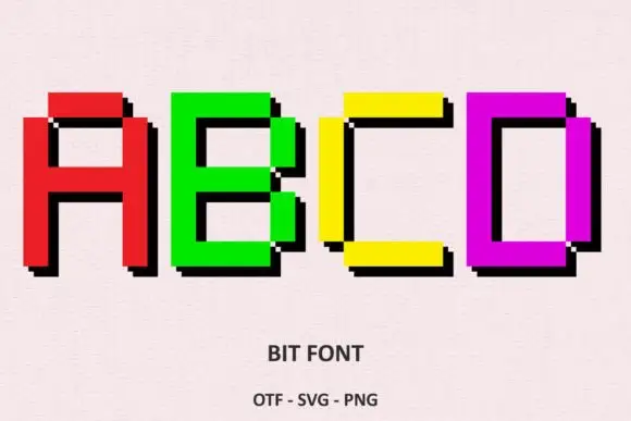
Bright rectangular pixel-style capitals with hard black offset shadows
Bit Font draws heavy capitals on a coarse pixel grid, gives each letter a solid colour, and steps a black shadow one block to the right so every word looks extruded by two rows of pixels.
Ideas for this font
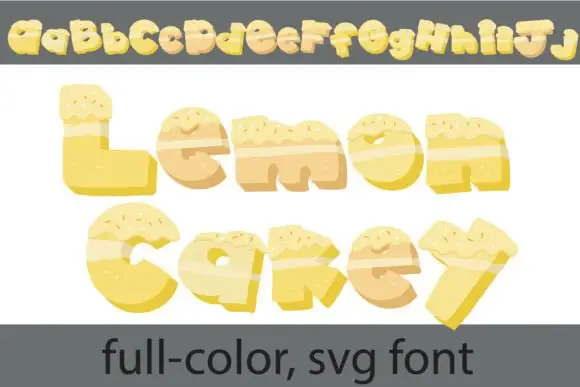
Cake-textured lettering
Lemon Cakey is a colour font on a white ground: irregular yellow letters built like slices of cake, with pale frosting across the top, small sprinkles and darker shaded sides, shown once as a full alphabet row at the head and then as two large words with a plain footer naming the format.
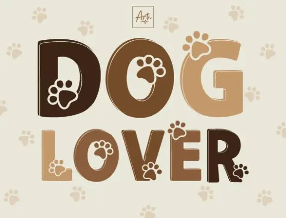
Heavy rounded capitals with paw-shaped details overlapping counters and outer edges
Dog Lover draws heavy rounded capitals in four shades of brown and cuts a paw print out of each letter, with a pale paw pattern repeating on the ground behind the words.
Same independent foundry
Allow optional Google Analytics to measure visits and catalogue actions. Your search words and notes are not included. Privacy & storage