Neutral Sans Workhorse

Lemon Cakey + Monure
Lets Lemon Cakey own the focal silhouette while handling secondary copy, sizing and subheads cleanly.
Inspect Monure specimenDisclosure: MakerFileHub may earn a commission from qualifying purchases via paid links on this page. How our links work.
Cake-textured lettering
Lemon Cakey is a colour font on a white ground: irregular yellow letters built like slices of cake, with pale frosting across the top, small sprinkles and darker shaded sides, shown once as a full alphabet row at the head and then as two large words with a plain footer naming the format.
Paid link
Get this fontProject & layout blueprintsAt-a-glance maker compatibility
Cut solid base, outline, and shadow layers in separate vinyl colors and align on registration marks.
Visual anatomy & craft review
The plate is a colour-font sheet, and the alphabet row at the head is the practical part: it shows the whole set at a size where the frosting and the crumbs can be judged before the display words are read. Each letter is drawn as a cake slice with a frosted top and a shaded side, so the word reads as a row of objects rather than as type, and the irregular heights give it a hand-made feel. That construction sets a large size floor, because the sprinkles and the frosting edge close first. The footer is product copy. It suits a bakery card, a party invitation and a shirt, and it is a device for a short word rather than a face for a menu.
Decorative, cake, texture, playful
Two-font hierarchy recipes
Tested contrast partners — pairing Lemon Cakey with grounded secondary typography.
Lemon Cakey + Monure
Lets Lemon Cakey own the focal silhouette while handling secondary copy, sizing and subheads cleanly.
Inspect Monure specimen
Lemon Cakey + Medvilea Editorial
Grounds bold display lettering with classic typographic authority on posters, badges and apparel.
Inspect Medvilea Editorial specimenPractical applications
Concrete hierarchy, scale and production guidance tailored to Lemon Cakey’s stroke geometry.
A cake display names the theme in the lettering, and the shaded sides give a small card real depth without a photograph.
Hierarchy & layout recipe
A6 card: the greeting at 30 pt, the details in a 10 pt sans, and the date at 9 pt. Keep 15 mm margins, print four colours on a white card and leave 12 mm at the foot for the address.
Pre-production check
Check the 30 pt greeting at home-print resolution, where a sprinkle closes; keep it above 1.2 mm. Confirm the details read at arm's length and that the card folds flat.
A cake label reads as a bakery, and the frosted tops hold on a small die where a fine face would look ordinary. It reads as a home bakery.
Hierarchy & layout recipe
Print a 55 by 80 mm label: the bakery at 12 pt, the product at 8 pt, and the weight at 7 pt. Keep 5 mm inside the die and simplify the frosting below 16 pt.
Pre-production check
Check the 12 pt bakery on a small die, where the frosting fills; use the plain cut there. Confirm the 8 pt product reads at arm's length and that the label takes a fold.
A cake display prints as sale kit, and the saturated yellow reads on a light shirt where a pale face would look washed out.
Hierarchy & layout recipe
Print a 240 mm chest graphic: the sale at 50 mm cap height, the year at 24 mm, and four inks on a light shirt. Keep the smallest sprinkle at 3 mm and place the graphic 80 mm below the collar.
Pre-production check
Check the screen at actual mesh, where a 3 mm sprinkle can fill; enlarge it to 4 mm. Wash-test one shirt and confirm the shading stays clean after five cycles.
Technical & licence verification
Confirm included OTF/TTF/WOFF formats, full glyph tables and licence coverage on the live store page before batch production.
Closest visual alternatives
Matched across letterform anatomy, stroke behaviour and craft applications.
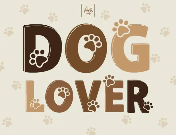
Heavy rounded capitals with paw-shaped details overlapping counters and outer edges
Dog Lover draws heavy rounded capitals in four shades of brown and cuts a paw print out of each letter, with a pale paw pattern repeating on the ground behind the words.
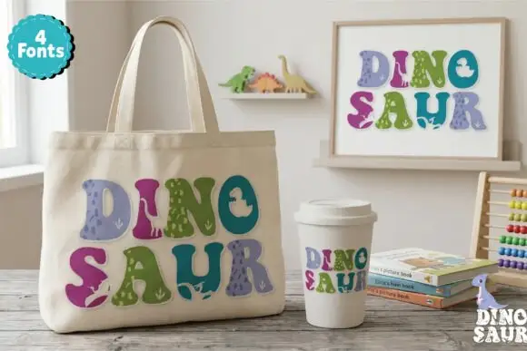
Soft chunky multicolour forms with small dinosaur-like silhouettes
Dinosaur Profonts fills chunky pastel capitals with dinosaur-skin textures, from scales to smooth hide, and sells four versions of the same alphabet so one word can mix four patterns.
Ideas for this font
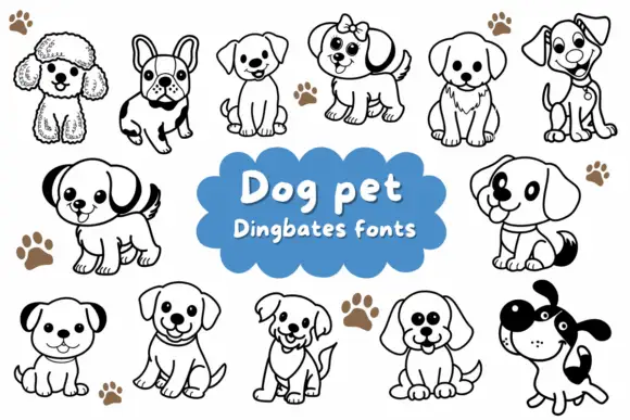
Rounded puppy outlines with dark ears, collars and varied facial expressions
Dog Pet is a typable set of about fifteen puppies — a poodle, a French bulldog, a spaniel, a terrier, a labrador, a dalmatian — drawn in a bold outline with a few patches solid black.
Ideas for this font
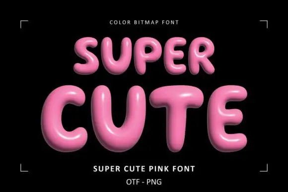
Glossy pink rounded display
Super Cute Font is a colour display on a black ground: glossy pink rounded capitals with soft highlights, dark shaded undersides and a slight taper, set in two lines inside small corner brackets, with a small note above and two plain lines beneath naming the style and the formats.
Ideas for this font
Same independent foundry
Allow optional Google Analytics to measure visits and catalogue actions. Your search words and notes are not included. Privacy & storage