High-Contrast Display Serif

Prime Academy + Stanza
Pairs sculptural editorial warmth with Prime Academy's clean modern geometry.
Inspect Stanza specimenDisclosure: MakerFileHub may earn a commission from qualifying purchases via paid links on this page. How our links work.
Vintage serif, script and sans trio
Prime Academy is a trio of a high-contrast display serif, a formal monoline script and a plain sans, presented in cream on a dark scene of an old typewriter and books.
Paid link
Get this fontProject & layout blueprintsAt-a-glance maker compatibility
Fine grain and micro-texture excel in 300 DPI print, sublimation, and screen print rather than small vinyl weeding.
Visual anatomy & craft review
Prime is set in a high-contrast display serif with sharp angled terminals, Academy follows in a formal monoline script whose capitals open into wide loops and whose connections are thin, and Font Collection is set in a plain sans that carries the functional line. The three voices are deliberately separated: the serif for the name, the script for the sub-line, the sans for anything that must simply be read, and each is shown at a size that suits it. The ground is a dark photograph of a vintage typewriter with paper and spectacles, and the copy below explains the trio in a fourth setting of the same serif. The point of the bundle is that a small institutional brand can cover an academic or heritage identity in one purchase, provided the three roles are kept distinct.
A library trio of serif, script and sans
Two-font hierarchy recipes
Tested contrast partners — pairing Prime Academy with grounded secondary typography.
Prime Academy + Stanza
Pairs sculptural editorial warmth with Prime Academy's clean modern geometry.
Inspect Stanza specimen
Prime Academy + Hailey
Introduces organic movement on pull-quotes, signatures and gift tags.
Inspect Hailey specimenPractical applications
Concrete hierarchy, scale and production guidance tailored to Prime Academy’s stroke geometry.
Three roles in one purchase let a magazine cover carry a title, a subtitle and a contents line without the risk of a fourth family creeping into the design.
Hierarchy & layout recipe
Print a 210 by 297 mm cover: set the title at 64 pt in the serif, set the subtitle at 30 pt in the script beneath with 16 mm of clear ground, and hold 18 mm of margin on all sides.
Pre-production check
Script and serif at similar weights can look like one muddled line; print one cover and check the two read as separate voices before the run.
A serif with a formal script reads as an old library rather than a party, which is what a wedding in a college chapel needs.
Hierarchy & layout recipe
Print a 130 by 180 mm invitation: set the names at 30 pt in the script, set the venue at 9.5 pt in the serif beneath with 18 mm of clear ground, and hold 15 mm of margin.
Pre-production check
The fine script hairlines can vanish on uncoated card; print one invitation on the intended stock and check a connector before the suite.
The trio gives a small academic business a name, a line and a functional voice, which is the whole of a modest identity.
Hierarchy & layout recipe
Print an 85 by 55 mm card: set the studio name at 16 pt in the serif, set the line beneath at 7 pt in the sans with 6 mm of clear ground, and hold 5 mm of margin on all sides.
Pre-production check
Three typefaces on one small card can crowd; print one card at the real size and check each voice is legible before the order.
Technical & licence verification
Confirm included OTF/TTF/WOFF formats, full glyph tables and licence coverage on the live store page before batch production.
Closest visual alternatives
Matched across letterform anatomy, stroke behaviour and craft applications.
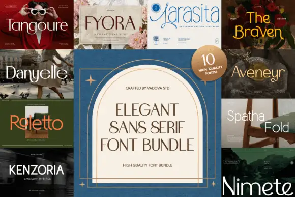
A multi-panel comparison of light, narrow and curving sans display directions
Elegant Sans Serif Font Bundle gathers ten separate sans covers around a central panel, each in a different register from a wide light luxury face to a bold condensed grotesque, and sells them together.
Ideas for this font
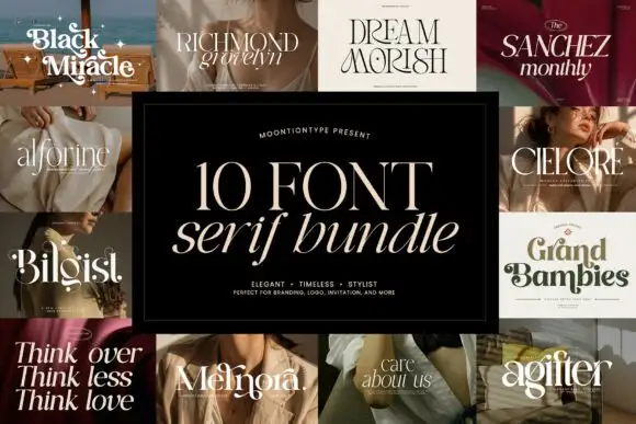
Collage of fine serif titles and heavier curled name forms
Elegant Serif Bundle sets a pale title on a black central panel beneath a slanted serif line, surrounded by ten panels, from Black Miracle, Richmond Grovelyn and Dream Morish through Alforine, Sanchez Monthly, Cielore, Bilgist, Grand Bambies and Melnora to Agilter, where the names range from delicate tall capitals to substantial rounded titles.
Ideas for this font
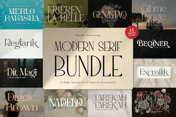
Fifteen-cut serif bundle
Modern Serif Style is a fifteen-font serif bundle shown as a wall of covers: each of the fifteen faces appears in a tile with its own name set in itself, ranging from thin didones to warm text serifs, with the bundle name centred over the grid on a cream panel.
Ideas for this font
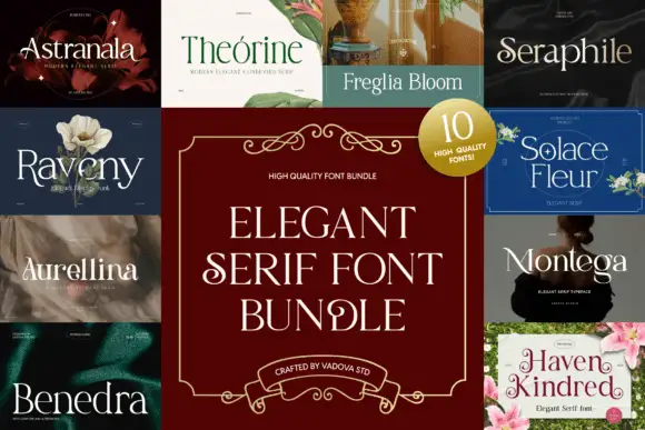
Collage of light serif titles with varied curled entries
Elegant Serif Bundle sets a pale serif title inside a burgundy ornamental frame, surrounded by ten panels, from Astranala, Théorine, Freglia Bloom and Seraphile through Raveny, Solace Fleur, Aurellina, Montega and Benedra to Haven Kindred, where light upright names alternate with large looping initials.
Same independent foundry
Allow optional Google Analytics to measure visits and catalogue actions. Your search words and notes are not included. Privacy & storage