High-Contrast Display Serif

Pretty Summer + Amor Hadena
Pairs sculptural editorial warmth with Pretty Summer's clean modern geometry.
Inspect Amor Hadena specimenDisclosure: MakerFileHub may earn a commission from qualifying purchases via paid links on this page. How our links work.
Narrow playful capitals above long connected script
Pretty Summer is a duo with a warm citrus palette: narrow playful capitals with a few decorated letters, and a long connected script beneath, framed by drawn orange slices.
Paid link
Get this fontProject & layout blueprintsAt-a-glance maker compatibility
Set Cricut or Silhouette operation to Pen, Foil Quill, or Laser Score — not Basic Blade Cut.
Visual anatomy & craft review
THIS and PRETTY run on one line in narrow capitals, and each letter is drawn with a quirky detail: the T has a slanted crossbar, the I is a plain stem, the S is a narrow curve and the R carries a small tail, while the Y and the P are wider than the rest so the row has an uneven rhythm. summer follows beneath in a long connected script with tight monotone loops, and it is set lower so the two rows read as a stacked pair rather than a sentence. The colours are green and orange on cream, drawn orange halves frame the top and bottom edges, and two captions name the pair. The duo is a cheerful summer combination for cards, packaging and event material: the capitals carry a word at a distance, the script carries a personal line, and the citrus palette keeps a small run affordable.
A narrow capital duo with a long script
Two-font hierarchy recipes
Tested contrast partners — pairing Pretty Summer with grounded secondary typography.
Pretty Summer + Amor Hadena
Pairs sculptural editorial warmth with Pretty Summer's clean modern geometry.
Inspect Amor Hadena specimen
Pretty Summer + Farmhouse
Introduces organic movement on pull-quotes, signatures and gift tags.
Inspect Farmhouse specimenPractical applications
Concrete hierarchy, scale and production guidance tailored to Pretty Summer’s stroke geometry.
A green and orange pair reads in sunlight, and the drawn orange halves mean the board is decorated without a second print.
Hierarchy & layout recipe
Print a 500 by 300 mm board: set the stall name at 80 pt in the capitals, set the line at 26 pt in the script with 20 mm of clear ground, and hold 20 mm of border on all sides.
Pre-production check
Orange on a printed board shifts red in direct sun; print one at the final size and check the ink before the set.
The citrus palette and the long script set a warm tone, and one card carries both the greeting and the name without another element.
Hierarchy & layout recipe
Print a 120 by 120 mm square card: set the greeting at 32 pt in the capitals, set the name at 18 pt in the script with 14 mm of clear ground, and hold 12 mm of margin.
Pre-production check
Narrow capitals at 32 pt can look cramped; print one card at the finished size and check the spacing before the batch.
A citrus palette on a bottle says the flavour before the label is read, and the narrow capitals fit a long product name on a small label.
Hierarchy & layout recipe
Print a 50 by 75 mm label: set the product at 14 pt in the capitals, set the flavour at 9 pt in the script with 5 mm of clear ground, and hold 4 mm of margin.
Pre-production check
The narrow capitals can close up at bottle size; print one on the real stock and check the R and the S before the order.
Technical & licence verification
Confirm included OTF/TTF/WOFF formats, full glyph tables and licence coverage on the live store page before batch production.
Closest visual alternatives
Matched across letterform anatomy, stroke behaviour and craft applications.
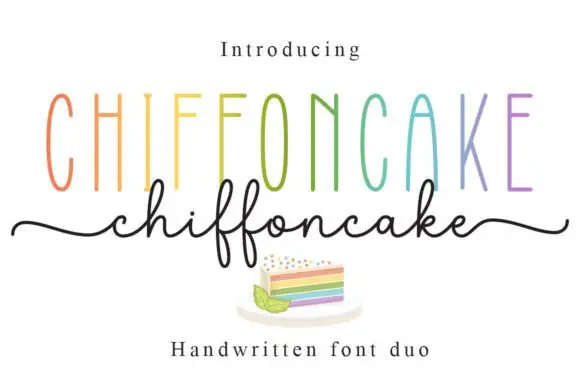
Tall narrow sans and fine looping script duo
Chiffoncake Duo pairs very tall narrow capitals, each in a different pastel tone, with a low connected script whose deep f loops drop below the baseline, and long tails extend from both sides of the lower word above a small cake illustration.
Ideas for this font
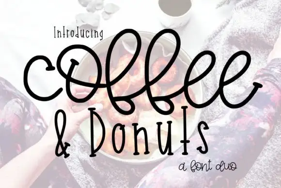
Large looping connected script paired with narrow upright letters
Coffee and Donuts pairs a large looping connected script with narrow upright letters, so a menu can carry a warm written heading and a tight printed list in the same ink.
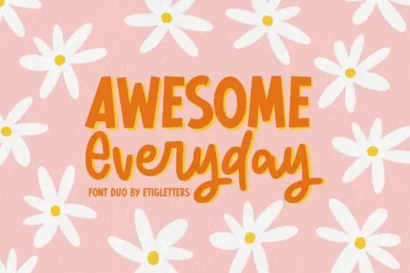
Irregular upright capitals paired with connected rounded script and long y loops
Awesome Everyday Duo places a capital row with thick narrow stems and uneven top edges above a connected rounded script whose y descenders drop into large lower loops and whose capital E begins with an open curl.
Ideas for this font
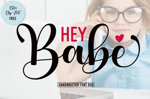
Heavy looping script paired with a smaller rounded sans in capitals
Hey Babe is a duo of a heavy looping script with tall capitals and a smaller rounded sans, arranged so a bold script line carries the design and the sans supplies the second voice.
Ideas for this font
Same independent foundry
Allow optional Google Analytics to measure visits and catalogue actions. Your search words and notes are not included. Privacy & storage