Editorial Serif Anchor

Bold Dream + The Lumina Awesome
Anchors Bold Dream's fluid strokes with crisp Roman proportions on wedding suites, headers and packaging.
Inspect The Lumina Awesome specimenDisclosure: MakerFileHub may earn a commission from qualifying purchases via paid links on this page. How our links work.
Heavy uneven capitals with a looped B, bulbous M and projecting crossbars
Bold Dream is a heavy hand-lettered capital set in which the strokes lean at slightly different angles, the B loops, the M builds deep soft arches and the A pushes its crossbar out, so a stacked phrase reads as written with a fat marker.
Paid link
Get this fontProject & layout blueprintsAt-a-glance maker compatibility
Weld or Unite overlapping script joins into one continuous vector path before sending to the blade.
Visual anatomy & craft review
The B lifts a closed loop above two round bowls, the M rises from three deep arches, the D and O keep narrow oval counters and the A sends a low crossbar past both stems, all at a marker weight with rounded ends and a rhythm that shifts letter to letter. The uneven stance is the character: no two stems lean alike, which is why the sample stacks two short rows on a plain field. Because the letters are wide, the face needs generous leading at 30 pt and above, and it welds for cutting from 1.1 inches of x-height. The stars, the pale pink ground and the small caption are presentation; the black marker capitals are the face.
Heavy · Uneven · Rounded
Two-font hierarchy recipes
Tested contrast partners — pairing Bold Dream with grounded secondary typography.
Bold Dream + The Lumina Awesome
Anchors Bold Dream's fluid strokes with crisp Roman proportions on wedding suites, headers and packaging.
Inspect The Lumina Awesome specimen
Bold Dream + Bargain Condensed
Keeps small-scale dates, URLs, nutrition facts and care instructions crisp and legible below script titles.
Inspect Bargain Condensed specimenPractical applications
Concrete hierarchy, scale and production guidance tailored to Bold Dream’s stroke geometry.
The uneven marker caps feel hand-made, and the heavy strokes stay clear at 40 pt stacked on a small card printed in one ink on a plain ground.
Hierarchy & layout recipe
Print an A6 card: set the greeting at 40 pt stacked, keep 16 mm between the rows so the wide bowls do not touch, and set the name in a 12 pt sans beneath.
Pre-production check
Wide uneven capitals printed on tight leading collide at the shoulders; check the card and open the gap by 4 mm.
The chunky capitals cut into flags, and the even weight keeps a two-word phrase readable at 45 mm on a printed pennant strung across a garden.
Hierarchy & layout recipe
Cut an A4 flag set: set one word per flag at 45 mm, keep 8 mm of card around every stroke, and thread the string through 4 mm holes 6 mm from the top edge.
Pre-production check
A hole punched near a rounded stroke tears the flag; check the pennant and move the hole 4 mm away.
The marker caps suit a chalk-style label, and the heavy strokes hold at 18 pt on a 60 mm paper label where a fine serif would blur in print.
Hierarchy & layout recipe
Print a 60 by 40 mm label: set the words at 18 pt, keep 5 mm of border so the wide arches stay whole, and set the price in a 9 pt sans at the right edge.
Pre-production check
A heavy cap printed at 12 pt closes its oval counters; check the label and keep the words at 16 pt or above.
Technical & licence verification
Confirm included OTF/TTF/WOFF formats, full glyph tables and licence coverage on the live store page before batch production.
Closest visual alternatives
Matched across letterform anatomy, stroke behaviour and craft applications.
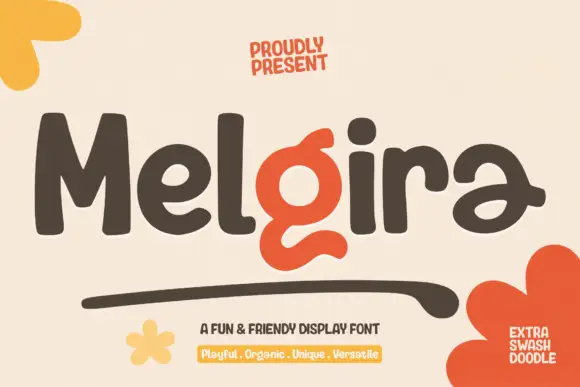
Heavy rounded display sans with a swash accent
Melgira draws a wide black rounded alphabet and then breaks its own rhythm with a lower-case pair whose descender swells into a long sweeping underline beneath the word.
Ideas for this font
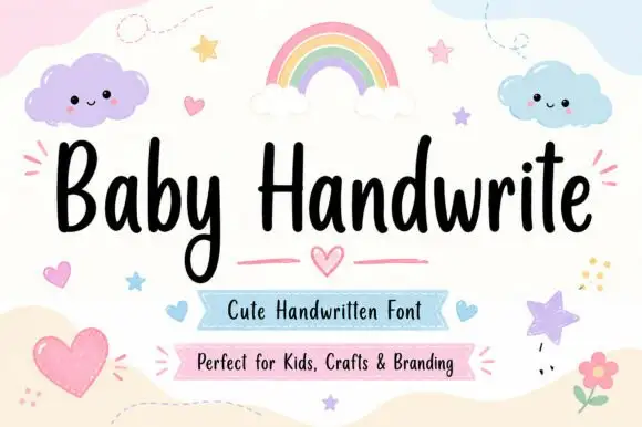
Friendly upright handwriting with a tall x-height
Baby Handwrite is a friendly handwriting face in which the letters stand upright, the x-height stays tall and the strokes round off, so a two-word title reads as something written on a nursery card with a marker.
Ideas for this font
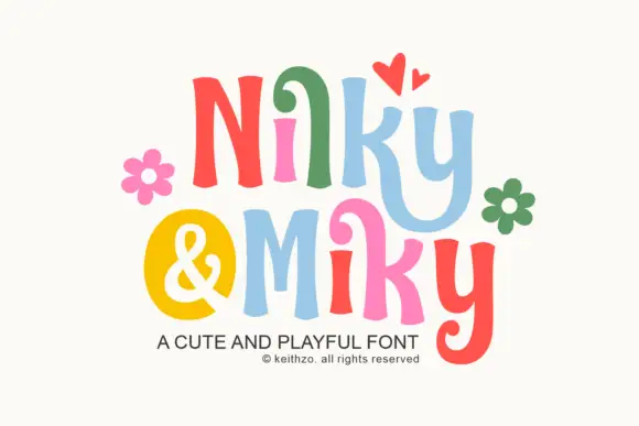
Bouncy curled display print
Nilky and Miky shows separate letters in six colours, each one flared at the ends and slightly tilted, with a curled inner stroke on the k and a deep hook on the y, while a yellow disc holds the ampersand between the two words and flowers and hearts sit around the row.
Ideas for this font
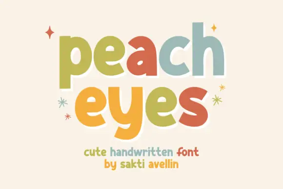
Heavy soft separate lowercase
Peach Eyes is a soft handwritten display in lowercase with fat rounded strokes and a different pastel colour on each letter, shown with drawn sparkles on a cream ground.
Ideas for this font
Same independent foundry
Allow optional Google Analytics to measure visits and catalogue actions. Your search words and notes are not included. Privacy & storage