Editorial Serif Anchor

Key West Script + Askinо
Anchors Key West Script's fluid strokes with crisp Roman proportions on wedding suites, headers and packaging.
Inspect Askinо specimenDisclosure: MakerFileHub may earn a commission from qualifying purchases via paid links on this page. How our links work.
Light large-loop connected script
Key West Script is a light connected script with oversized loops and long horizontal exits, drawn thin enough that the open space between letters reads as part of the word.
Paid link
Get this fontProject & layout blueprintsAt-a-glance maker compatibility
Weld or Unite overlapping script joins into one continuous vector path before sending to the blade.
Visual anatomy & craft review
The K opens with a tall straight stem and a small looped arm that barely leaves it, the W spreads into two shallow valleys that take up a third of the word, and the y drops a descender that swings back up through a wide loop before the next letter starts. Every exit stroke runs long and flat at hairline weight, and the tracking inside the joins is generous, which is what gives the sample its airy, unhurried rhythm. Weight is almost unvarying and very light, so the letterforms depend on the dark ground behind them to be visible at all. The teal palm photograph and the widely tracked caption beneath the word belong to the cover, and the small tracked line above it is a label, not part of the alphabet.
Airy · Looped · Relaxed
Two-font hierarchy recipes
Tested contrast partners — pairing Key West Script with grounded secondary typography.
Key West Script + Askinо
Anchors Key West Script's fluid strokes with crisp Roman proportions on wedding suites, headers and packaging.
Inspect Askinо specimen
Key West Script + Mansory
Keeps small-scale dates, URLs, nutrition facts and care instructions crisp and legible below script titles.
Inspect Mansory specimenPractical applications
Concrete hierarchy, scale and production guidance tailored to Key West Script’s stroke geometry.
A light looped script reads as a relaxed mark rather than a logo, and its long horizontal exits let a two-word name sit on a wide tote panel without extra decoration.
Hierarchy & layout recipe
Set the name at 60 mm wide on the tote panel, hold the loops at least 3 mm clear of the seam, and keep the club's small sans address at 6 mm beneath so the script stays the only decorative element.
Pre-production check
Screen printing on canvas swallows a hairline; ask for a 1.5 mm minimum line or the loops will break up on the first wash.
The script's loops bring the informality a bar menu wants at the top while the hairline weight keeps it from shouting over the drinks list below it.
Hierarchy & layout recipe
Set the header at 36 pt on the top third of an A4 menu, keep the cocktail names in a plain sans at 10 pt with 4 mm of leading, and let the y descender of the header fall into the gap before the first heading.
Pre-production check
Laminate a proof and look at it under bar lighting: the hairline joins vanish at that angle, so the header may need one weight heavier than the specimen suggests.
Large loops and long exits give a small card the feel of a place already decided on, and the airy spacing keeps a long pair of names from crowding a narrow format.
Hierarchy & layout recipe
Set the names at 28 pt on a 100 by 70 mm card, let the final loop release toward the date block without touching it, and keep 8 mm clear at the bottom for the location line in a tracked sans.
Pre-production check
The light weight disappears on textured or recycled card; proof the names on the exact stock, because the loop crossings need the tooth of the paper to hold.
Technical & licence verification
Confirm included OTF/TTF/WOFF formats, full glyph tables and licence coverage on the live store page before batch production.
Closest visual alternatives
Matched across letterform anatomy, stroke behaviour and craft applications.
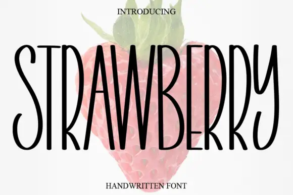
Tall narrow handwritten caps
Strawberry is a tall narrow handwritten face in black over a faded illustration of a strawberry: very condensed capitals with uneven strokes, high ascenders and a light bounce, set as one word with a small serif line above and beneath.
Ideas for this font
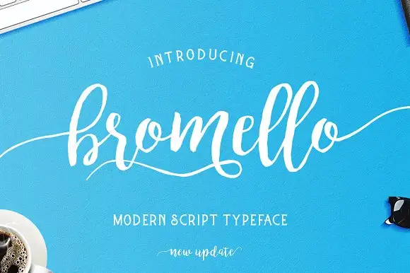
Loose brush script with a light even stroke and long flat entry tails
Bromello is a loose brush script in which the strokes stay light and even, the letters lean forward gently and the entry and exit run out as long flat tails on both sides.
Ideas for this font
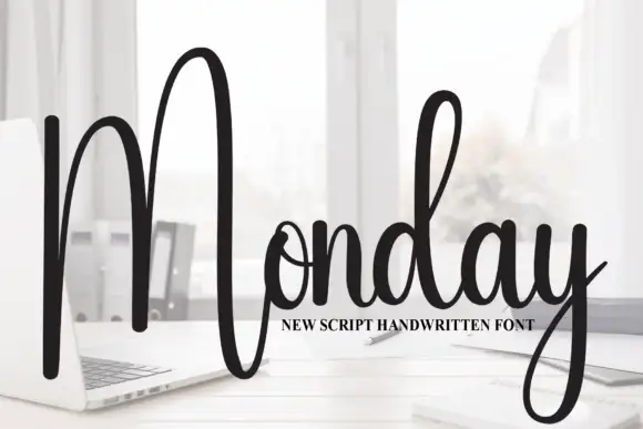
Tall script with an oversized narrow M
Monday is a tall script in black over a photograph of a desk: a very tall narrow capital M drawn as two long strokes with a shallow valley between, a compact connected body and a y whose descender curls below the word.
Ideas for this font
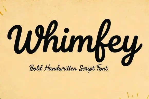
Bold handwritten script
Whimfey is a bold handwritten script in black on aged yellow paper: fat even strokes, a high x-height, short ascenders and a tight rhythm that reads as a confident everyday hand.
Ideas for this font
Allow optional Google Analytics to measure visits and catalogue actions. Your search words and notes are not included. Privacy & storage