Modern Grotesque Body

Oddly Christmas + Base Edge
Creates crisp high-hierarchy contrast beneath Oddly Christmas headlines across menus, websites and labels.
Inspect Base Edge specimenDisclosure: MakerFileHub may earn a commission from qualifying purchases via paid links on this page. How our links work.
Swash display with ornamental flourishes
Oddly Christmas is a swash display in deep red on cream: a high-contrast face with long curled swashes that leave the first and last letters, loop over the block and return beneath it, small four-point stars between the words, and a green attribution line at the foot.
Paid link
Get this fontProject & layout blueprintsAt-a-glance maker compatibility
Sturdy stroke walls and open counters weed cleanly on adhesive vinyl, HTV apparel film, and cut cardstock.
Visual anatomy & craft review
The two words are stacked and the drawing is a festive display with flourishes built into the skeleton: the swashes start at the terminals and travel across the plate, so the lettering reads as one drawn composition rather than two lines. The contrast is high, the serifs are small, and the curves carry the weight, which is what gives the block its seasonal formality. Because the flourishes need room, the face works at large sizes, and the specimen sets it across the plate with the stars filling the gaps. The palette is two inks, and the green attribution at the foot is the only element outside the red, which keeps the composition controlled.
Decorative, swash, festive, ornate
Two-font hierarchy recipes
Tested contrast partners — pairing Oddly Christmas with grounded secondary typography.
Oddly Christmas + Base Edge
Creates crisp high-hierarchy contrast beneath Oddly Christmas headlines across menus, websites and labels.
Inspect Base Edge specimen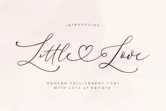
Oddly Christmas + Little Love
Adds a warm human signature touch for 1-to-3-word callouts without competing against structured serif capitals.
Inspect Little Love specimenPractical applications
Concrete hierarchy, scale and production guidance tailored to Oddly Christmas’s stroke geometry.
A swash display gives a December card a decorative look without an illustration, and the flourishes fill the plate where a plain face would leave it empty.
Hierarchy & layout recipe
A6 card: the greeting at 28 pt with the flourishes trimmed, the details in a 9 pt serif, and two stars. Keep 12 mm margins, leave 8 mm for the swash returns, and print two colours on a cream card.
Pre-production check
Check the 28 pt greeting, where a swash can cross the trim; pull the block inward by 5 mm. Confirm the 9 pt details keep a 4.5:1 contrast and that the stars clear the letterforms.
A decorative label reads as a gift item, and the single-block composition fits a small jar face where a long word would otherwise crowd.
Hierarchy & layout recipe
Print a 60 mm round label: the product at 14 pt, the weight in a 6 pt serif, and one star. Keep 5 mm inside the die so the flourishes are never cut, and print two colours on a cream stock.
Pre-production check
Check the 14 pt product on a curved jar, where a flourish can distort; simplify it below 20 mm. Confirm the 6 pt weight reads on the shelf and that the die clears the lowest curl.
A swash display frames a seasonal anthology as a gift book, and the flourishes give the cover movement without a photograph.
Hierarchy & layout recipe
Set the title at 80 mm cap height across 200 mm, the subtitle in a 12 pt serif, and the editor at 8 pt. Print two colours on a matte stock and keep the stars as the only ornament.
Pre-production check
Check the title at thumbnail size, where the fine swashes can disappear; keep them above 0.3 mm. Confirm the 8 pt editor survives lamination and that the title clears the trim by 12 mm.
Technical & licence verification
Confirm included OTF/TTF/WOFF formats, full glyph tables and licence coverage on the live store page before batch production.
Closest visual alternatives
Matched across letterform anatomy, stroke behaviour and craft applications.
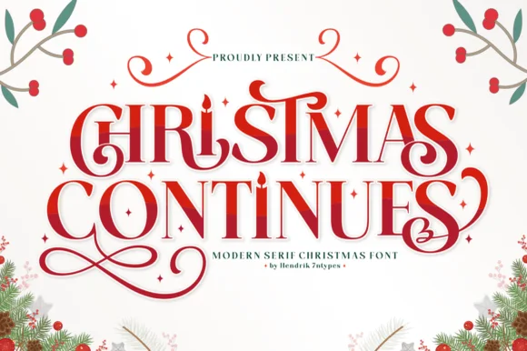
Ornamental holiday display serif with candle-flame i & spiral curls
Christmas Continues is a whimsical holiday display serif (not a cursive script) featuring curled spiral hooks, ligatures, and a candle-flame 'I'.
Ideas for this font
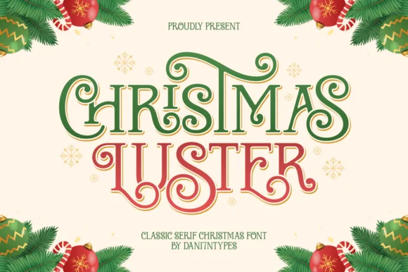
Ornamental ribbon-swashed vintage Christmas display serif
Christmas Luster is actually a lush, swash-curled classic display serif (NOT a connected script!) weaving storybook loops through red-and-green capitals!
Ideas for this font
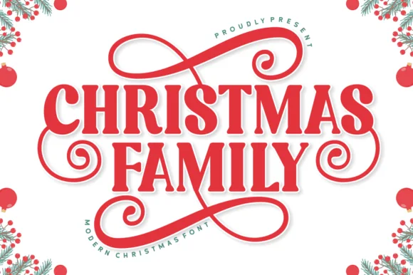
Bold ribbon-swashed holiday display slab-serif
Christmas Family is a sturdy, festive display serif (not a script) crowned and underlined by thick figure-eight gift-ribbon flourishes.
Ideas for this font
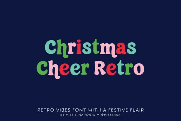
Cozy 1970s retro-groovy mixed-case holiday & everyday serif
Christmas Cheer Retro is a charming, chubby retro serif by Miss Tiina with soft rounded brackets and playful mixed-case bounce (zero holiday clipart attached!).
Ideas for this font
Same independent foundry
Allow optional Google Analytics to measure visits and catalogue actions. Your search words and notes are not included. Privacy & storage