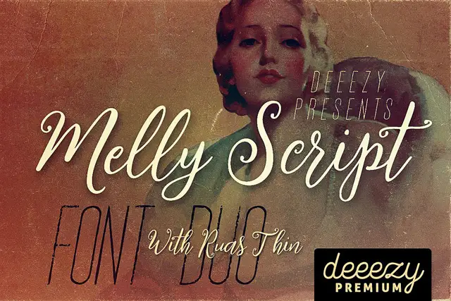
Editorial Serif Anchor

North + Wolles Elegant Modern Serif
Anchors North's fluid strokes with crisp Roman proportions on wedding suites, headers and packaging.
Inspect Wolles Elegant Modern Serif specimenDisclosure: MakerFileHub may earn a commission from qualifying purchases via paid links on this page. How our links work.
Tall textured SVG brush script
North is a tall textured brush script in cream over a mountain photograph: heavy vertical strokes with a dry, chalky texture inside each letter, tall narrow loops and a fast forward lean.
Paid link
Get this fontProject & layout blueprintsAt-a-glance maker compatibility
Weld or Unite overlapping script joins into one continuous vector path before sending to the blade.
Visual anatomy & craft review
The two words are stacked, and the face is a brush script with a built-in texture: the N is a pair of tall stems with a thin join, the o and the r are narrow, the t crosses high and the s and the c close small, while the inside of every stroke is broken by a chalky grain, which is what makes a heavy script read as painted on timber or printed on rough stock. The stroke is heavy and the letters are tall and compressed, so a ten-letter phrase fills a wide measure without any other element. Beneath the display line a second line sets the same style in a smaller brush hand, which shows the texture at caption size, and two tracked capitals at the foot name the format. The ground is a photograph of a mountain range at dusk. North is a brush script for posters, apparel, packaging and signage with a handmade tone.
A dry-brush script over mountains
Two-font hierarchy recipes
Tested contrast partners — pairing North with grounded secondary typography.
North + Wolles Elegant Modern Serif
Anchors North's fluid strokes with crisp Roman proportions on wedding suites, headers and packaging.
Inspect Wolles Elegant Modern Serif specimen
North + Modern Limited
Keeps small-scale dates, URLs, nutrition facts and care instructions crisp and legible below script titles.
Inspect Modern Limited specimenPractical applications
Concrete hierarchy, scale and production guidance tailored to North’s stroke geometry.
A dry brush script suits a venue built from timber, and the texture reads as painted lettering rather than a printed panel.
Hierarchy & layout recipe
Print a 600 by 400 mm board: set the greeting at 100 pt over two lines, keep 24 mm of clear ground beneath before the names at 24 pt, and hold 22 mm of border on all four sides.
Pre-production check
A texture that reads well on paper can look like a faded print on a board; print one at the final size and judge the grain before the set.
A textured brush script gives an outdoor feature a voice, and the heavy strokes hold over a landscape photograph where a thin face would disappear.
Hierarchy & layout recipe
Print a 230 by 300 mm cover: set the cover word at 90 pt on two lines, keep 26 mm of clear ground beneath before the cover lines at 11 pt, and hold 22 mm of margin on all four sides.
Pre-production check
A cream script over a bright sky loses contrast; print one cover and check every letter separates before the run.
A textured script gives a small bottle a handmade look, and the heavy strokes stay legible on a narrow label at shelf distance.
Hierarchy & layout recipe
Print a 45 by 85 mm label: set the brand at 15 pt on one line, keep 6 mm of clear ground beneath before the volume at 4.5 pt, and hold 4 mm of margin on all four sides.
Pre-production check
A textured stroke on a coated label can fill; print one on the real material and check the grain before the order.
Technical & licence verification
Confirm included OTF/TTF/WOFF formats, full glyph tables and licence coverage on the live store page before batch production.
Closest visual alternatives
Matched across letterform anatomy, stroke behaviour and craft applications.
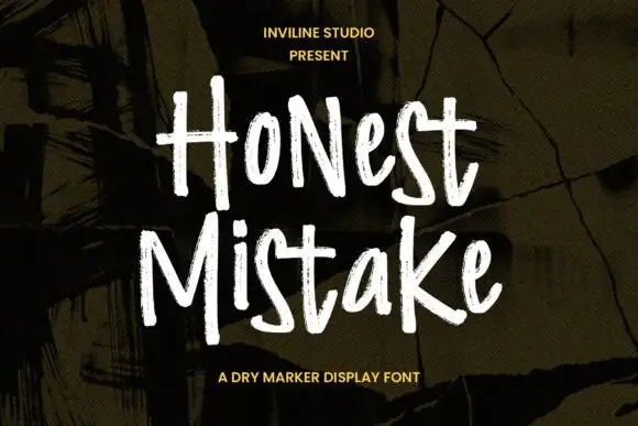
Rough narrow mixed-case marker forms with dry edges and uneven height
Honest Mistake is a narrow mixed-case marker face in which the strokes carry a dry edge, the heights shift and the crossbars sit unevenly, so a word reads as something written quickly on a wall of plywood.
Ideas for this font
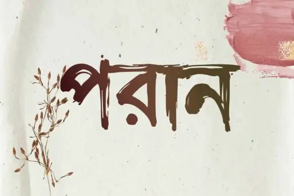
Bengali brush lettering
Poran is Bengali brush lettering in dark brown on a speckled off-white sheet: a single word with a rough horizontal head line and tapered, uneven strokes, with a dried botanical drawing at the left and a rose brush swatch at the upper right.
Ideas for this font

Slanted brush capitals with torn ends
Temur Amorak Urban Bold Brush Font sets two rows of heavy white capitals that lean hard to the right, with torn ragged stroke ends, long diagonal cuts through the thick stems and a small green brush subtitle underneath on a dark grainy field.
Ideas for this font
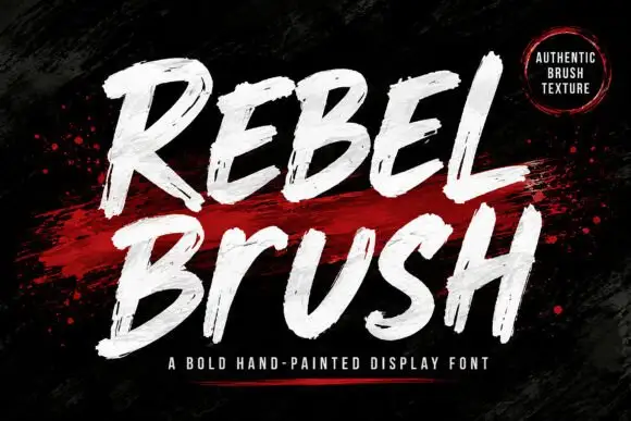
Heavy condensed display sans
Rebel is a heavy condensed display sans in bright blue on black: tall narrow caps with flat terminals, cut corners on the diagonals, a high waist and closed counters, set as one stacked block with a second word in outline and small tracked notes at the sides.
Ideas for this font
Same independent foundry
Allow optional Google Analytics to measure visits and catalogue actions. Your search words and notes are not included. Privacy & storage