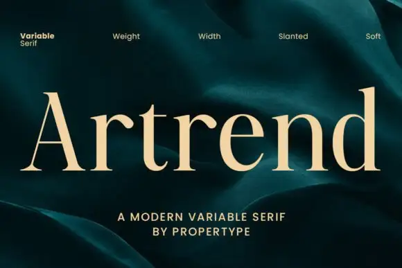
High-Contrast Display Serif

Neue Reman Sans + Amor Hadena
Pairs sculptural editorial warmth with Neue Reman Sans's clean modern geometry.
Inspect Amor Hadena specimenDisclosure: MakerFileHub may earn a commission from qualifying purchases via paid links on this page. How our links work.
Heavy grotesque variable family
Neue Reman Sans is a heavy grotesque in white over a collage: wide even strokes, flat terminals, tight counters and a circular registered mark, presented as a seven-weight variable family with a sidebar of technical notes, so the plate reads as a type-specimen cover rather than an advert.
Paid link
Get this fontProject & layout blueprintsAt-a-glance maker compatibility
Sturdy stroke walls and open counters weed cleanly on adhesive vinyl, HTV apparel film, and cut cardstock.
Visual anatomy & craft review
The specimen sets the family name across three lines, and the drawing is a neo-grotesque at heavy weight: the stems are wide, the counters are narrow, and the terminals are cut flat, which gives the block an even, industrial texture. The wordmark uses a registered circle and an at sign as decorative glyphs, which shows the character set working as marks rather than only as letters. A sidebar lists the axes, the language coverage and the number of styles, and a small photograph of a sculpture sits inside a frame at the right, which is the convention of a contemporary specimen sheet. The palette is white and one accent on a busy collage, and the type is the only flat element on the page, which is what makes it readable against the texture.
Grotesque, heavy, variable, contemporary
Two-font hierarchy recipes
Tested contrast partners — pairing Neue Reman Sans with grounded secondary typography.
Neue Reman Sans + Amor Hadena
Pairs sculptural editorial warmth with Neue Reman Sans's clean modern geometry.
Inspect Amor Hadena specimen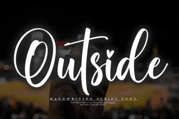
Neue Reman Sans + Outside
Introduces organic movement on pull-quotes, signatures and gift tags.
Inspect Outside specimenPractical applications
Concrete hierarchy, scale and production guidance tailored to Neue Reman Sans’s stroke geometry.
A heavy grotesque with a variable axis gives a collective one wordmark that scales from a card to a wall, and the flat strokes survive fabrication in metal or vinyl.
Hierarchy & layout recipe
Set the mark at 20 pt on a card, 90 mm on a wall and 8 pt in a caption, using a lighter weight below 12 pt. Keep one colour and reserve clear space equal to the cap height so the registered mark can sit beside the word.
Pre-production check
Check the 8 pt caption, where narrow counters can fill; switch to the regular weight. Confirm the wall mark reads at ten metres and that the registered glyph stays legible at 20 pt on a card.
A heavy grotesque gives an annual the look of a specimen sheet, and the variable axis lets the cover and the spine share one voice at two widths.
Hierarchy & layout recipe
Set the title at 105 mm cap height across 230 mm, the subtitle in a 10 pt regular, and the year at 9 pt. Keep the title over a quiet area of a collage image and set the subtitle on a plain band.
Pre-production check
Check the title at 105 mm, where narrow counters can close against a busy collage; keep the image dark behind the type. Confirm the 10 pt subtitle reads at newsstand distance and that the title holds at thumbnail size.
A grotesque family covers a festival's whole signage system, and the heavy weight reads at distance where a light face would disappear against a crowd.
Hierarchy & layout recipe
Specify 200 mm stage headers in the heavy weight, 40 mm wayfinding in the medium, and 12 mm programme entries in the regular. Keep one colour and a consistent clear space of half the cap height on every panel.
Pre-production check
Check the 12 mm programme entries under festival lighting, where a regular weight can grey out; use the medium. Confirm the 40 mm wayfinding reads at five metres and that the stage headers are legible from the back of the field.
Technical & licence verification
Confirm included OTF/TTF/WOFF formats, full glyph tables and licence coverage on the live store page before batch production.
Closest visual alternatives
Matched across letterform anatomy, stroke behaviour and craft applications.
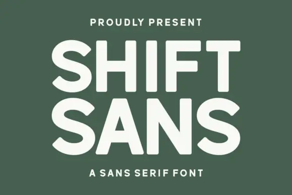
Bold high-x-height grotesque
Shift Sans is a bold grotesque in cream on green: very tall x-height, short ascenders, flat terminals and slightly narrow counters, with two stacked lines filling the plate and a tracked caption above and below, so the pair reads as a contemporary poster headline.
Ideas for this font
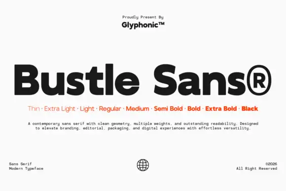
Dense rounded mixed case with open e bowls and a compact high t shoulder
Bustle shows black mixed-case lettering on white in a heavy treatment, where broad nearly even strokes surround compact bowls, the e opens horizontally, the u stays rounded and the t carries a compact shoulder high above the baseline.
Ideas for this font

Modern geometric grotesque caps
Limited Coffee is a modern geometric grotesque in black on cream: wide round capitals, a circular O and C, a low crossbar on the A, flat terminals and even spacing, so the pair reads as a contemporary retail sign rather than a period revival.
Ideas for this font
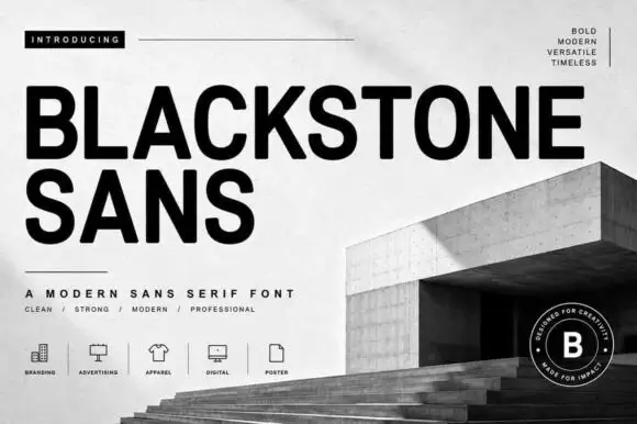
Substantial plain capitals with round O and blunt diagonal K and R legs
Blackstone Sans shows black uppercase words over a pale architectural cover, where substantial nearly even strokes form rounded B and O bowls, flat arms and blunt diagonal legs on the K and R, and the two title lines keep a straightforward block rhythm without swashes or outlines.
Ideas for this font
Same independent foundry
Allow optional Google Analytics to measure visits and catalogue actions. Your search words and notes are not included. Privacy & storage