Modern Grotesque Body

Monster of Fantasy + Modern Limited
Creates crisp high-hierarchy contrast beneath Monster of Fantasy headlines across menus, websites and labels.
Inspect Modern Limited specimenDisclosure: MakerFileHub may earn a commission from qualifying purchases via paid links on this page. How our links work.
Sharp display serif with inset star
Monster of Fantasy is a sharp display serif in black on a pale linen gradient: tall caps with long extended diagonal feet, an inset star inside the O, a small off-set lowercase 'of' between the lines, and a large A whose apex runs above the cap height.
Paid link
Get this fontProject & layout blueprintsAt-a-glance maker compatibility
Sturdy stroke walls and open counters weed cleanly on adhesive vinyl, HTV apparel film, and cut cardstock.
Visual anatomy & craft review
The two words are stacked with a small lowercase connective between them, which is the arrangement a fantasy title usually takes, and the drawing is a sharp serif: the feet extend into long diagonals, the O carries an inset star, and the A rises above the other capitals, so the block reads as a title rather than as a line of text. Those details set the size floor, because the star and the extended feet close up when the letters shrink, and the plate sets the word large enough that each one reads. The pale linen ground is a soft texture test, and the black holds because the surface is even. The small credit at the head and foot names the style and the studio, which keeps the sheet reading like a specimen.
Serif, sharp, display, fantasy
Two-font hierarchy recipes
Tested contrast partners — pairing Monster of Fantasy with grounded secondary typography.
Monster of Fantasy + Modern Limited
Creates crisp high-hierarchy contrast beneath Monster of Fantasy headlines across menus, websites and labels.
Inspect Modern Limited specimen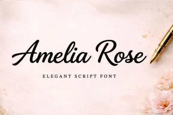
Monster of Fantasy + Amelia Rose
Adds a warm human signature touch for 1-to-3-word callouts without competing against structured serif capitals.
Inspect Amelia Rose specimenPractical applications
Concrete hierarchy, scale and production guidance tailored to Monster of Fantasy’s stroke geometry.
A sharp serif with an inset star gives a genre cover its own mark, and the long feet hold at thumbnail size where a plain serif would look generic.
Hierarchy & layout recipe
Set the title at 85 mm cap height across 200 mm, the author in a 12 pt serif, and the imprint at 8 pt. Print one colour on a coated stock and keep the star counters above 4 mm.
Pre-production check
Check the title at 85 mm, where the extended feet can collide with the line below; keep 12 mm between lines. Confirm the 8 pt imprint survives lamination and that the title clears the trim.
A dramatic serif reads as a themed venue, and the inset star gives a short name a detail that survives on a door plate and a ticket.
Hierarchy & layout recipe
Set the mark at 20 pt on a ticket, 90 mm on a wall and 13 pt on a card, keeping the star only above 24 pt. Keep one colour and clear space equal to the cap height.
Pre-production check
Check the 13 pt card mark, where the star can close; drop it at that size. Confirm the wall mark reads at six metres and that the long feet stay inside the panel.
A sharp serif sets a dark theme without an illustration, and the extended feet give the title a silhouette that reads from across a room.
Hierarchy & layout recipe
A2 poster: the event at 100 mm cap height, the details in a 16 mm serif, and the venue at 11 mm. Keep 30 mm margins and print one colour on a dark stock with the type reversed out.
Pre-production check
Check the poster at five metres, where the inset star can fill; keep it above 6 mm. Confirm the 11 mm venue reads at three metres and that the title clears the trim.
Technical & licence verification
Confirm included OTF/TTF/WOFF formats, full glyph tables and licence coverage on the live store page before batch production.
Closest visual alternatives
Matched across letterform anatomy, stroke behaviour and craft applications.
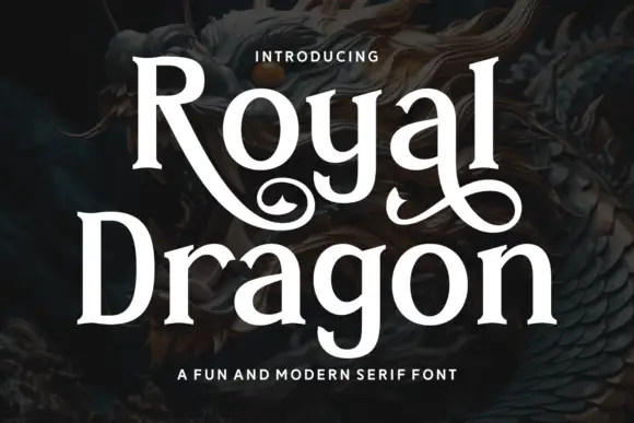
Modern serif with playful flourishes
Royal Dragon is a modern serif in cream on a dark dragon painting: moderate contrast, sturdy serifs, and flourishes that curl from the g and the l, so the word reads as a friendly editorial face with one decorative move.
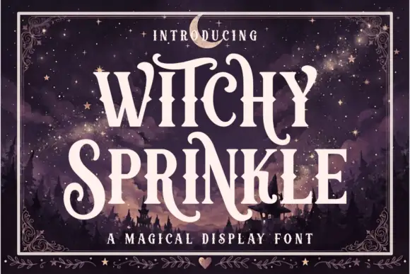
Magical display serif with elongated spurs and pointed curls
Witchy Sprinkle is a magical display serif in which the stems rise into elongated spurs, the terminals curl into points and the contrast stays high, so a two-word title reads as a hand-drawn storybook sign.
Ideas for this font
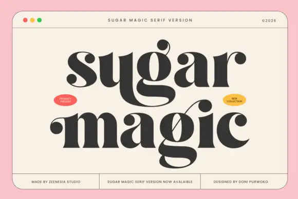
Funky fat serif display
Sugar Magic is a funky fat serif display in near-black on a warm cream panel: very heavy stems, ball terminals, swollen bowls and a lower line with a long connecting swash, set across two lines inside a rule frame with two small oval badges and a footer row of tracked notes.
Ideas for this font
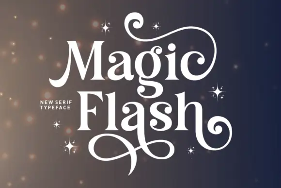
Contrasted serif with huge swash terminals
Magic Flash is a contrasted serif display in white on a dark ground: tall wide letters with hairline joins and enormous swash terminals that curl out of the M, the F and the h, with a scattering of drawn four-point stars.
Ideas for this font
Same independent foundry
Allow optional Google Analytics to measure visits and catalogue actions. Your search words and notes are not included. Privacy & storage