Editorial Serif Anchor

Moking + Grandeur – Elegant Classic Serif
Anchors Moking's fluid strokes with crisp Roman proportions on wedding suites, headers and packaging.
Inspect Grandeur – Elegant Classic Serif specimenDisclosure: MakerFileHub may earn a commission from qualifying purchases via paid links on this page. How our links work.
Very heavy rounded connected script
Moking is a very heavy rounded connected script in white on a black mountain photograph: fat even strokes, tight joins and low round letters that read as a bold mark rather than as handwriting.
Paid link
Get this fontProject & layout blueprintsAt-a-glance maker compatibility
Weld or Unite overlapping script joins into one continuous vector path before sending to the blade.
Visual anatomy & craft review
The word fills the frame, and the face is a display script built on weight: the M opens with a heavy loop, the o is a wide circle, the k throws a fat leg, the i is a short stem and the n and the g close with tight bowls, while the letters connect with joins as thick as the stems, so a seven-letter word becomes a single solid gesture. There is almost no contrast, the counters are small and the baseline sits low, which is what lets white lettering read over a textured photograph without a panel behind it. A circular badge in the corner names the face as a bold script and a tracked capital line at the foot repeats the style. Moking is a bold script for packaging, covers, apparel and event graphics, and it is at its best in one short word at a large size where the counters can stay open.
A fat bold script on a dark landscape
Two-font hierarchy recipes
Tested contrast partners — pairing Moking with grounded secondary typography.
Moking + Grandeur – Elegant Classic Serif
Anchors Moking's fluid strokes with crisp Roman proportions on wedding suites, headers and packaging.
Inspect Grandeur – Elegant Classic Serif specimen
Moking + Homies
Keeps small-scale dates, URLs, nutrition facts and care instructions crisp and legible below script titles.
Inspect Homies specimenPractical applications
Concrete hierarchy, scale and production guidance tailored to Moking’s stroke geometry.
A bold script in white on a dark ground reads across a room, and the single-gesture look gives a plain board the presence of a painted sign.
Hierarchy & layout recipe
Print a 500 by 350 mm board: set the greeting at 110 pt on one line, keep 24 mm of clear ground beneath before the names at 22 pt, and hold 20 mm of border on all four sides.
Pre-production check
Fat joins can close at board size; print one at the final size and check the counters before the set.
A heavy script over a photograph makes a title that belongs to the image rather than sitting on top of it, and the weight holds over dark tonal areas.
Hierarchy & layout recipe
Print a 230 by 300 mm cover: set the title at 90 pt on one line, keep 26 mm of clear ground beneath before the author line at 11 pt, and hold 22 mm of margin on all four sides.
Pre-production check
A white script over a light sky disappears; print one cover and check every letter separates before the run.
A festival banner needs one word that reads from across a field, and the bold stroke survives the distance and the outdoor printing.
Hierarchy & layout recipe
Print a 3000 by 1000 mm banner: set the word at 420 pt on one line, keep 90 mm of clear ground beneath before the dates at 90 pt, and hold 80 mm of border on all four sides.
Pre-production check
Large outdoor printing thickens a stroke; print one section at the final size and check the counters before the run.
Technical & licence verification
Confirm included OTF/TTF/WOFF formats, full glyph tables and licence coverage on the live store page before batch production.
Closest visual alternatives
Matched across letterform anatomy, stroke behaviour and craft applications.

Bouncing tail script with long entry and exit swashes
Farmhouse is a bouncing tail script in which the letters sit at different heights, the strokes swell on the downstroke and long swashes enter and leave the word, so a name reads as hand lettering on a painted board.
Ideas for this font
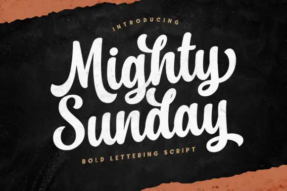
Bold lettering script with heavy looping capitals and a tight stacked fit
Mighty Sunday is a bold lettering script in which the capitals loop heavily, the strokes stay fat through the joins and two stacked words lock together into a single block.
Ideas for this font
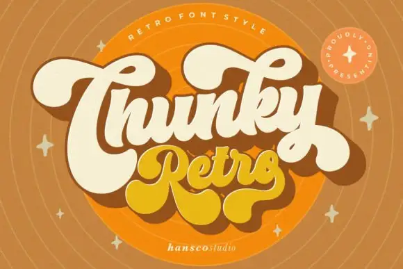
Heavy retro script with fat curled terminals and tight connected loops
Chunky Retro is a heavy script in which the strokes stay thick through every join, the loops close tight and the terminals curl into fat hooks that read as seventies packaging.
Ideas for this font

Fine lowercase script with a heart worked into the central connector
Hello Honey is fine lowercase script in which the two words are joined by a heart drawn into the connector, with long flat tails on both sides and a small even x-height.
Same independent foundry
Allow optional Google Analytics to measure visits and catalogue actions. Your search words and notes are not included. Privacy & storage