Neutral Sans Workhorse

Spooky + Montreal
Lets Spooky own the focal silhouette while handling secondary copy, sizing and subheads cleanly.
Inspect Montreal specimenDisclosure: MakerFileHub may earn a commission from qualifying purchases via paid links on this page. How our links work.
Swash script with seasonal ornaments
Spooky is a swash script in white with a heavy outline on a purple graveyard scene: a fat connected script with long entry and exit swashes, small ghosts hanging from the swashes, and a bouncy baseline, so the plate reads as a friendly Halloween title.
Paid link
Get this fontProject & layout blueprintsAt-a-glance maker compatibility
Weld or Unite overlapping script joins into one continuous vector path before sending to the blade.
Visual anatomy & craft review
The word is set once, arced, and the drawing is a brush script at heavy weight: the strokes swell, the joins are thick, and the terminals roll into curls, which gives the face its energy. The swashes are the structure: one rises off the first letter and loops back, another drops from the last and swings under the word, and small ghosts hang from both, which turns the lettering into illustration. Because the strokes are heavy, the face reads at a distance and on fabric, and the counters stay open under the outline. The ground is a purple silhouette of trees, bats and headstones, and the caption beneath sits in tracked caps so the drawing stays the only decorative element.
Script, swashed, seasonal, playful
Two-font hierarchy recipes
Tested contrast partners — pairing Spooky with grounded secondary typography.
Spooky + Montreal
Lets Spooky own the focal silhouette while handling secondary copy, sizing and subheads cleanly.
Inspect Montreal specimen
Spooky + Gorga
Grounds bold display lettering with classic typographic authority on posters, badges and apparel.
Inspect Gorga specimenPractical applications
Concrete hierarchy, scale and production guidance tailored to Spooky’s stroke geometry.
A swash script with hanging ghosts reads as a decorated title, and the heavy strokes hold at poster size where a thin script would disappear into the background.
Hierarchy & layout recipe
A2 portrait: the title at 110 mm cap height, the details in a 14 mm sans, and a 6 mm border. Keep 30 mm margins, print white on a deep purple, and keep the hanging ghosts away from the small type.
Pre-production check
Check the poster at five metres, where the swashes can blur into the ground; keep the outline heavy. Confirm the 14 mm details read at three metres and that the ghosts do not overlap the details block.
A friendly swash script keeps an October birthday playful rather than spooky, and the heavy strokes stay legible on a small card printed at home.
Hierarchy & layout recipe
A6 card: the name at 30 pt with a 1 mm outline, the details in a 9 pt sans, and one small ghost. Keep 12 mm margins and print two colours on a dark card so the white stays crisp.
Pre-production check
Check the 30 pt name, where a swash can touch the trim; pull the lockup in by 4 mm. Confirm the 9 pt details keep a 4.5:1 contrast and that the outline does not fill the counters.
A friendly script attracts children without frightening them, and the heavy strokes photocopy better than a textured or drippy display.
Hierarchy & layout recipe
A4 print: the headline at 46 mm cap height, the times in a 10 mm sans, and a 4 mm rule. Keep 20 mm margins and print two colours at the highest copier setting so the swashes stay open.
Pre-production check
Check the A4 on a copier, where a thin swash can fill; keep the swash above 1.5 mm. Confirm the 10 mm times read at two metres and that the headline fits without wrapping.
Technical & licence verification
Confirm included OTF/TTF/WOFF formats, full glyph tables and licence coverage on the live store page before batch production.
Closest visual alternatives
Matched across letterform anatomy, stroke behaviour and craft applications.
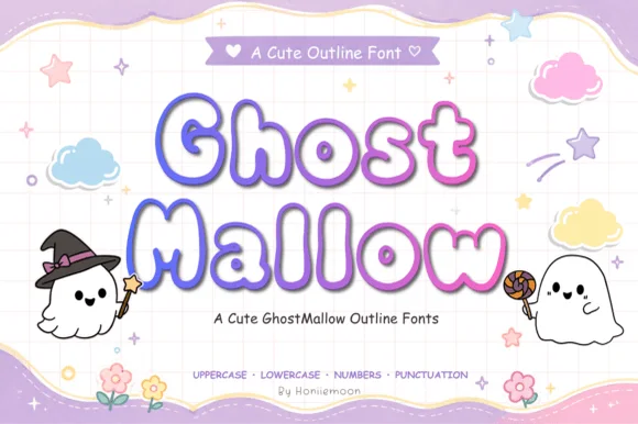
Puffy pastel marshmallow-ghost Halloween outline font (Full charset)
Ghost Mallow is a squishy, pastel-cute Halloween outline font with wavy ghost-hem bottoms across uppercase, lowercase, numbers & punctuation!
Ideas for this font
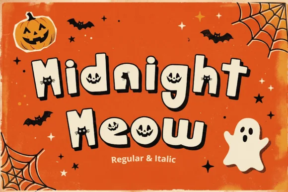
Jack-o'-lantern & peeking black-cat counter Halloween font (Regular & Italic)
Midnight Meow is an adorable chunky Halloween display duo ('Regular & Italic') hiding carved jack-o'-lantern faces and peeking black-cat ears right inside the letter counters!
Ideas for this font
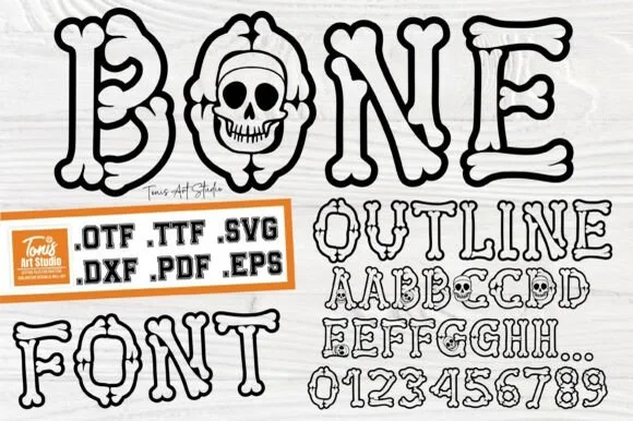
Cartoon hollow bone & grinning-skull Halloween alphabet (.OTF .TTF .SVG .DXF .PDF .EPS)!
Bone Outline builds every letter and '0–9' numeral out of cartoon skeleton bones—complete with a grinning skull inside 'O'—in OTF, TTF, SVG, DXF, PDF & EPS!
Ideas for this font
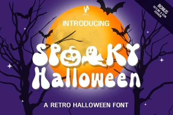
70s groovy ghost & jack-o'-lantern counter font (+ Bonus Outline & Icons!)
Spooky Halloween (by NPNaay) is a 1970s groovy display pack hiding cute ghosts & jack-o'-lanterns inside letter bowls—PLUS a Bonus Outline & Icon version!
Ideas for this font
Same independent foundry
Allow optional Google Analytics to measure visits and catalogue actions. Your search words and notes are not included. Privacy & storage