Neutral Sans Workhorse

Lemon Life + Bareum
Lets Lemon Life own the focal silhouette while handling secondary copy, sizing and subheads cleanly.
Inspect Bareum specimenDisclosure: MakerFileHub may earn a commission from qualifying purchases via paid links on this page. How our links work.
Bold brush script with weight
Lemon Life is a bold brush script in cream on a warm photographic ground: a thick stroke with visible modulation, fat loops on the ascenders, blunt joining strokes and a bouncy baseline, with lemon illustrations at the edges and a caption beneath in a light script.
Paid link
Get this fontProject & layout blueprintsAt-a-glance maker compatibility
Sturdy stroke walls and open counters weed cleanly on adhesive vinyl, HTV apparel film, and cut cardstock.
Visual anatomy & craft review
The two words are stacked and the drawing is a brush script at heavy weight: the downstrokes are thick, the upstrokes are thinner, and the joins are drawn as blunt links rather than hairlines, which keeps the phrase readable at a distance. The bounce keeps the lockup lively and the fat loops give the face its handmade character. Because the stroke is heavy, the face works at label size and on fabric, which the specimen shows by setting the words large over a photograph and keeping the supporting caption in a lighter script. The lemon illustrations and the small ornament at the edges belong to the product imagery, and the palette is cream on a warm ground, which gives the plate a sunny, food-oriented feel.
Script, brush, bold, friendly
Two-font hierarchy recipes
Tested contrast partners — pairing Lemon Life with grounded secondary typography.
Lemon Life + Bareum
Lets Lemon Life own the focal silhouette while handling secondary copy, sizing and subheads cleanly.
Inspect Bareum specimen
Lemon Life + Grandeur – Elegant Classic Serif
Grounds bold display lettering with classic typographic authority on posters, badges and apparel.
Inspect Grandeur – Elegant Classic Serif specimenPractical applications
Concrete hierarchy, scale and production guidance tailored to Lemon Life’s stroke geometry.
A bold brush script reads as a hand-lettered label, and the thick stroke survives on a small sticker where a fine script would break up.
Hierarchy & layout recipe
Print a 60 by 90 mm label: the product at 16 pt, the volume in a 7 pt sans, and a lemon. Keep 4 mm inside the die and print two colours on a coated stock so the joins stay sharp.
Pre-production check
Check the 16 pt product on a curved bottle, where the outer letters distort; reduce the width. Confirm the 7 pt volume reads in the chiller and that the lemon clears the type block.
A brush script reads as a painted sign and photographs well, and the heavy stroke holds from across a market where a light face would vanish among the goods.
Hierarchy & layout recipe
A2 board: the stall at 120 mm x-height, the prices in a 22 mm sans, and a 6 mm rule. Keep 25 mm margins and paint two colours on a light board so the modulation stays visible.
Pre-production check
Check the board at four metres, where the modulation can read as a wobble; keep the weight consistent. Confirm the 22 mm prices read at two metres and that the rule clears the fruit boxes.
A bold script sets a sunny tone, and the heavy stroke keeps the greeting readable at card size where a thin script would look faint.
Hierarchy & layout recipe
A6 card: the greeting at 28 pt, the details in a 9 pt sans, and a small lemon. Keep 12 mm margins and print two colours on a white card so the joins stay open at home-print resolution.
Pre-production check
Check the 28 pt greeting, where a join can fill and close a counter; keep the counters above 2 mm. Confirm the 9 pt details keep a 4.5:1 contrast and that the lemon clears the trim.
Technical & licence verification
Confirm included OTF/TTF/WOFF formats, full glyph tables and licence coverage on the live store page before batch production.
Closest visual alternatives
Matched across letterform anatomy, stroke behaviour and craft applications.
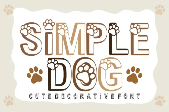
Paw-print outlined display
Simple Dog is an outlined rounded display in warm browns on a pale ground: light caps drawn as a heavy contour with paw prints overlapping the upper edges and sitting inside the counters, with two solid paw prints beside the second line and a tracked line at the foot.
Ideas for this font
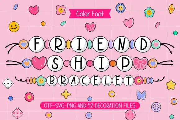
Slim black capitals inside white round beads with coloured spacers
Friendship Bracelet draws each capital inside a round bead threaded on a string, and fills the spaces between the words with charms: hearts, flowers, butterflies and small smiling faces.
Ideas for this font
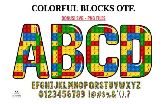
Outlined block capitals filled with colourful studded rectangles
Colorful Blocks builds every letter from a grid of plastic bricks, fills them in primary red, yellow, green and blue, and adds a glossy highlight and a heavy black contour around the whole shape.
Ideas for this font
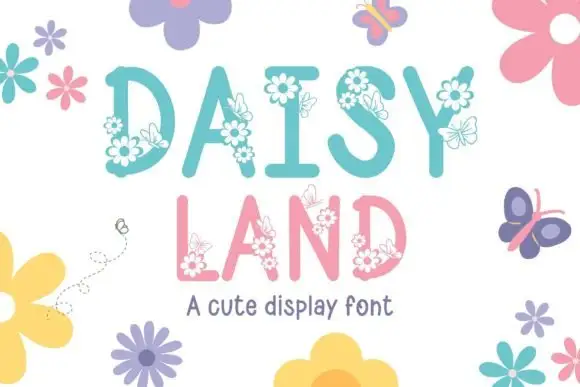
Tall soft capitals carrying small daisy clusters and fine outlined butterflies
Daisy Land is a cute display face in which each capital is a slender pastel letter with drawn daisies, leaves and butterflies attached to its stems, so a word looks like a trellis in flower.
Same independent foundry
Allow optional Google Analytics to measure visits and catalogue actions. Your search words and notes are not included. Privacy & storage