Modern Grotesque Body

Kytie + Base Edge
Creates crisp high-hierarchy contrast beneath Kytie headlines across menus, websites and labels.
Inspect Base Edge specimenDisclosure: MakerFileHub may earn a commission from qualifying purchases via paid links on this page. How our links work.
Heavy compact serif with angled stems, teardrop details and a long t bar
Kytie is a heavy compact serif in which the stems angle slightly, the bowls stay broad and close, the details finish in teardrops and the t crossbar runs long toward a tilted dot, so a name reads as a luxury magazine title.
Paid link
Get this fontProject & layout blueprintsAt-a-glance maker compatibility
Weld or Unite overlapping script joins into one continuous vector path before sending to the blade.
Visual anatomy & craft review
The K pushes two thick arms from a narrow junction, the y drops a short curved tail, the o and e keep broad compact bowls with a fine join, and the t reaches a hairline crossbar toward a large leaning dot. The teardrop terminals are the character: they soften a heavy face at one point per letter, which is why the sample sets one name over a close portrait. Because the counters are small and the weight is heavy, the face wants 30 pt in print and reads best as a single short word; the bold cut ships alongside for secondary lines. The portrait, the shadow and the small credit are presentation; the pale heavy serif name is the face.
Bold · Compact · Teardrop
Two-font hierarchy recipes
Tested contrast partners — pairing Kytie with grounded secondary typography.
Kytie + Base Edge
Creates crisp high-hierarchy contrast beneath Kytie headlines across menus, websites and labels.
Inspect Base Edge specimen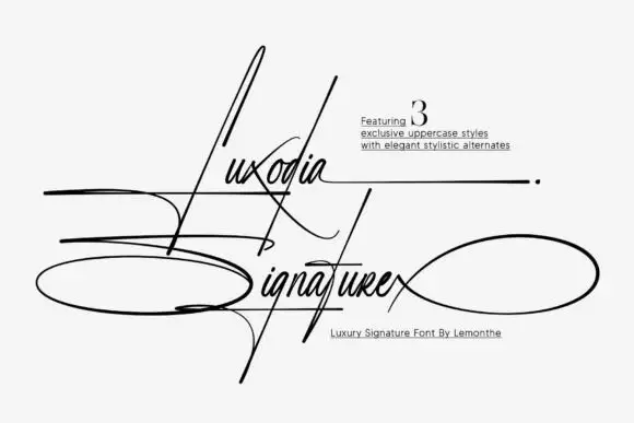
Kytie + Luxodia Signature
Adds a warm human signature touch for 1-to-3-word callouts without competing against structured serif capitals.
Inspect Luxodia Signature specimenPractical applications
Concrete hierarchy, scale and production guidance tailored to Kytie’s stroke geometry.
The compact weight holds a cover at scale, and the teardrop details survive at 70 pt on a coated sheet with a single-word title.
Hierarchy & layout recipe
Print an A4 cover: set the title at 70 pt across the upper third, keep 20 mm of clear ground beneath, and set the issue line in a 9 pt caps at the foot.
Pre-production check
A heavy title printed over a lit portrait edge loses its outline; check the cover and keep the title on a plain band.
The luxury weight suits a small carton, and the compact bowls stay solid at 20 pt on a 45 mm panel with a plain volume line at the foot.
Hierarchy & layout recipe
Print a 45 by 90 mm carton: set the product name at 20 pt, set the volume in a 6 pt caps at the foot, and keep 8 mm of clear space above the name for the long t bar.
Pre-production check
A long crossbar printed close to a rule looks like a strike; check the panel and keep 6 mm between the bar and any line.
The heavy serif marks the courses, and the compact forms keep a short heading distinct at 18 pt above the lighter dish lines.
Hierarchy & layout recipe
Print a 105 by 210 mm menu: set the course headings at 18 pt, set the dishes at 10 pt in a light serif beneath, and keep 14 mm between courses so the teardrops sit clear.
Pre-production check
Heavy headings set tight over light dishes pull the page down; check the proof and keep 12 mm of air under each heading.
Technical & licence verification
Confirm included OTF/TTF/WOFF formats, full glyph tables and licence coverage on the live store page before batch production.
Closest visual alternatives
Matched across letterform anatomy, stroke behaviour and craft applications.
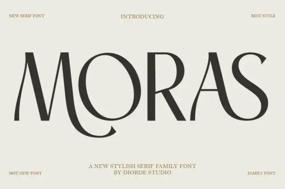
Stylish display serif family
Moras is a stylish serif family in near-black on pale stone: very high contrast, hairline stems and thin flat serifs, with a curling tail on the R, a swooping S and a ligature between the O and the R, set as one wide word with tracked corner notes.
Ideas for this font
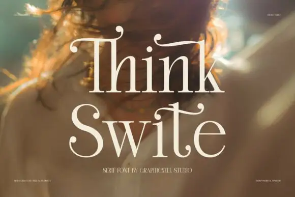
Display serif with calligraphic curled terminals
Think Swite is a display serif in cream over a warm portrait: tall letters with a strong contrast, thin stems and curled calligraphic terminals that lift off the tops of the T and the h, set as two stacked words with a small caption beneath.
Ideas for this font
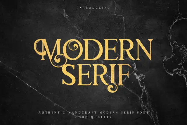
Display serif with ornate curled details
Modern Serif is a display serif in gold on dark marble: heavy letters with curled hairlines growing out of the stems, small flourishes at the feet and a moderate contrast, set as two stacked words with a tracked line beneath.
Ideas for this font
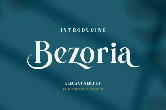
Elegant serif with calligraphic tails and a flowing lowercase
Bezoria is an elegant serif in which the lowercase carries calligraphic tails, the bowls flow into their stems and the serifs stay fine, so a single name reads as a piece of modern lettering rather than as a text face.
Ideas for this font
Same independent foundry
Allow optional Google Analytics to measure visits and catalogue actions. Your search words and notes are not included. Privacy & storage