Neutral Sans Workhorse

Kota Kita + Base Edge
Lets Kota Kita own the focal silhouette while handling secondary copy, sizing and subheads cleanly.
Inspect Base Edge specimenDisclosure: MakerFileHub may earn a commission from qualifying purchases via paid links on this page. How our links work.
Heavy geometric cutout capitals with notched counters and a flat baseline
Kota Kita is a heavy geometric capital alphabet with cut-out notches, a flat baseline and almost no contrast, drawn so a short word reads as a solid signage block.
Paid link
Get this fontProject & layout blueprintsAt-a-glance maker compatibility
Sturdy stroke walls and open counters weed cleanly on adhesive vinyl, HTV apparel film, and cut cardstock.
Visual anatomy & craft review
The K keeps a heavy stem with two arms meeting at a sharp vertex, the O closes into a rounded square with a rectangular counter, the T holds a wide flat arm and the A is drawn as a wedge with a low bar. Counters are rectangular and small, corners are cut flat rather than rounded, and the letterfit is tight enough that the word reads as one shape. A few letters carry a notch cut through a stem, which is what keeps the face from looking like a plain bold sans at poster sizes. Weight is uniform, the baseline is flat and there is no contrast anywhere. The orange ground, the white and black lettering and the paired stacking in the sample are presentation; the typeface is the two words.
Geometric · Heavy · Cutout
Two-font hierarchy recipes
Tested contrast partners — pairing Kota Kita with grounded secondary typography.
Kota Kita + Base Edge
Lets Kota Kita own the focal silhouette while handling secondary copy, sizing and subheads cleanly.
Inspect Base Edge specimen
Kota Kita + Augler
Grounds bold display lettering with classic typographic authority on posters, badges and apparel.
Inspect Augler specimenPractical applications
Concrete hierarchy, scale and production guidance tailored to Kota Kita’s stroke geometry.
The heavy geometric block reads at cover size and holds its shape when a cover is seen as a thumbnail, which is where most covers are judged now.
Hierarchy & layout recipe
Set the wordmark at 110 pt across the top third of an A4 cover, keep the issue line in a fine sans at 9 pt, and leave 20 mm at each side so the wide letters are not clipped.
Pre-production check
Heavy blocks on newsprint gain ink; check the press sheet and open the rectangular counters if the O and A begin to fill.
The cutout construction reads as contemporary signage and reproduces cleanly in vinyl, metal and paint, which is what a store front needs.
Hierarchy & layout recipe
Set the store name at 25 cm on the fascia, keep the opening hours in a fine sans at 5 cm, and hold 15 cm of margin so the heaviest stems are not cut by the frame.
Pre-production check
Vinyl of a heavy geometric face needs bridges inside the small counters; check the cut file at full size and open the notches slightly.
A geometric block gives a modern wedding its signage without falling back on a serif, and the flat baseline keeps a short name formal.
Hierarchy & layout recipe
Set the greeting at 10 cm on a 500 by 700 mm board, set the names in a fine sans at 4 cm beneath, and leave 10 cm of margin so the wide T arms stay inside the frame.
Pre-production check
A heavy block beside fine sans details can look unbalanced; check the board at full size and increase the weight of the details rather than shrinking the greeting.
Technical & licence verification
Confirm included OTF/TTF/WOFF formats, full glyph tables and licence coverage on the live store page before batch production.
Closest visual alternatives
Matched across letterform anatomy, stroke behaviour and craft applications.
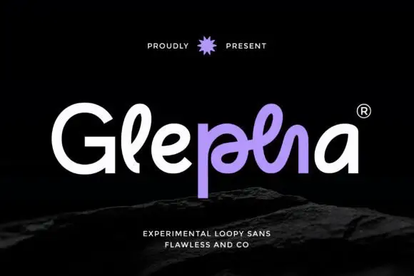
Looped rounded mixed case with interwoven central strokes and a deep p stem
Glepha shows white and purple lettering on black, where a broad open G introduces rounded lowercase forms, the l rises into a narrow loop and the central letters intertwine through a crossing horizontal stroke, while the p drops far below the main bodies and the final a keeps a simple broad bowl.
Ideas for this font
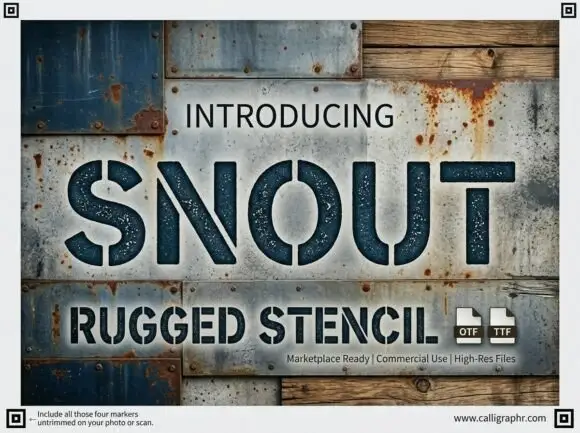
Wide rugged stencil capitals with narrow vertical gaps and speckled fill
Snout is a wide industrial stencil in which heavy capitals are interrupted by narrow vertical gaps, the S and O stay round against straight-sided N, U and T shapes and a speckled fill roughens the surface, so a word reads as a sprayed crate marking.
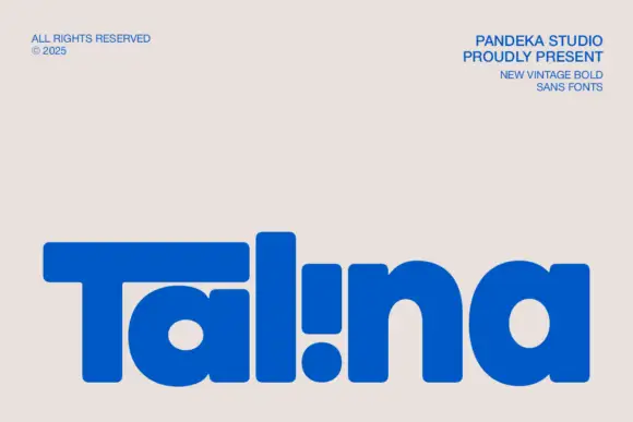
Heavy rounded logo display
Talina is a heavy rounded display in royal blue on a pale sheet: a short name set in very heavy rounded letters with an extended T arm, wide round bowls and an inverted dot-and-stem i that reads as a cut counter, with three small credits in the corners.
Ideas for this font
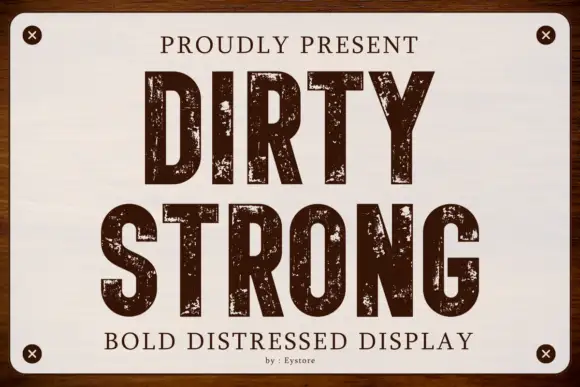
Condensed capitals with coarse scattered erosion and straight stems
Dirty Strong is a condensed industrial display in which the stems run straight and narrow, the bowls stay compact and coarse patches of wear break the fill at several scales, so a heading reads as paint on a warehouse sign.
Ideas for this font
Allow optional Google Analytics to measure visits and catalogue actions. Your search words and notes are not included. Privacy & storage