Modern Grotesque Body

Imheve + Helina
Creates crisp high-hierarchy contrast beneath Imheve headlines across menus, websites and labels.
Inspect Helina specimenDisclosure: MakerFileHub may earn a commission from qualifying purchases via paid links on this page. How our links work.
Extremely heavy capitals with short feet and small diagonal openings
Imheve is an extremely heavy capital alphabet with short slab feet, tiny diagonal openings and almost no white inside the letters, drawn so a short word reads as an architectural mass.
Paid link
Get this fontProject & layout blueprintsAt-a-glance maker compatibility
Sturdy stroke walls and open counters weed cleanly on adhesive vinyl, HTV apparel film, and cut cardstock.
Visual anatomy & craft review
Every letter is built from thick rectangles: the I is a plain slab with feet at both ends, the M holds two heavy diagonals, the H joins two thick stems with a bar as heavy as the stems and the V closes to a sharp point. The only white inside the letters appears as small diagonal slits, which is what keeps the face readable while removing nearly all counters, and the feet are short and flat with no bracketing. Weight is maximal and there is no contrast at all, so the word reads as one block at any size above 60 pt; below that the slits close and the letters merge. The green and yellow ground, the magenta ink and the two small credits are presentation; the typeface is the word.
Massive · Squared · Serifed
Two-font hierarchy recipes
Tested contrast partners — pairing Imheve with grounded secondary typography.
Imheve + Helina
Creates crisp high-hierarchy contrast beneath Imheve headlines across menus, websites and labels.
Inspect Helina specimen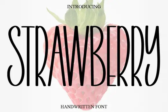
Imheve + Strawberry
Adds a warm human signature touch for 1-to-3-word callouts without competing against structured serif capitals.
Inspect Strawberry specimenPractical applications
Concrete hierarchy, scale and production guidance tailored to Imheve’s stroke geometry.
The massive squared construction reads at cover size and holds up as a thumbnail, which is where annual covers are usually judged.
Hierarchy & layout recipe
Set the wordmark at 120 pt across the top half of an A4 cover, keep the issue line in a fine sans at 9 pt, and leave 20 mm at each side so the wide letters are not clipped.
Pre-production check
Below about 60 pt the diagonal slits close; check the printed cover and keep the wordmark large rather than substituting another face.
The architectural weight suits a studio fascia and reads down a corridor, and the squared skeletons cut cleanly in metal and vinyl.
Hierarchy & layout recipe
Set the studio name at 25 cm on the fascia, keep the address in a fine sans at 5 cm, and hold 15 cm of margin so the heavy slabs are not cut by the frame edge.
Pre-production check
A cut vinyl slab with slits needs bridges; check the cut file at full size and keep every slit at least 4 mm wide.
The block weight gives a contemporary wedding signage without a serif, and the squared letters read at a distance in a large room.
Hierarchy & layout recipe
Set the greeting at 10 cm on a 500 by 700 mm board, set the names in a fine sans at 4 cm beneath, and leave 10 cm of margin so the wide letters stay inside the board.
Pre-production check
A massive block beside fine sans details looks unbalanced; check the board at full size and increase the weight of the details before shrinking the greeting.
Technical & licence verification
Confirm included OTF/TTF/WOFF formats, full glyph tables and licence coverage on the live store page before batch production.
Closest visual alternatives
Matched across letterform anatomy, stroke behaviour and craft applications.
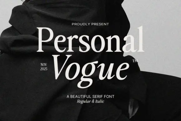
Elegant editorial serif with italic
Personal Vogue is a serif in cream on a monochrome fashion photograph: a moderate-contrast roman with fine serifs and a true italic with a strong slant, set on two lines with small tracked notes at the sides and an attribution beneath.
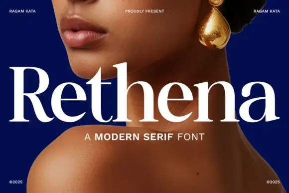
Modern serif with softened joins
Rethena is a modern serif in white over a deep blue portrait: moderate contrast, softened joins, round bowls and short bracketed serifs, set as one large word with a capital line beneath and small credits in the corners.
Ideas for this font
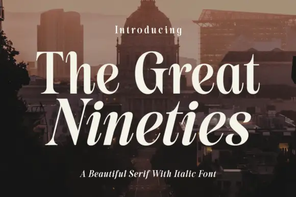
High-contrast serif with an italic companion
The Great Nineties is a serif family in cream over a city at dusk: a high-contrast roman with fine bracketed serifs for the first line and a matching italic for the second, sold together as a pair.

High-contrast italic editorial serif
The Simple Editorial is a high-contrast italic serif in near-black on white: very fine hairlines, sharp serifs, a strong forward slant and a tall waist, shown in a full specimen with weight and width labels in a small caps grid around the display line.
Ideas for this font
Allow optional Google Analytics to measure visits and catalogue actions. Your search words and notes are not included. Privacy & storage